Amateur!This is pure love to me! I am very excited for this one. Now to decide if I really need to hang on to my 3 versions of the siege mold.
Amateur!This is pure love to me! I am very excited for this one. Now to decide if I really need to hang on to my 3 versions of the siege mold.
Okay, calm down Straxus.
Inside Tarn's living room.
Ugh, One of the dumbest Marvel UK retcons. There was such an easy workaround for that that didn't need to invalidate all of Megatron's UK issue appearances.Okay, calm down Straxus.
What do you mean? That's all Megaplex. I mean maybe the real Megatron is in there somewhere...There is NOTHING wrong with troop building Megatron.
Yeah. He's the winged one on the far right.I mean maybe the real Megatron is in there somewhere...

Megs and Galvy look like they're comparable heights when you stand them stock straight next to each other. Also Megs' shins continue to look less blue under different lighting.


I'm just not seeing it. Plenty of people have commented about the cannon is wrong but... it just looks like a G1 Megatron fusion cannon to me.The fusion cannon is so ...wrong its laughable
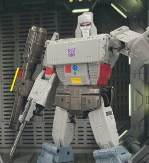
The back end is longer than the front end, when the opposite is supposed to be true.I'm just not seeing it. Plenty of people have commented about the cannon is wrong but... it just looks like a G1 Megatron fusion cannon to me.
It's extra striking after being used to Siege, and Earthrise to a lesser extent. Those versions had the balance out of whack the opposite direction, with a long barrel and a really short back end. That's also not screen accurate, but it looks a lot better than this.The back end is longer than the front end, when the opposite is supposed to be true.
Agreed! A splash of red on the inner legs would have also looked good for balance purposes, but it wouldn't be strictly screen accurate. A toy deco on this might look fantastic, actually...with the chest loops & all...I agree with Exatron that I think the main problem is the middle portion is shorter than it should be, and the area where it's missing (red line below) got 'given' to the back end, making it longer than it should be. If the middle chunk was as big as the yellow line it would look a lot better.
Leg coloring looks better in that pic next to Galvatron, though still a smidge too dark. And then this one looks too blue again. It'll be interesting to see the final product in person.
I wonder if we'll ever get a comic-y black helmet repaint...