Takara's initial plan to dub Animated as a movie prequel (and the immediate scrapping of that plan) was all their own initiative. By the time Animated was getting ready for release in Japan, it was on its way out in Hasbro's markets, around the time when Hasbro's final Animated releases got relegated to Toys 'R' Us exclusives instead of mass retail, and when Hasbro was just about to launch their new Aligned continuity.I don't know if this was tied to any late changes from the original plan Sabrblade mentioned (which I remember being utterly baffled by even at the time); no idea if the timings would result in that.
You are using an out of date browser. It may not display this or other websites correctly.
You should upgrade or use an alternative browser.
You should upgrade or use an alternative browser.
Outside? Inside? No, thinking ABOUT the box: your thoughts on Transformers packaging
- Thread starter lastmaximal
- Start date
I do find it interesting how Hasbro always seems to cycle back to "primarily white packaging with some red highlights" eventually.
Cybertron... but then it goes away for Classics and the movie stuff but it's back for Animated... goes away for Universe 2.0, movie stuff, RtS, but it's back for Prime RiD and Beast Hunters...
It popped up again for both AoE and TLK and RiD '15, and then again for the tail end of EarthSpark and now Cyberworld.
I'm not saying all of these designs are on the same level, Animated's packaging pops and Cyberworld's comes off as very bland, but it is interesting that Hasbro does seem to like to come back to the "white base with a pop of red" look.
It does seem to be a "pendulum swinging" situation with them and even Mattel, whose WWE line has occasionally cycled back to lighter-colored cards. Their Cars line too, I think? They had a long run on red cards, then light gray... It's just refreshing after a period of solid, often dark, colors that start to feel a bit samey.
I agree that they're not all equally appealing, as various factors do result in some hitting better than others. I keep thinking we could do with some for Transformers right now, but Evergreen has had a bland version of it for so long and Cyberworld is following more in that direction than setting its own (really not getting the fun vibe of the show from it).
I agree that they're not all equally appealing, as various factors do result in some hitting better than others. I keep thinking we could do with some for Transformers right now, but Evergreen has had a bland version of it for so long and Cyberworld is following more in that direction than setting its own (really not getting the fun vibe of the show from it).
On the opposite end of the spectrum, black-background packaging seems to come back every so often too. Generation 2, Beast Wars Transmetals/Transmetals 2/Fox Kids/Mutant Beast Wars, Energon, 2007 Movie, Titanium Series, Special Edition, debatably Dark of the Moon, the Prime Dark Energon subline, Combiner Wars, Titans Return, Power of the Primes, Studio Series, Siege, Shattered Glass Collection, and (beginning in 2022, the ones from before were primarily brown instead of black) Generations Selects.
The black background packaging seems to sell better, despite how much the white with red highlights pops.
Beginning with Combiner Wars, it also seems to be the visual distinguisher between "For Collectors" (black/dark color background) and "For Kids" (white/light gray/bright color background).The black background packaging seems to sell better, despite how much the white with red highlights pops.
Which is what ended up happening with Star Wars.Beginning with Combiner Wars, it also seems to be the visual distinguisher between "For Collectors" (black/dark color background) and "For Kids" (white/light gray/bright color background).
"Black is just cooler, man, you babies with your kiddie baby toys just wouldn't get it."
Ah well. I don't even necessarily disagree; even outside the edginess there is a sophistication and elegance to a black box with understated colors. See it all the time outside toys. And that pendulum has to go somewhere.
Ah well. I don't even necessarily disagree; even outside the edginess there is a sophistication and elegance to a black box with understated colors. See it all the time outside toys. And that pendulum has to go somewhere.
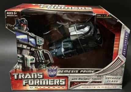
Nemesis Prime in a nutshell."Black is just cooler, man, you babies with your kiddie baby toys just wouldn't get it."
It would be interesting to see what color packaging other contemporary toylines were using at the time. In other words, does Hasbro switch between light and dark just to refresh their own appearance, or are they intentionally trying to stand out from the packaging of competing toylines on shelves and pegs around them?
I'd wager it's a bit of both, as companies are typically trying to set themselves apart while staying within the scope of "what's working now". So more a continuum than an either/or.
But that would be an interesting discussion. I'm just usually not paying attention to much more than Transformers (maybe the superheroes or wrestlers, if that), and there isn't really much in that specific category. But I'm sure others would be better equipped to comment on that.
But that would be an interesting discussion. I'm just usually not paying attention to much more than Transformers (maybe the superheroes or wrestlers, if that), and there isn't really much in that specific category. But I'm sure others would be better equipped to comment on that.
From what I've seen in the action figure aisles lately...
Ninja Turtles: yellow and green packaging
Sonic: blue packaging
Mario: red packaging
Mario Kart: light gray packaging
Star Wars (kids toys): white packaging
Star Wars (collector toys): black packaging
Dragon Ball: black packaging
Masters of the Universe: brown and blue packaging
Marvel Legends: black packaging
Other Marvel: blue and red packaging
Batman: black packaging
Superman: black and red packaging
Other DC: black packaging
Mighty Morphin Power Rangers: Re-ignition: green packaging
Last edited:
The 2000s, 8: Across The...
When Classics was launched, it was a stopgap that came two years too late for the 20th anniversary and had a modest scope. (To be fair, prior to this the brand had gotten a lot of nostalgic love that also gave longtime collectors some toy features they appreciated, in the Masterpiece and Alternators ranges.) However, the year after that, the movie forever changed the way the brand existed and operated, and essentially gave it enough f-you money to explore doing this nostalgia line stuff more consistently at regular retail, continuing the brand team's conception of what "G1 with knees" meant (which typically included more changes than just knees).
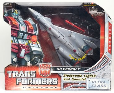
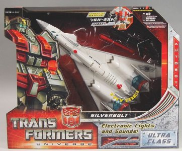
Universe 2.0 (really just called Universe at retail) was a sort of hybrid of Classics and the Movie, taking the brand backward and forward at the same time in ways that weren't always congruous or compatible, but made for interesting and novel toys. By now Hasbro had kind of gotten this era's packaging approach on lock, and approached the line with a lot of packaging design touches that would maintain what Classics started (and cement some that would go on to later Generations lines).
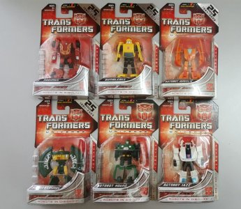
Universe 2.0 responded to the craving for more Transformers product at retail and the hype of the upcoming 25th anniversary (which was incorporated into the packaging). This led to the line covering basically every price point, from Legends to, well, Unicron, with many multipacks besides.
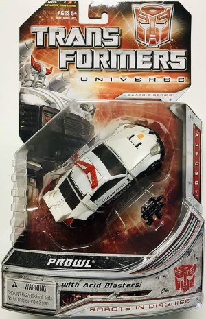
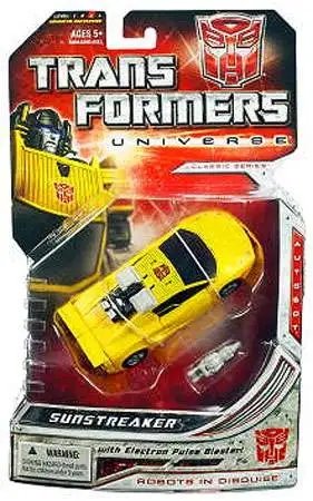
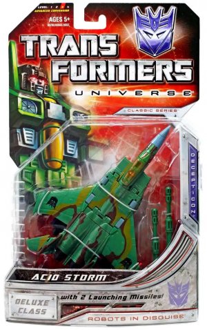
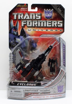
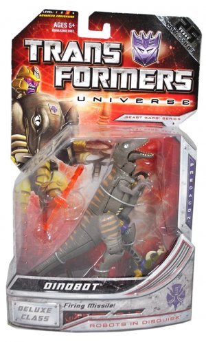
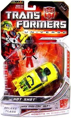
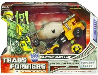
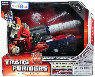
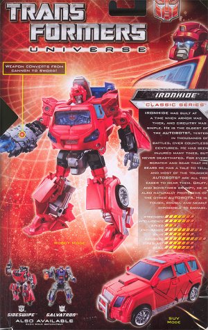
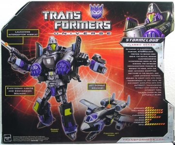
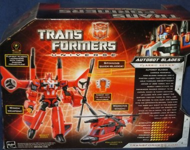
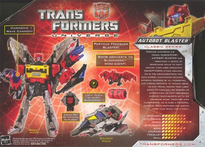
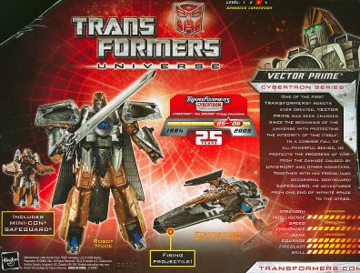
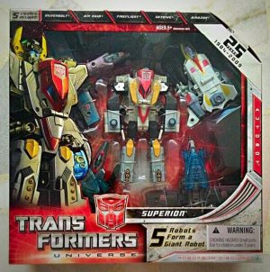
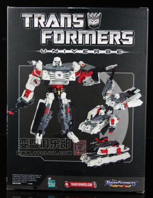
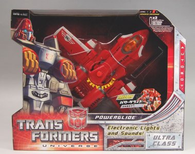
Carded figures would have a red card (the red vignetted and fading into shadows on the ends) with a notch cut into the left edge. The classic grid was brought back as a circular grid of radiating lines and concentric circles, forming a sort of wireframe tunnel, reminiscent of some of the G2 packaging but in warmer colors. The line logo was the classic-font Trans Formers on two lines, with "Universe" in glowing text below and backed by a glowing horizontal line ("Robots in Disguise" would appear elsewhere on this packaging). Small silver bars labeled "Classic Series" (later Generation 1, Beast Wars, Armada, etc) would be just above the bubble. Beveled, colored faction symbols would be in a corner (or next to the nameplates, on boxed figures). Character names were written in white on gunmetal nameplates, and toys would typically be packed in altmode. These elements would more or less form the basis of all nostalgia-themed lines going forward from Transformers (Reveal the Shield) to Generations onward.
Later waves would get a foil label on the corner of the packaging, denoting that this was celebrating "25 Years" of the brand. The packaging design would also use the familiar grungy distressed metal panels for borders and the front card. Rows of cutouts (through which glowed more red) would fill out the bottom edge as needed, sometimes with "Robots in Disguise" written there as well.
One feature from these panels I've never been able to get out of my mind, and am somewhat annoyed by to this day, is the weird swooping curved vent... thing, that formed a corner of the packaging. This would be even bigger on boxed packaging, and was prominent on the front of the packaging throughout. I don't know what it is, it just seems like a weird shape and a bad idea for a way to fill out a right angle.
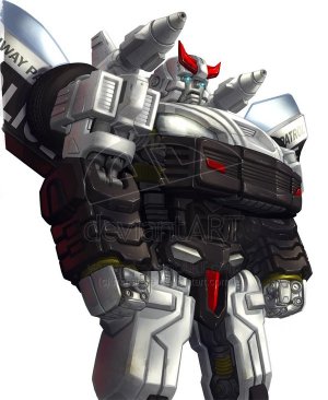
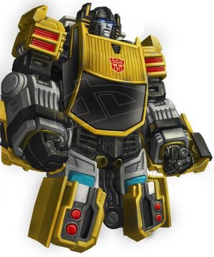
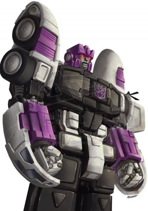
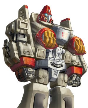
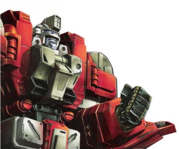
Far more notorious to normal people was the character artwork. Universe 2.0 was known, perhaps infamous, for its static depictions of characters in robot mode. The intention was to be iconic, stoic, and statue-like, and they certainly were... statue-like. The intended stoic vibe ended up being more Dull Surprise in practice, although Hasbro would try to course-correct with subtle changes like different facial expressions, raised fists, and so on. These half-body shots would be used for Deluxes and up (not counting multipacks). On the right side of the packaging would be a vertical plate listing the faction in colored text.
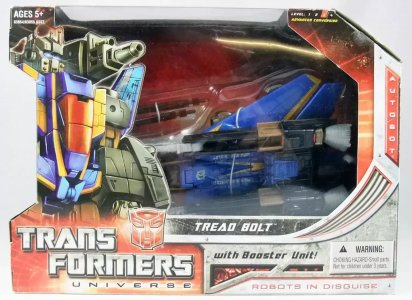
Boxed figures had the same red backdrop texture, nameplate, and logo design, but would bring one of the more complex box shapes to this point. These were like some weird kind of stretched-out serif D, with a notch on the left and a corner cut on the top right. The side panels would be used for co-sells and character artwork.
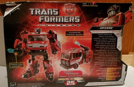
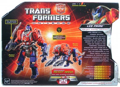
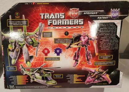
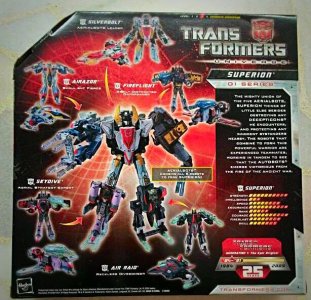
The back of the box would feature the by-now-standard-again bio and tech specs, as well as stock photos of the toy in each mode with the relevant callouts.
For the 25th anniversary, Universe figures would also receive a timeline notation on the back highlighting the era represented by the toy: Generation 1, Generation 2, the Beast Era, and the now-formally-named Unicron Trilogy. This was paired with the foil corner on the front mentioned earlier.
Universe was everything you could imagine a Classics line (unnecessarily) crossed with movie aesthetics (some releases more than others) on a movie-toyline budget would be. Toys were sometimes odd blends of both aesthetics, pushing the Classics-level updating of designs even further, and the line was frankly obese with ancillary releases. Hasbro has never been a slouch at making hay while the sun shines, and the sun was going bonkers. The line was a wild mix of new molds (representing G1 and some other series like Beast Wars and Armada), and Cybertron (and other) molds redecoed into everyone Hasbro thought they could get away with (especially given the line's sometime commitment to movie-ish realism).
When Classics was launched, it was a stopgap that came two years too late for the 20th anniversary and had a modest scope. (To be fair, prior to this the brand had gotten a lot of nostalgic love that also gave longtime collectors some toy features they appreciated, in the Masterpiece and Alternators ranges.) However, the year after that, the movie forever changed the way the brand existed and operated, and essentially gave it enough f-you money to explore doing this nostalgia line stuff more consistently at regular retail, continuing the brand team's conception of what "G1 with knees" meant (which typically included more changes than just knees).
Universe 2.0 (really just called Universe at retail) was a sort of hybrid of Classics and the Movie, taking the brand backward and forward at the same time in ways that weren't always congruous or compatible, but made for interesting and novel toys. By now Hasbro had kind of gotten this era's packaging approach on lock, and approached the line with a lot of packaging design touches that would maintain what Classics started (and cement some that would go on to later Generations lines).
Carded figures would have a red card (the red vignetted and fading into shadows on the ends) with a notch cut into the left edge. The classic grid was brought back as a circular grid of radiating lines and concentric circles, forming a sort of wireframe tunnel, reminiscent of some of the G2 packaging but in warmer colors. The line logo was the classic-font Trans Formers on two lines, with "Universe" in glowing text below and backed by a glowing horizontal line ("Robots in Disguise" would appear elsewhere on this packaging). Small silver bars labeled "Classic Series" (later Generation 1, Beast Wars, Armada, etc) would be just above the bubble. Beveled, colored faction symbols would be in a corner (or next to the nameplates, on boxed figures). Character names were written in white on gunmetal nameplates, and toys would typically be packed in altmode. These elements would more or less form the basis of all nostalgia-themed lines going forward from Transformers (Reveal the Shield) to Generations onward.
Later waves would get a foil label on the corner of the packaging, denoting that this was celebrating "25 Years" of the brand. The packaging design would also use the familiar grungy distressed metal panels for borders and the front card. Rows of cutouts (through which glowed more red) would fill out the bottom edge as needed, sometimes with "Robots in Disguise" written there as well.
One feature from these panels I've never been able to get out of my mind, and am somewhat annoyed by to this day, is the weird swooping curved vent... thing, that formed a corner of the packaging. This would be even bigger on boxed packaging, and was prominent on the front of the packaging throughout. I don't know what it is, it just seems like a weird shape and a bad idea for a way to fill out a right angle.
Far more notorious to normal people was the character artwork. Universe 2.0 was known, perhaps infamous, for its static depictions of characters in robot mode. The intention was to be iconic, stoic, and statue-like, and they certainly were... statue-like. The intended stoic vibe ended up being more Dull Surprise in practice, although Hasbro would try to course-correct with subtle changes like different facial expressions, raised fists, and so on. These half-body shots would be used for Deluxes and up (not counting multipacks). On the right side of the packaging would be a vertical plate listing the faction in colored text.
Boxed figures had the same red backdrop texture, nameplate, and logo design, but would bring one of the more complex box shapes to this point. These were like some weird kind of stretched-out serif D, with a notch on the left and a corner cut on the top right. The side panels would be used for co-sells and character artwork.
The back of the box would feature the by-now-standard-again bio and tech specs, as well as stock photos of the toy in each mode with the relevant callouts.
For the 25th anniversary, Universe figures would also receive a timeline notation on the back highlighting the era represented by the toy: Generation 1, Generation 2, the Beast Era, and the now-formally-named Unicron Trilogy. This was paired with the foil corner on the front mentioned earlier.
Universe was everything you could imagine a Classics line (unnecessarily) crossed with movie aesthetics (some releases more than others) on a movie-toyline budget would be. Toys were sometimes odd blends of both aesthetics, pushing the Classics-level updating of designs even further, and the line was frankly obese with ancillary releases. Hasbro has never been a slouch at making hay while the sun shines, and the sun was going bonkers. The line was a wild mix of new molds (representing G1 and some other series like Beast Wars and Armada), and Cybertron (and other) molds redecoed into everyone Hasbro thought they could get away with (especially given the line's sometime commitment to movie-ish realism).
Last edited:
(continued)
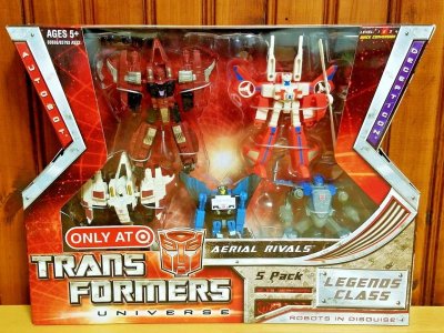
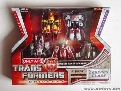
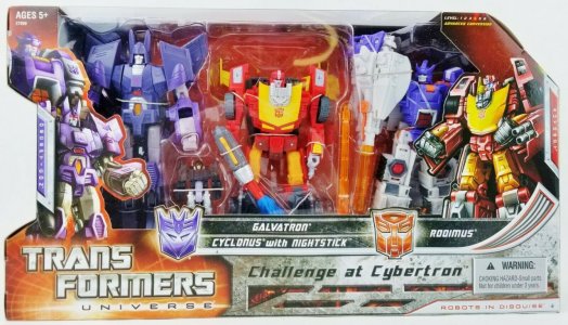
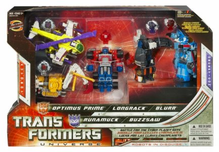
Multipacks and exclusives of various stripes were commonplace. Many just took on modified sizes or lengths of the standard boxed packaging (Battle for the Cyber Planet Keys, which packed toys in a mix of modes), down to clustering artwork together on the box front where applicable (Challenge at Cybertron, and the comic 2-packs, packing all characters in robot mode). Some like the Legends multipacks had unique trapezoid combos akin to the ones seen for the Movie line.
Even the Classics-era Devastator style packaging resurfaced with the other two Energon combiners packed in "core torso bot in robot mode surrounded by limbs in vehicle modes" (in outside-US markets; within the US these would show up in Revenge of the Fallen packaging). Boxes had the usual design minus the notch onn the left side.
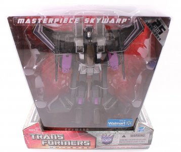
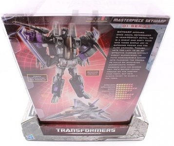
In keeping with what would be the standard approach for US releases of Masterpiece toys, the new Masterpiece Skywarp received Universe-themed packaging, the same way its predecessor Masterpiece Starscream was decked out for Classics (with much the same "trapezoidal display shell atop wider cardboard platform/base" design).
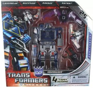
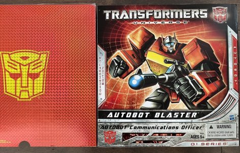
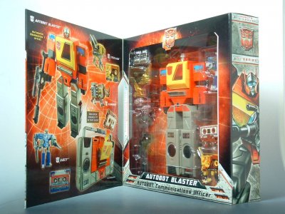
Reissues would also get some love, fittingly for the 25th anniversary. SDCC got two G1-reissue exclusives, which were both released in the line's packaging sttyle. the G1 Soundwave mold would be trotted out again in a wide version of the Universe box but with more cassette pals this time. A "Commemorative Series" Blaster (with three cassettes) reissue also got a mesmerizing red-and-gold foil/lenticular effect sleeve.
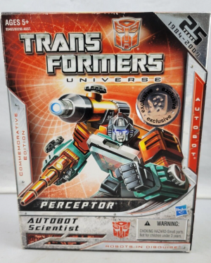
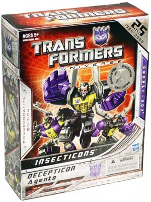
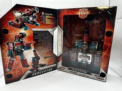
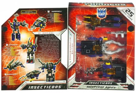
Toys R Us got Commemorative Series reissues of Perceptor and an Insecticon 3-pack. These had opening panels with character art on the grid-portal background similar to the Blaster convention exclusive. The inner side of the front panel had stock pictures and the bio/tech specs on the same portal background, and the toy/s were packed in altmode.
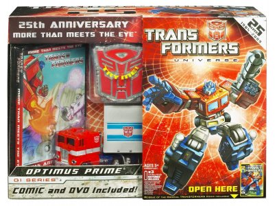
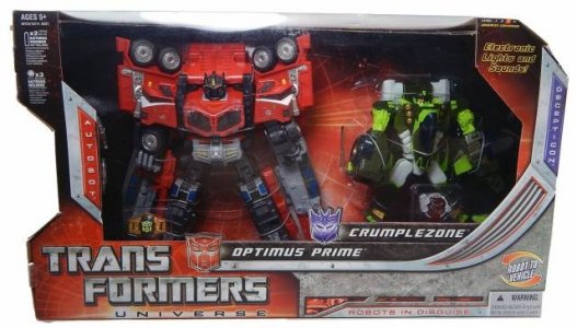
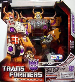
Finally, the original Optimus Prime mold was released in a big box a fancy fold-open panel (character art on the grid-portal), and which included a soundbox, a DVD, and a reprint of issue 1 of the Marvel comic. Other reissues included Cybertron Galaxy Force Optimus Prime and Crumplezone (in a 2-pack) and Armada Unicron in an immense version of the Universe 2.0 box style.
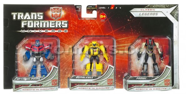
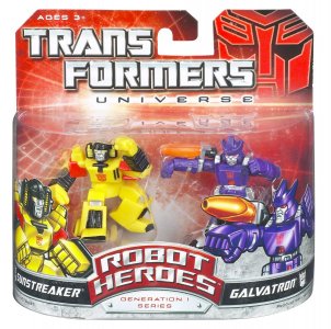
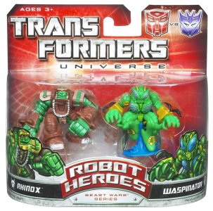
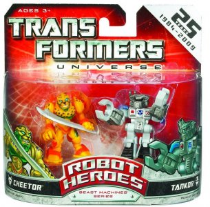
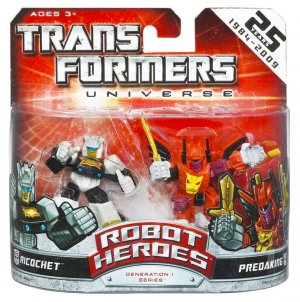
Even Robot Heroes, continuing on from the 2007 movie line, picked up steam. It would apply the 2008 wireframe-portal carded packaging look (and the later 25 Years foil corner) to their usual wide, short cards with the hang tags built in (note the early use of a movie-style big Autobot logo in the corner), and expanding to feature characters from various generations (mostly G1/BW, with one BM pairing; the series would be cancelled beforeRID2991 RID2001 and Victory could be repped).
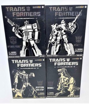
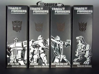
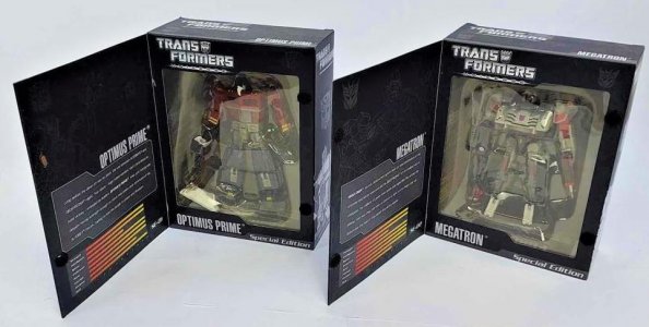
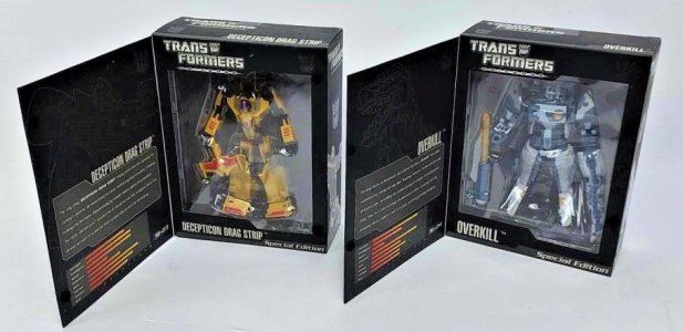
Of particular interest were the Special Editions, which were something of a surprise late in the line in boxes that looked nothing like any of the other exclusive releases. Just four figures, this subset got very slick all-black packaging with white print. These played with a sophisticated black-and-white presentation and varying print textures (gloss, foil) to create a premium feel for what were essentially redecos. A foil Transformers Universe logo sat above white line art if the character within.
These adorned a front flap that opened to show the bio and tech specs on its reverse side, and reveal a display window for the toy in robot mode. Full-color stock pictures of the toy would be on the back.
Takara had by this point been using Henkei as their release venue for Universe molds, but made exceptions for three US-packaging USA Editions that just had stickers to further set them apart (the toys were of course very visible as well).
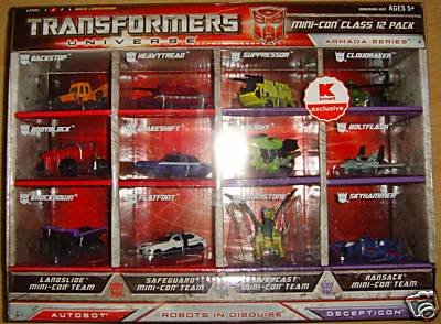
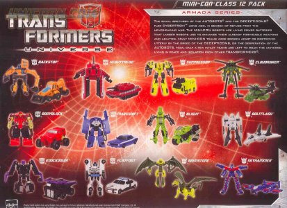
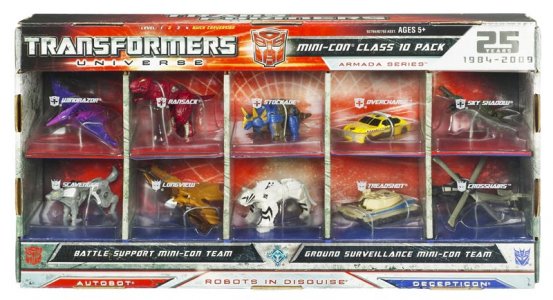
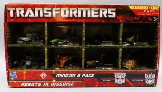
My personal favorites, unsurprisingly, were the Mini-Con multipacks. Giant sets of 12, 10, and 8 Mini-Cons were released in really cool shelf-style packaging that displayed each in its own cell in altmode, all enclosed in a plastic shell or window. The 10-pack go the 25 Years label as well.
(I am still looking for that damn Euro exclusive 8-pack. Someone help please. End my suffering.)
Hasbro throws down heavily for anniversaries, and this was clear even back then, with both the 20th and 25th having a Universe line to provide a venue for the celebration. Unlike the first Universe line, though, this one was bolstered by the movie's runaway success, and so it and the packaging were inescapable for a good long while. Funny enough, its influence on later lines (not even counting how ROTF would also have red-heavy packaging) made it inescapable in a different sense as well.
Multipacks and exclusives of various stripes were commonplace. Many just took on modified sizes or lengths of the standard boxed packaging (Battle for the Cyber Planet Keys, which packed toys in a mix of modes), down to clustering artwork together on the box front where applicable (Challenge at Cybertron, and the comic 2-packs, packing all characters in robot mode). Some like the Legends multipacks had unique trapezoid combos akin to the ones seen for the Movie line.
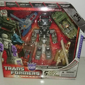
Even the Classics-era Devastator style packaging resurfaced with the other two Energon combiners packed in "core torso bot in robot mode surrounded by limbs in vehicle modes" (in outside-US markets; within the US these would show up in Revenge of the Fallen packaging). Boxes had the usual design minus the notch onn the left side.
In keeping with what would be the standard approach for US releases of Masterpiece toys, the new Masterpiece Skywarp received Universe-themed packaging, the same way its predecessor Masterpiece Starscream was decked out for Classics (with much the same "trapezoidal display shell atop wider cardboard platform/base" design).
Reissues would also get some love, fittingly for the 25th anniversary. SDCC got two G1-reissue exclusives, which were both released in the line's packaging sttyle. the G1 Soundwave mold would be trotted out again in a wide version of the Universe box but with more cassette pals this time. A "Commemorative Series" Blaster (with three cassettes) reissue also got a mesmerizing red-and-gold foil/lenticular effect sleeve.
Toys R Us got Commemorative Series reissues of Perceptor and an Insecticon 3-pack. These had opening panels with character art on the grid-portal background similar to the Blaster convention exclusive. The inner side of the front panel had stock pictures and the bio/tech specs on the same portal background, and the toy/s were packed in altmode.
Finally, the original Optimus Prime mold was released in a big box a fancy fold-open panel (character art on the grid-portal), and which included a soundbox, a DVD, and a reprint of issue 1 of the Marvel comic. Other reissues included Cybertron Galaxy Force Optimus Prime and Crumplezone (in a 2-pack) and Armada Unicron in an immense version of the Universe 2.0 box style.
Even Robot Heroes, continuing on from the 2007 movie line, picked up steam. It would apply the 2008 wireframe-portal carded packaging look (and the later 25 Years foil corner) to their usual wide, short cards with the hang tags built in (note the early use of a movie-style big Autobot logo in the corner), and expanding to feature characters from various generations (mostly G1/BW, with one BM pairing; the series would be cancelled before
Of particular interest were the Special Editions, which were something of a surprise late in the line in boxes that looked nothing like any of the other exclusive releases. Just four figures, this subset got very slick all-black packaging with white print. These played with a sophisticated black-and-white presentation and varying print textures (gloss, foil) to create a premium feel for what were essentially redecos. A foil Transformers Universe logo sat above white line art if the character within.
These adorned a front flap that opened to show the bio and tech specs on its reverse side, and reveal a display window for the toy in robot mode. Full-color stock pictures of the toy would be on the back.
Takara had by this point been using Henkei as their release venue for Universe molds, but made exceptions for three US-packaging USA Editions that just had stickers to further set them apart (the toys were of course very visible as well).
My personal favorites, unsurprisingly, were the Mini-Con multipacks. Giant sets of 12, 10, and 8 Mini-Cons were released in really cool shelf-style packaging that displayed each in its own cell in altmode, all enclosed in a plastic shell or window. The 10-pack go the 25 Years label as well.
(I am still looking for that damn Euro exclusive 8-pack. Someone help please. End my suffering.)
Hasbro throws down heavily for anniversaries, and this was clear even back then, with both the 20th and 25th having a Universe line to provide a venue for the celebration. Unlike the first Universe line, though, this one was bolstered by the movie's runaway success, and so it and the packaging were inescapable for a good long while. Funny enough, its influence on later lines (not even counting how ROTF would also have red-heavy packaging) made it inescapable in a different sense as well.
Last edited:
Aw man, we could have had a sneak peek at what characters from nine centuries into the future are gonna look like?! We were robbed!!!the series would be cancelled before RID2991 and Victory could be repped).
Hasbro tries to be forward-thinking ONE time. Budget cutbacks, man.
They can barely manage paint apps, did anyone really think clairvoyance was in the budget?
I guess just clairplastic.
The 2000s, 9: Revengeance
The 25th anniversary of Transformers coincided with the hotly-anticipate sequel to the brand's 2007 live-action debut on the silver screen. The hype for this sequel was intense, despite a writer's strike that could not stop Michael Bay from filming and putting the film together (but probably should have).
The toyline for Revenge of the Fallen continued the red packaging theme from Universe 2.0, pairing this with a sand-colored Cyberglyphics theme that played on the Egyptian pyramids setting of the movie's climactic schmozz. The titular The Fallen would grace the packaging by having his glowing red eyes (?) stare out from the top edge of the box or below the line logo on the card, while the card or box took on the form of evenly notched zig-zagging sides perhaps evoking The Fallen's helmet spikes. Cards just had the notches cut out of the edges, while boxes filled the gaps of the edges with clear plastic, adding to the fairly large window on the front (and narrower one on top) of the box. The backing portion that highlighted the toy was a light sandy background, with columns of Cyberglyphic designs.
The movie toyline logo -- this time the two-line Trans Formers with a small "Revenge of the Fallen" subtitle, and the relevant faction logo (with red eyes) behind this set in the gap left after "Trans" -- would be in the lower left corner of boxes and big on the front of cards. Character artwork was now more indicative of their movie appearances, still using headshots but now fuller renders turned 3/4. At least, for Deluxes and up (including offscreen characters!), as Scouts had pictures of the altmode instead and Legends had neither.
Figures were packaged in different modes per size class, with a lot more packed in robot mode than there used to be. Legends and Scouts were in robot mode, while Deluxes and Voyagers were in altmode (except for "preview" figures of Bumblebee and Soundwave and some Voyagers like The Fallen).
However, Leader class figures were typically packaged in robot mode. (At least one Optimus Prime and Starscream release got both a robot mode packaging release and an altmode packaging version.)
The back of the packaging essentially applied the same conventions seen from recent lines at the time. This was still well within the time frame of monolingual English packaging, so the tech specs and bios were still featured, alongside the usual large stock images of the toy in both modes. A nameplate setup similar to the first movie's profile nameplate was used above the bio, with red details punctuating the vertical edge. A slightly clearer view of the (darkened) background image could be seen here as well, showing a bit more detail of the mysterious Fallen's visage. The logo for the line's engineering gimmick, Mech Alive, would also be visible on the back of the packaging for Deluxes and up.
The biggest toys of the line got big versions of themed packaging; the "Battle Charged" retool of Ultimate Bumblebee got a large robot-mode box with the zig-zagging pattern on one side, and the line's massive (separating but non-converting) Constructicon Devastator got a suitably immense box that smartly used the zig-zagging sides to feature the six individual vehicles in little octagons whose edges formed the jagged sides of the main box.
Last edited:
(continued)
ROTF ran for seemingly forever, with this impression being added to by its subline imprint not really having substantially different packaging. NEST Global Alliance basically added a new badge for the faction to the packaging (on the card for Legend and Scout 2-packs, on the bubble for Deluxes, on one side edge for boxed packaging, and showing up big on the back), with everything else remaining the same.
ROTF and NEST still rode high on the brand's viability at retail, with lots of retailer interest in exclusives. Like the previous two lines, this took the form of a TON of multipacks across different price points, of whatever molds were available (mostly a mix of molds from the two movie lines). These would typically have wider versions of the regular card and box packaging, and put the (usually) paired characters next to each other in robot mode. Perhaps the biggest one, which the wiki labels an Australasian market exclusive, offered two Leader class toys together: Jetfire and Buster Optimus Prime.
Side lines also took a cue from the main ROTF packaging. Robot Heroes adopted the line's colors and design cues, with multiple multipacks even providing diorama backdrops similar to the first movie's 5-pack. Fast Action Battlers, Power Bots, and Gravity Bots mostly retained the notched sides notably used a brighter red and colored the faction sigils in the line logo a bright yellow gradient, also adding splashes of blue.
Transformers RPMs, a new Hot Wheels style subline, had an entirely different logo (one-lone all caps TRANSFORMERS in a cleaner silver with RPMs centered below it in yellow) and packaging that used various forward-facing character artwork. Roleplay items (a couple of voice changer helmets and a Bumblebee plasma cannon) would have similarly red-and-sandy-yellow packaging. (In keeping with its original divergence from the first movie's packaging design, Robot Replicas once again mostly just adopted the logo and had big, card-dominating character renders.)
Some exclusives did have some special packaging. Some notable examples include Target's "burning" The Fallen exclusive, who got this line's hexagonal packaging. Various Seeker redecoes (Ramjet, Skywarp, Nebular Starscream) from the Voyager Starscream mold were released in trapezoidal clear shell packaging similar to that used for the first movie's Premium Megatron and Ratchet.
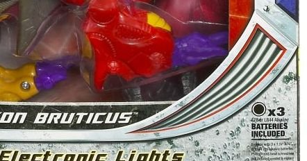
ROTF-packaging releases of the Universe 2.0 redecos of the two Energon combiners (Bruticus Maximus and Superion) retained the "torso bot in robot mode, limbs in altmode" packaging. The movie's own immense combiner Constructicon Devastator was also available as a slightly less immense Legends class giftset, in curved clear-shell packaging that evoked its ginormous counterpart and even used the same gimmick of having toy photo insets of the seven vehicles forming the zig-zag edges.
The new Human Alliance subline took on the diorama display packaging aspect of the old Screen Battles packaging, taking things further with clear plastic shells (with white printing) that formed most of the packaging, the better to show off the larger licensed vehicle toy alongside photos of the character and human partner on the front.
Last edited:

