Outside? Inside? No, thinking ABOUT the box: your thoughts on Transformers packaging

lastmaximal

Administrator
Staff member
Council of Elders
Citizen
I do remember Premium Series being well toward the end, to the point where rumors or talk of it had gone on long enough that I was surprised it happened.

That timeline tracks, too, as the packaging elements used for Screen Battles echo the earlier, pre-blue energy elements (although there are some on the back, but lacking the lightning, and the Tech Specs colors aren't the older oranges/yellows). That's good to know, thanks.
 

Sabrblade

Continuity Nutcase
Citizen
Yeah, Premium Series was meant to be the last hurrah for the 2007 movie line, going out with the most screen-accurate versions that the line was willing to redeco and/or retool. But it was also thanks to Premium Series clogging the shelves so late in the game that the first waves of Animated toys were so hard to find at the time they were supposed to be first released in 2008.
 

lastmaximal

Administrator
Staff member
Council of Elders
Citizen
I'm a bit surprised by that, as I remember them being pretty scarce. But then that's probably because they were that locally. I don't think we even got Premium Series here (the tail end curse, plus a totally separate market). But I was surprised we got as much as we did.
 

CoffeeHorse

Exhausted, but still standing.
Staff member
Council of Elders
Citizen
I think Hasbro was also surprised we got as much as we did. I'm sure they had high hopes but this was such an out of control runaway success that it changed the whole company.
 

Sabrblade

Continuity Nutcase
Citizen
Retailers were demanding more movie product thanks to the success of the movie increasing the demand that much more. That's also why those Walmart-exclusive Cybertron and Classics Deluxe redecos were sold as Movie toys instead of as part of the Universe 2008 line. Walmart wanted more movie toys.
 

The Mighty Mollusk

Scream all you like, 'cause we're all mad here
Citizen
I was working at Target at the time. We had seven or eight pallets of movie toys for the street date. I was out of state on the day of the launch and didn't get back for two or three more days. It was pretty cleaned out already.

Still managed to hit another Target out in Illinois and picked up a few figures (I think Ironhide, Wreckage, and the totally-not-Laserbeak Real Gear figure whose name escapes me).
 

CoffeeHorse

Exhausted, but still standing.
Staff member
Council of Elders
Citizen
I have Booster X10. I bought enough stuff on day one that the cashier told me I was entitled to get a free Real Gear figure. So I picked that one.
 

Steevy Maximus

Well known pompous pontificator
Citizen
I was working at Target at the time. We had seven or eight pallets of movie toys for the street date. I was out of state on the day of the launch and didn't get back for two or three more days. It was pretty cleaned out already.

Still managed to hit another Target out in Illinois and picked up a few figures (I think Ironhide, Wreckage, and the totally-not-Laserbeak Real Gear figure whose name escapes me).
I worked at Walmart. Had plenty on launch date, a full "feature section" in the toy aisle like any other blockbuster film of the time. Stuff sold, but it wasn't particularly notable for the first few weeks. Then the movie hit, and I show up to work Friday or Saturday evening (night shifter) and the TF section was just...empty. It was my first "toy craze" I had experienced as a retail worker. As is, the only reason I managed to get most of the toys close to release was because I worked at nights and could pilfer from the pallets at my 2am lunch break. The 07 Camero Bee was DAMNED hard to keep in stock.
 

Sabrblade

Continuity Nutcase
Citizen
The 07 Camero Bee was DAMNED hard to keep in stock.
Yeah, I definitely remember that one being really hard to find at first.

Oh, how little did we know at the time how soon we would be begging for all the Bumblebees to just go away.
 

CoffeeHorse

Exhausted, but still standing.
Staff member
Council of Elders
Citizen
I never found it. Not one. They obviously way overcorrected and took infuriatingly and inexcusably long to notice, but that initial correction had to happen.
 

lastmaximal

Administrator
Staff member
Council of Elders
Citizen
The 2000s, 7: Something Completely Different

How do you follow up a super-successful live action movie with a distinct aesthetic and feel? By debuting something that looked nothing like it... so now you have TWO flavors of awesome. Delayed a bit by the ongoing success of the movie line, Transformers Animated proved to be an enjoyable followup in 2008, changing things up to feature a distinct look brought on by godfather Derrick Wyatt and leading to some very memorable toys that, like the love action movie toys and yet unlike them, made us say "how did you get that out of that". Animated was a true feat of committing to a style, and I don't know how likely it is to ever see the like of it again in these somewhat homogenized Evergreen days.

(Whenever I think back to this era, for some reason I keep misplacing Animated as following up ROTF -- which is weird because I lived through this period, and was as annoyed as anyone at Animated getting marginalized in favor of movie-based stuff around the sequel's incredible hype. But no, it shook things up after the FIRST movie, and the timing worked out for it to land as a series that took some inspiration from movie elements and ventured forth into a whole new aesthetic and narrative direction.)


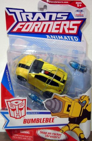
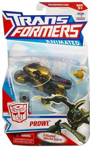
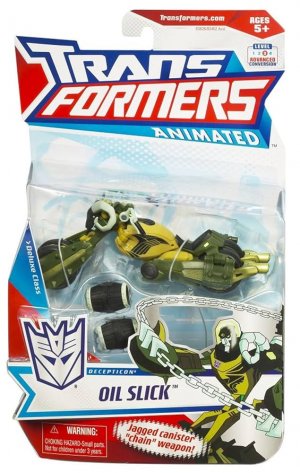
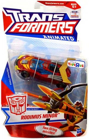
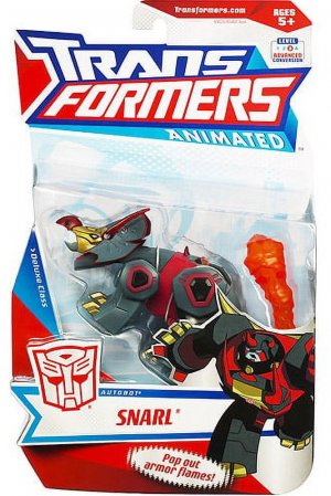
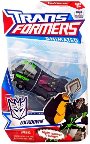
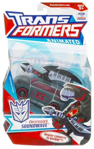
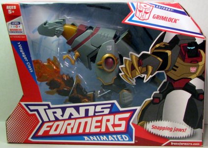
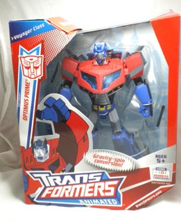
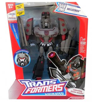
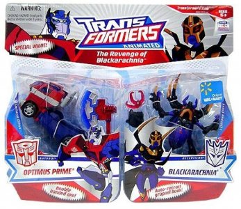
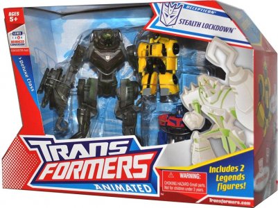
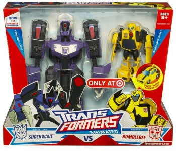
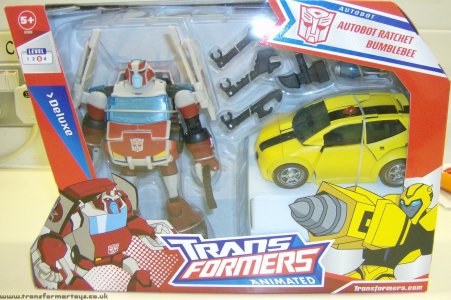
The packaging was as kinetic as the toys and show themselves, with light colors giving us a break from the onslaught of black and red from the year before. With a base of very light blue/white/gray bordered and punctuated by tapering red and blue diagonals, the Animated packaging really stood out on shelves. The very logo of the line was Trans Formers in lines set at opposing angles with "Animated" providing the base, all dynamic angles and action, and the rest of the packaging look played with these sorts of shapes.

bumblebee-animated-deluxe.jpgtransformers-animated-deluxe-prowl-USA-box-package-front_1200x1200.j.jpganimatedlugnut.jpgapifrmn0g__02329.jpg

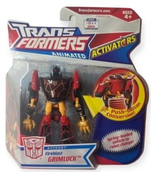
Carded figures had tall cards and large (about 3/4 of the card generally) bubbles that took on some of the internal card shapes; the size of the bubble was at least partly due to the similarly bug front card. The logo was big up top, and similarly large action-pose character artwork complemented the nameplates on the front card, which would be faction color text on angular boxes with pointy ends. The other end of the nameplate would have a bordered silver faction sigil, and the card would have red, silver, and blue borders with dynamic diagonal cut edges. A character headshot would dominate one side of the front bubble. A similarly off-kilter text box identified the price point, and a wavy-edged bubble provided a gimmick callout not commonly seen on the front of packaging at the time. At least one of the wide surfaces (usually white on red) ended in halftone dots, continuing the action-y comic book-y vibe.

8137bWtcpCL._UF894,1000_QL80_.jpg234rtgf.jpgbd7854f8-c3a1-4b73-9874-cb6d509bb7e4.a0a4257f128b02c911b90388a8e2ff8.jpgtranslockani.jpg7654edf.jpg

There was clearly a commitment to embracing a comic-booky 2D feel to contrast the CGI 3D-ness of the movie, and it looked sharp. Behind the toy was a light blue cityscape in the stylized art style of the show -- and in remarkably better condition than Classics' cityscape. This would appear in dark gray on the back of the packaging.

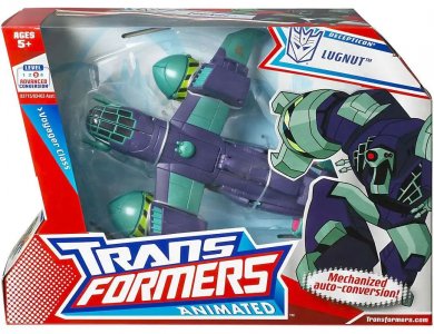
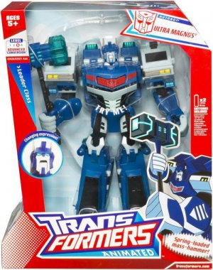
Boxes were similarly angular and dynamic, taking advantage of the experiments Hasbro had done with multi-sided boxes to have what seemed like a wide right-facing arrowhead shape (or a stylized serif D) with a big window featuring the toy in altmode (at least one packaging variant of Optimus Prime had him in robot mode). Character artwork and the big logo provided visual anchors at the bottom.

91s2R33OcBL.jpg08_op_voyage_box_1219981676.jpgtransformers-animated-leader-megatron-box-package-front_1200x1200.jp.jpg

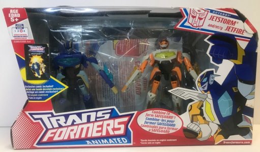
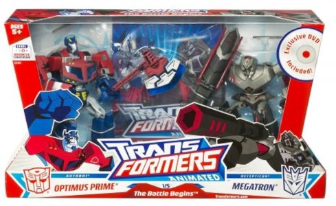
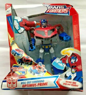
Toys would generally be packed in altmode, with exceptions like the Activators line (which was set on wider versions of the card), the Jetfire/Jetstorm twin pack, the Megatron/Optimus Prime "The Battle Begins" pack, the Leader Class assortment (which had taller boxes as a result), and the massive Roll Out Command Optimus Prime.

m_wp_64b1129691e053c3072bf46b.jpg51MD0wkziVL._UF894,1000_QL80_.jpg45tytr32.jpgytrfvc.jpg

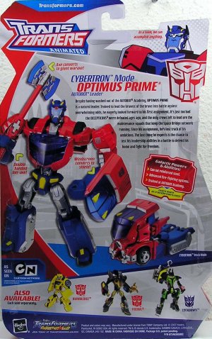
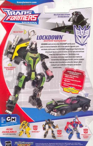
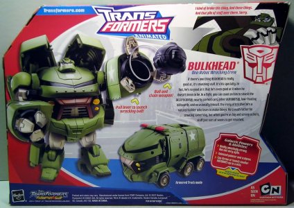
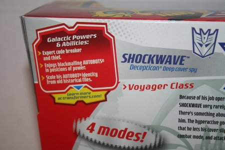
The back of the packaging repeated the same design vibe, of course. I wasn't as fond of this because it looked somewhat cluttered and messy, but the use of color to organize things was quite good. Large red curves framed the stock photos of the toy in both modes, with blue panels set at an angle bordering it from top and bottom. The stock photos of the toy were accompanied by a character-art headshot (and quote) set at a rakish angle, a bio (and function!). Tech spec numbers were replaced on cardbacks with a new profile element: a faction color-themed box listing the character's "Galactic Powers and Abilities" and an invitation to learn more on the website. This certainly cemented the greater focus on "character" as part of the presentation that would complement the cartoon. Boxes had a layout guided by a large oval cutout showing the city backdrop bordered by red with a blue "floor".

81xZpBzNwqL.jpg234rtghg.jpg91BfDsP2MBL._UF1000,1000_QL80_.jpgshockwaveBumblebee7_M.jpg

Multipacks would be a feature later in the line, whether the now-familiar "two Deluxes on conjoined cards" format or the new "Deluxe plus two Legends" in Voyager-ish boxes or "Voyager plus Activator" format. That last used uneven-hourglass boxes with wider bases and the toys packed in robot mode more as Versus packs, complete with each side having opposing packaging elements (mainly the size class label) and artwork. Apparently the UK (at least, maybe elsewhere too) also had some Deluxe 2-packs in Voyager-style boxes.

7D1A50~1.jpgb8b98e34-8eb6-4f4c-9116-f6e115667b61.jpgTransformers-Animated-shockwave-vs-bumblebee-giftset-box-package.jpgratchet-bumblebee-001_1222436763.jpg

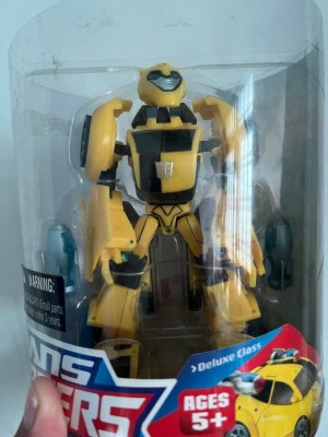
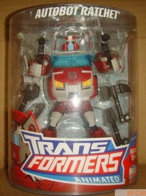
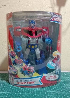
Some markets also had Allspark Power-ish cylinder/canister packaging for the Deluxes in robot mode. These weren't the only ones to get that treatment, as somehow someone got the idea to repackage the massive Roll Out Command Optimus Prime in that too.

FoxHLfKaAAAMRzO.jpgratchetxw1_1231907466.jpgFoxHbDxaEAI7XTP.jpg

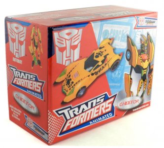
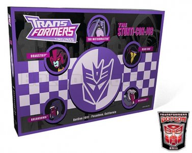
Botcon would pick up a lot of these packaging design staples for its windowless box release of Cheetor. This kept the color scheme and repurposed the starburst on the front of boxes: instead of a gimmick callout, it bore Cheetor's name in the classic Beast Wars font. The 2011 Botcon box set was slightly more of a departure, sort of the animated vibe through a Menasor-colored lens. It used a cooler-hued Animated logo, and provided character artwork headshot insets for its included characters in the show style. These were arranged atop straightforward graphic elements (no wild angles), with a a purple/white checkerboard and crash test Decepticon logo being the central visual anchors on top of a gray-on-black version of the city artwork, all bordered in purple. Never got that set, sadly (and I really had my eye on that G2 Sideswipe, but never could find it at an agreeable price, and now it's insane). Best I can do is repurpose Universe SE Drag Strip. But a handsome box!
transformers-animated-TFCC-Cheetor-box_1024x1024.jpgdecepticonbox__scaled_600.jpg
 
Last edited:

lastmaximal

Administrator
Staff member
Council of Elders
Citizen
(continued)

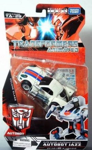
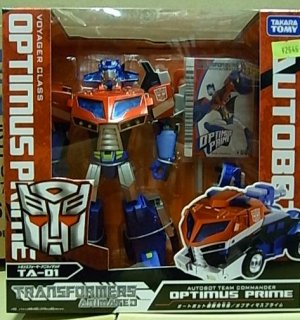
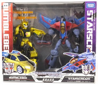
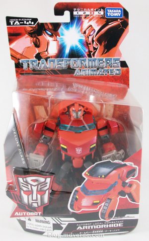
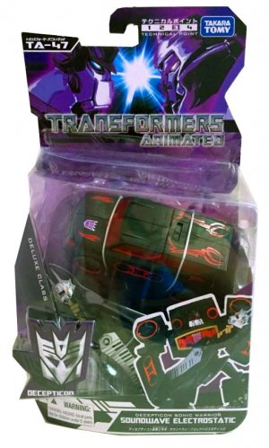
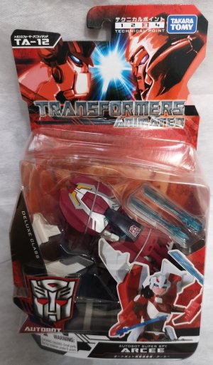
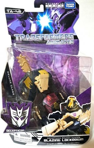
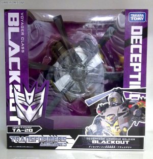
Japan's Animated packaging, interestingly, skewed darker and more saturated than the US line's did.

7654e.pngreduced-image_1396_4_1600815860.jpgRIMG5341.jpg543e.jpg

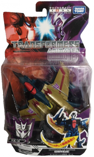
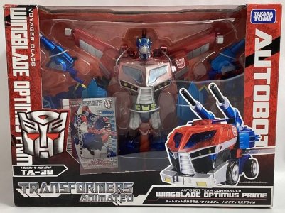
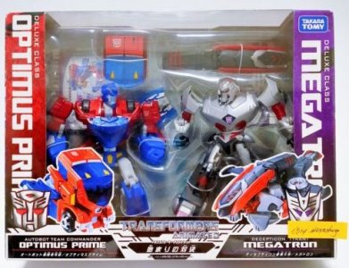
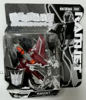
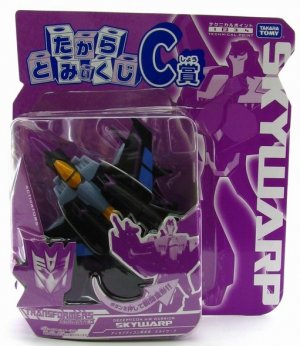
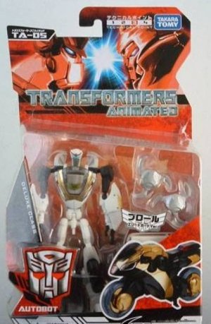
Deluxe figures were on red or purple cards with what seemed to be an abstract spray backdrop, with close-ups of Optimus' and Megatron facing off up top. Activators had smaller cards that had the colors split and added a quick-transformation callout arrow, but otherwise were the same. The logo (the classic front reading TRANSFORMERS ANIMATED on two lines in a somewhat incongruous, movie-style distressed finish) would be below them (on the bottom left for boxed figures). The front card would have a silver faction sigil (with Deluxe Class written above it, rotated diagonally) and a large half-body or so shot of the toy in robot mode, which was above a black parallelogram nameplate that bore the character's name and function in English. Interestingly, the bubble seemed to be the same shape as the US one. Toys would mostly be packed in altmode, with some exceptions in both types of packaging (Prowl, Ironhide, Armorhide, Optimus Prime, Wingblade Optimus Prime...).

5119220981_7129f063cd_b.jpgtransformers-animated-japan-ta-47-soundwave-electrostatic-sound-.jpg34tr32w.jpg71d5y5OnCSL._AC_SL1080_.jpg

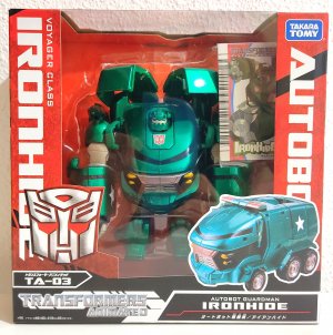
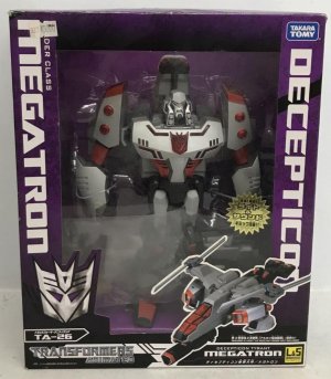
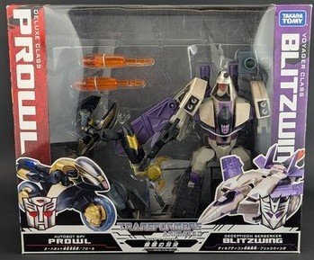
Boxed figures received much the same treatment, with lots of touches calling back to older Japanese line packaging. The faction and character name were now also written on either side of the window (rotated clockwise) in big white letters that stood out on the colored packaging. The line logo and character number anchored the lower left and the nameplate mirrored this on the lower right, below a stock photo picture of the toy in the non-packaged mode. (I'm not sure if the L&S logo for "lights and sounds" -- seen here with Megatron -- was widely used outside of this instance.)

TA20a-68390-1300-1300-90-wm-left_top-100-Unicroncomwatermarkpng.jpgtakara_tomy_ironhide_ta03_bulk_1594792019_5d3ae9f0.jpg23rg.jpg71+OObOHpaL._UF894,1000_QL80_.jpg

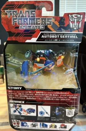
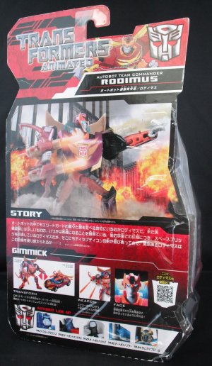
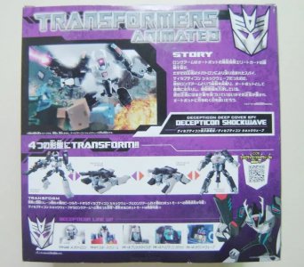
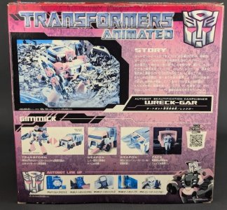
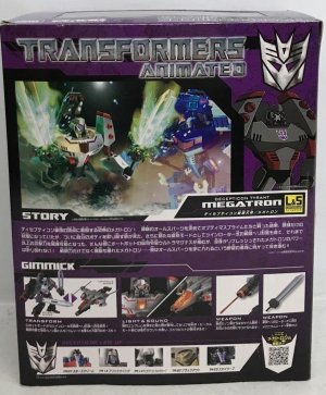
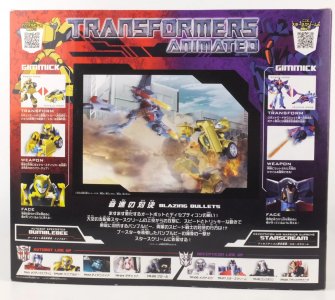
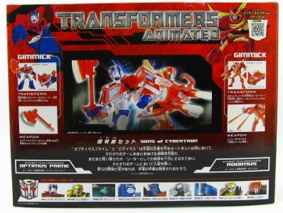
The back of the packaging would hearken back to older lines as well, with a large logo and nameplate up top, a big unevenly-shaped panel in the center showing off an action pose for the toy in robot mode, a blurb labeled STORY, and a feature highlight photo set labeled GIMMICK next to what I think may be the earliest (?) use of a QR code in Transformers packaging. At the bottom would be co-sells in headshot form. This was much the same for boxed figures, except the photo panel and STORY blurb would be side by side (and the character nameplate below STORY).

t4wdf.jpgDSCF1492.jpgTA-14_5.jpg2345t.jpg3rtgfdw.jpg

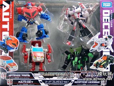
Takara Tomy would also bring back versus packs for this line (complete with calling them hodowns showdowns), with Autobots and Decepticons each bringing their faction's packaging deco to their half of the box, crossfading halfway through (and with both characters clashing in one shared photo panel, given a titled story like Blazing Bullets or Fight Of Start). This would also usually be the case for mixed-faction multipacks of Activators figures.

65a4752bb7ed7c18ac0902c6-transformers-animated-the-beginning.jpg543edf.jpg5tyhgre.jpg1285947901_41_88829_1cfa075c687b405.jpg

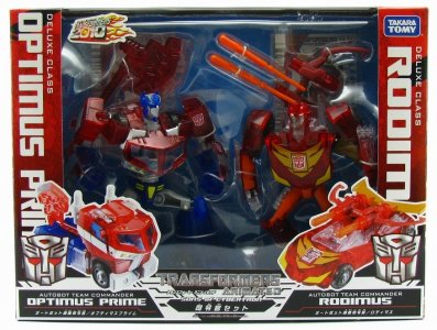
One two-pack (Sons of Cybertron, released in Animated packaging under the 2010 Transformers line per the wiki) was a pair of Autobots in gorgeous clear plastic in a robot-mode "versus" packaging style box (which was red-vs-red) with a blue inner tray.

tfa-soc-01-jpg.jpgtfa-soc-07-jpg.jpg

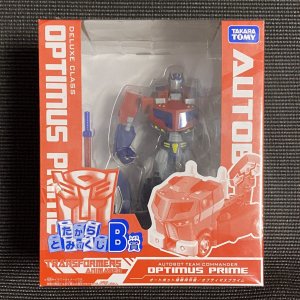
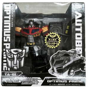
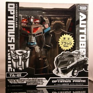
Takara's line had a slew of exclusives and campaign items, with some packaged ones (above a baggie, from Activator to Voyager) getting the monochrome treatment. Interestingly, the Family Mart prizes would get monochromatic packaging that still had unique "prize" logo and names printed on them, rather than just colorizing (or desaturating) an existing card/box, as Optimus Prime Elite Guard Version and Optimus Prime Black Ver. got.

4tgtre.jpgkujisw_1289823137.jpgddd00040e13243c5b425e9c7dc4d7338.jpg34tyhgre.png81-Et506ajL._UF894,1000_QL80_.jpg

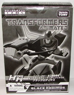
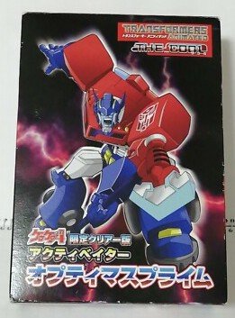
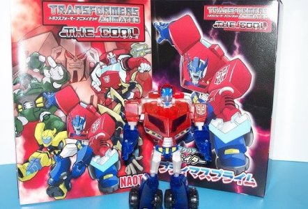
Magazine exclusive Black Rodimus would be unique here, packed in a windowless box with monochromatic character artwork in the front of it. Elite Guard Prowl, on the other hand, just got the usual Prowl packaging. On the opposite end of that spectrum, Clear Version Optimus Prime (an Activator redeco I found out existed today) got entirely unique packaging, including the Special Edition collection of the The Cool manga.

tfablrod-1.jpgreduced-image_1813_8_1600818758.jpg234tf.jpgergfewf.jpg

On the whole, the Animated toyline and show were a great palate cleanser for after the glut of live action movie-themed designs and packaging, as much as it was great on its own merits. It ended up being deployed at the perfect time, as exactly what Transformers needed: a show that had been in the works for a while to show up with such a sharp visual contrast to the movies and their more grounded design feel. This came through on every level of the line, from character models to the toys that somehow captured them so well to the confident, energetic packaging that showcased them.
 
Last edited:


Top Bottom