Outside? Inside? No, thinking ABOUT the box: your thoughts on Transformers packaging

lastmaximal

Administrator
Staff member
Council of Elders
Citizen
(continued)

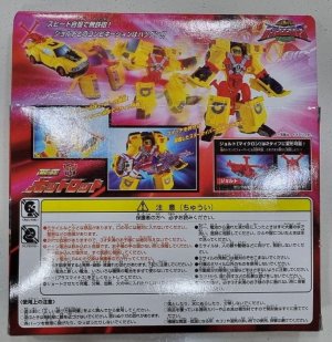
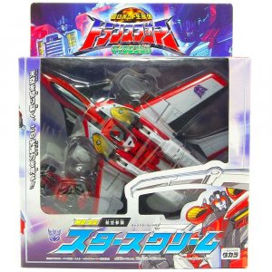
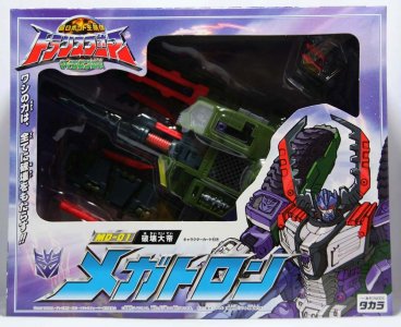
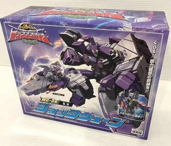
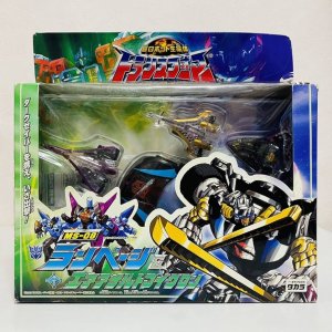
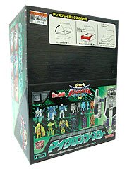
Over in Japan, the Legends of the Microns line (still getting used to that, having called it Micron Legend since those days) approached packaging in a way similar to Car Robots -- windowed packaging for earlier releases (except toys were now in boxes with solid hang tabs instead of being, uh, skin packs) and windowless boxes for later ones. The windowless boxes would continue Car Robots' pairing of artwork for robot mode with toy pictures for altmode. The packaging art would usually be the same Dreamwave art assets used in the US, but with some differences, such as for Hot Shot (thankfully), Jetfire, and Megatron.

transformers_armada_hot_shot_h_1710765422_31593a18_progressive.jpgtransformers-micron-legend-MD-02-Starscream-grid-voyager-takara-japan-box-package-front.jpg8765tgh.jpg

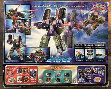
Box backs featured a cool transformation sequence across the box and highlights of the toy gimmicks in insets, and for bigger boxes, co-sells (headshots gathered per faction, rather than toy pictures) at the bottom. A separate inset pair of pictures (for each mode) highlighted the Micron partner alongside the (other) gimmicks. Of some trivial interest is that the toys faced right or left based on faction, not price point. One nice detail is that the interior tray highlighted the Micron partner with a little Micron panel.

ikmnbvfdc.jpg71GTKtvilUL._UF894,1000_QL80_.jpg

My favorite part of the Japanese packaging has to be the Micron packaging. The card wasn't particularly good (Optimus Prime and Megatron flanking the logo on a green, light-streaked backdrop, leading the chase for the Microns) but the bubble being the Micron faction symbol made up for that. This is still one of my favorite anythings about packaging, and when I first saw it in person at a specialty store I thought it was the coolest damn thing.

These worked together to create an "unlocking a Micron panel" vibe, rooted in a silver said panel being behind the Microns themselves, typically arranged all pointing up in a three-lines-converging/diverging manner where feasible. These also included artwork (on the front base of the bubble) that featured the three team members in robot mode. The Exdimension redecos would reuse all of this, except with a black/foil silver nameplate on the front-of-bubble card.

6ytr45.jpg71H3uTRd5SL._SL1213_.jpg607054949.jpg

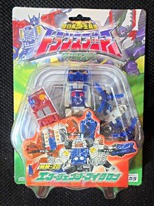
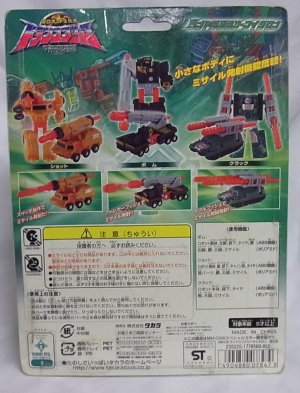
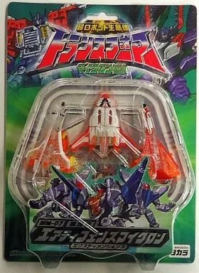
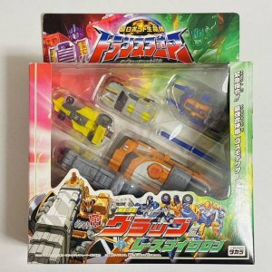
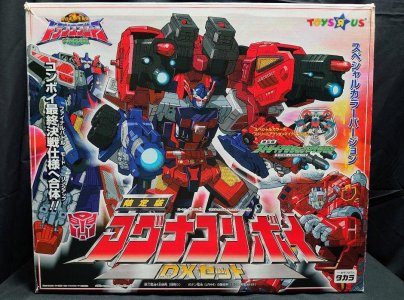
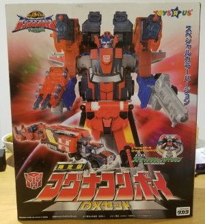
Japanese releases were back to trying different packaging formats; while versus packs were still out, Takara sought to leverage the "Mini-Con partners" element of the line by packaging Deluxes (and their own Partners) with Mini-Con Teams. These packages, which used artwork for both the teams tended to highlight the included teams, or at least make sure they were visible in the window. A later, perhaps the (maybe literally) ultimate multipack for the line, the gorgeous Magna Convoy DX box set, would be an immense windowless box.

71MlpoXlnhL._UF894,1000_QL80_.jpg71zthzZMiwL._UF894,1000_QL80_.jpg713juQPnneL.jpg2020-12-25 00.52.00.jpg


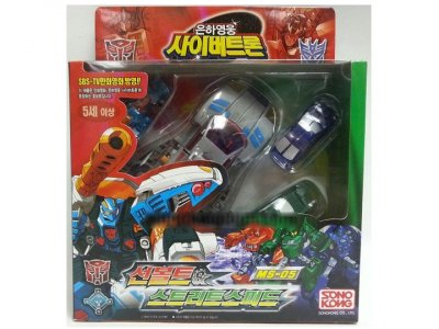
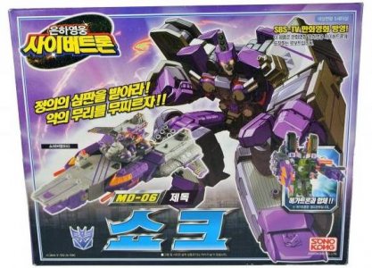
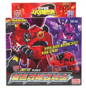
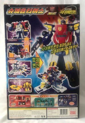
Sonokong continued importing then-current Transformers lines, with a tight Armada lineup named Eunha Yeongung: Cybertron and having packaging that mostly featured the same style as their previous releases. The packaging was similar to Takara's with some text and logo differences (compare this Shock with Takara's Shockwave). A nice touch is how their windowless packaging for Ultra Magnus/Overload has a ghostly picture of Super Mode Optimus on the front, setting up that connection.

0911545f-4ba7-4614-a9a2-0f2adce648a7.jpgreduced-armmd06t.jpg

c0a77766-f285-432e-9723-eaeafd661d31.jpgtgfertg.jpg


Next: I have loved you for 20 years, please accept this gift of Alpha Q
 
Last edited:

lastmaximal

Administrator
Staff member
Council of Elders
Citizen
Thanks to everyone, just everyone, for reading these and sharing your thoughts!

Great write-up. I have a similar love for Beast Wars and 2007 packaging. I "discovered" Beast Wars when I was 3 years old. The lizard eye packaging of the original Beast Wars packaging was so cool. And the edgy box art is insane, I wish we could get an artbook with all of it like we did for the G1 era. Everyone looked more like monsters than robots. I kept the cards for every single Beast Wars toy my parents bought me. No other kid I knew did that, lol. I had to throw away some of them after my cat used them as a toilet a few years later, but some others were stored in a different place and survived. I remember being so sad about that, specially for the collapsed boxes for Transmetal Optimus and Megatron I had kept.

The first Bay movie was how I got back into Transformers, and I loved the packaging. I was at that age were you're embarrased about liking childish stuff, so I mostly experienced that era from afar, but there's a sort of "industrial alien" feel to that packaging design that's just perfect. AND it has a big eye behind the toy, like Beast Wars. So maybe the key to excellent visual design in packaging is just slapping a big ol' non-human eye behind the product.

I'm also a big fan of Classics, Cybertron and Animated cards and boxes. So much style, and detail. The little flaps depicting both modes on Classics I just found out about like, 4 years ago, as I've never seen a boxed Classics toy in person. I was blown away, VELCRO on a card???

Nice note on the 2007 packaging! I do remember being a bit nonplussed about the eye motif, and somehow never connected it to Beast Wars. I always just figured it was a natural choice for an extreme close-up (they did something similar in at least one trailer). I'll save my thoughts on those other lines for if I live long enough to get to them in this series, but I can say I love those too.

I will say yes to any extensive, exhaustive artbook that does for these lines what the Legacy book did for G1.

Nice write-up, always love the trip down memory lane. The packaging for '84-87 really does feel like top-tier stuff to me, and I think it's easy to take for granted how much the mural art, individual character art and tech specs all made the toyline so much more enjoyable. I remember being quite sad when Beast Machines got rid of the individualized art. We still get some decent art from time to time but I definitely miss the tech specs on today's packages.

It's probably a good thing the 'net wasn't around yet for me to complain on, because I probably would've bemoaned those packaging changes for the Micromasters and onwards with the silver cards and downstep in art. The Action Master stuff is good but does look a bit more generic, like a lot of other 90s toys at the time. Turbomaster packaging (which we didn't get in the states) looks great though.

As I grew up on G2 I'm probably influenced by nostalgia, but I remember thinking those packages were really cool at the time. Not just the black cards, but the triangular clamshells that the mid-sized toys had were really cool. Total pain to open, but maybe that just added to the mystique, heh.

Beast Wars also had great packaging with the beast eye, and continuing the tradition of the painted individual character art. It almost felt like a shame that opening the packaging necessitated ripping off the clamshell and leaving a big tear in the card.

Cybertron had some nice packaging too with the white coloring and trapezoidal shaped boxes.

I appreciate it! This was partly an excuse to do gown memory lane for its own sake, to be honest. Looking back at the context for the packaging (both the brand's and my own) has been kinda sweet as long as I keep from reflecting too much, haha. I agree with you on a lot of this, and am reminded of how I taught myself to slice open the bubbles around the BW period by holding the blade flat, parallel to the card. Because I was a little older by then and had always hated tearing open carded stuff from earlier toylines. Especially since in this pre-/early-internet era, this was the ONLY way we'd HAVE copies of this art and such -- a detail that comes up so, so often when I flash back, that desire to find and keep a copy of some art or picture and the only way being on some box or card or wrapper. (shiver) I couldn't remove the glued-on part of the bubble, so part of the card art etc would always be blurry, but that was worlds better than a huge gouge in the print leaving empty cardboard.

84-87 is the best. Beast Wars is also very good. The only thing that holds it back is the lack of murals on the back. Imagine how crazy those would have been. We were robbed.

I never really felt much fondness for that art style as something attached to a toyline I loved, but I would absolutely love to have seen some wild Frazetta-like fray featuring those sick, er, metal furries.

Gotta return later to continue reading, but just wanted to drop this off in the meantime:
Thank you very big. I have stolen this and it has improved the original post tenfold. (I also replaced the Prowl picture, because I'm not sure what's up with it having a Milton Bradley logo; that might have been a custom from a fan page or something.)

Speaking as someone who delved into completing Machine Wars recently....
I love how committed they were to mirroring Beast Wars' packaging with that line, swapping the animal/organic elements with mechanical elements.

Maybe it was equal measures commitment or working with what they had to crank it out quickly ("just use the same template, swap in another texture"). It would have been faster to just recolor or blur the dino-scales and call it a day, so they clearly did put some effort into it. I just wish they'd also changed the font for the toyline logo.

Machine Wars was something I was weirdly retrospectively excited about, having found out about it maybe a year too late (mostly by binge-reading -- you nerd, past me -- Dave Van Domelen's reviews). Would they continue it? Would they use the Turbomaster car molds (love) and the Predator jets? How would they use these designs to narratively bridge G1 and the Beast Wars? I'll always wonder about the possibilities. The Botcon stories that eventually got made were kind of interesting in parts, but nothing mashes that nostalgia/lore-wanting button like Jackpot's MW Starscream piece from the ill-fated Genesis artbook.
 
Last edited:
lastmaximal

Administrator
Staff member
Council of Elders
Citizen
Ah...memories! X-9 Ravage was the very first JDM toy I bought, back when it was released. I don't think that any of the subsequent "updates" have been as good as that original release. I still have it and still have a soft spot for it.

Oh yes, the topic, packaging. There has been a lot to like over the years, but regardless of box art, I generally prefer Transformers packaged in alt mode (X-9 Ravage not withstanding). I get that they had to not do that over the years for various excuses reasons, but it's just a personal preference.
transformers packaged in robot mode goes against god tbh

I also miss the days of having these packed in altmode. I guess it makes sense as the line has not been reliant on the gimmick for a while now. Even in BW that was such a big part of the appeal -- the wonder of a mostly-Schleich-model-quality beast mode turning into an articulated robot just took over from "this super-detailed model car turns into a robot?" and took it further. These days it's the brand and the cool-looking robot mode, which is probably also behind the rise of non-transforming merch. It's a bit odd, because it's not like there's a ton of vehicle toylines on that level it competes with -- but this basically puts it in contention with a hundred humanoid-action-figure toylines. I guess it may be because that robot mode can look cooler and evoke more personality and buy-in than the toy could in altmode? Kind of like how YouTube's current algorithm dictates your thumbnails have to have a face to do well.

Whatever. Screw all that and give me my car-in-box back as the standard.

I feel I'm in the minority when I say I honestly dislike most Japanese packaging for Transformers. Tends to feel too busy and too empty at the same time. I'd never seen the Sonokong package, I like it more than the Takara examples. Feels more synthetic and dynamic, despite the similar style.

I generally don't like busy compositions, which is why I surprise myself sometimes by liking or preferring some of the Japanese box design to the US. But then I am also a weeb in training to get my weeb certificate from weeb university. But there have been cases where the Japanese packaging just does nothing for me (like the EG##-numbered EZ Collection on blue cards) or even feels vaguely bootleg-y because it uses a lot of similar design approaches.

I do occasionally have to remember the difference in language and cultural tastes; the feeling that there are too many callouts or ones that seem slapped on at weird angles is likely not a matter of them not knowing better, it's just for tastes that are distinct from mine. (I'm not at all saying you judged them that way, just that I have before.)

Beast Machines, I feel, REALLY suffered from Hasbro/Kenner's divided attention during that time.
I truly appreciate this detailed context, which included a bunch of stuff I vaguely knew about but did not think about enough (the impact of Hasbro throwing everything they could spare at the seismic cultural event that was Episode One -- I do sometimes miss having that kind of monoculture -- and some stuff I outright didn't know, like even Takara farming that out.

Some of this retrospective has reminded me, in less cringe-inducing waves at this point in my life, that there are quite a few things I wish I could have done differently in those years. With 1999 and 2000 being particularly big ones. Nothing to do with any of this, of course, other than [1] I wasn't really back into Transformers yet and [2] a lot of what I would eventually be passionate about and interested in I was still kind of backburnering in favor of dumb stuff.

Thoughts on packaging? Just briefly, I think the current generic design used across SS and AotP is the worst packaging design ever. It’s so empty, so bland, like it should be for generic supermarket own-brand* transforming robot action figures. I’d ever take the Beast Machines design over this.

* or “supermarket private label” as Google tells me is the term in North America.

I'm not a fan either. All I like about it is that it standardized the minimal-tape-on-the box design of older Studio Series (with the interfolding panels on the bottom) and gets away from the bizarreness of "put more wacky facets and angles on this box!" that's pervaded things for so long. But it's so... BORING.

RiD 2001 was great packaging as well. I like the way they kept the feel of Beast Wars but yet modified it and made it feel new.

This was a thought percolating below the surface while I was writing that -- the circle, the yellow in the center, the textured grid evoking the scales -- but somehow I missed the boat of explicitly saying it, and instead connected it to an entirely different toyline. I wish I could tell you what the hell happened there, lol.

I guess, like RID2001 itself, it does a masterful and appealing job of carrying forward elements of that vehicle era and the beast era. Nice save, dummy

here's my fuckin thoughts on transformers packaging: like 95% of it eventually just goes in the garbage because it takes up space
Yeah but like, some of it is pretty cool, and does a good job of housing TFs if/when they're not on display somewhere. I get it though: I'm working through a collection inventory / purge (haven't done one in about a decade), and I'm parting ways with a lot of packaging I don't want anymore.

I agree, and this is something I come to terms with in different ways -- I used to want to keep everything, then I haggled myself down to just the cards and back-of-box panels, then I adopted the practice of running things through a scanner before paring down to those parts. But even the hoarded backing cards are, spacewise, an albatross now. So I may just talk myself into getting rid of those as well.

Still...
athingisnt.jpg


ER was peak Transformers Generations packaging IMO

I have a fondness for WFCT, a big part of which is the trauma bond of being the COVID era series. But I do think Earthrise wound up being the best of them.
 

Exatron

Kaiser Dragon
Citizen
I agree, and this is something I come to terms with in different ways -- I used to want to keep everything, then I haggled myself down to just the cards and back-of-box panels, then I adopted the practice of running things through a scanner before paring down to those parts. But even the hoarded backing cards are, spacewise, an albatross now. So I may just talk myself into getting rid of those as well.
This is exactly where I'm at, too. I used to keep everything back in the UT days. It worked out well enough storing stuff in the boxes, with the cards underneath. As that became unworkable, I started saving just the box backs and storing everything more compactly in crates. Now, that's still just too much space. I'm slowly going through and trying to pare down my collection. Part of that pricess is scanning and discarding all those cards and box backs for the toys I'm keeping.

Or most of them, anyway. Some of my favorites will still get saved.
 

CoffeeHorse

Exhausted, but still standing.
Staff member
Council of Elders
Citizen
I just keep a box until I'm absolutely sure nothing's defective. Then in the trash it goes.
 

Princess Viola

Dumbass Asexual
Citizen
My box keeping policy is relatively simple:
- Non-Hasbro market box? Keep
- Commander, Titan, Masterpiece, or Haslab box? Keep
- G1 box (either vintage or reissue)? Keep
- Anything from G2 through the Unicron Trilogy? Larger figures keep the boxes, carded figures...maybe keep the card backs and try to remove them from the card to not majorly damage the card.

Anything else? Into the trash it eventually goes.
 

Sabrblade

Continuity Nutcase
Citizen
Armada was, I think, where the discourse around the multilingual text on the packaging hit fever pitch, probably because this was where the decision -- linked to that requirement -- was made to nix bios and tech specs from the packaging. Even RID2001, which had already needed to deal with allotting real estate to printing the same thing in multiple languages, managed to retain those. This hallmark of Transformers was lost here, to be regained and relost a few times down the line, due to outside factors that were uncomfortably demonstrative of how the toy market, the toy production process, and just the world was different from When I Was Your Age. Nevertheless, the back of the wide cards/boxes still managed to display the toy and its gimmicks (central to this toyline) well, with bubbles providing highlights for key text.
Armada wasn't completely devoid of bios for the toys, however. Hasbro's official Transformers website hosted bios for the toy characters of Armada, Universe, and Energon (for this one, click each URL that ends in ".bios/dn/default.cfm").

Full archives of the Hasbro.com bios for the Armada toys (and more) can be found on TFTechSpecs.com.

Although, from what I can tell, the Hasbro.com Armada bios seemed to have used the same text found on the Armada trading card produced by Fleer, and not every toy got a bio on the website.
 
Last edited:
lastmaximal

Administrator
Staff member
Council of Elders
Citizen
Yup, that was something brought up as a consolation at the time as well (not that it's anything really close, but this was always going to be the way to adapt when the multilingual writing was on the wall). At least fans could still find out about and ponder the edifying depths of Hot Shot's "Well let's go!".

I was careful to qualify that these were excuses from just the packaging. I'm not sure if this was a constant thing (it was more bonus material for Cybertron, which DID have bios on the box, but that was part of the key gimmick so I'm not sure if it was a thing for later lines with on-package bios), but it seems to have come and gone instead, with the latest iteration being Legacy's QR codes.
 

LordGigaIce

Another babka?
Citizen
Maybe it was equal measures commitment or working with what they had to crank it out quickly ("just use the same template, swap in another texture"). It would have been faster to just recolor or blur the dino-scales and call it a day, so they clearly did put some effort into it. I just wish they'd also changed the font for the toyline logo.
This is my ignorance talking, but did templates work that way before everything was digitized? I mean now, sure, absolutely. The layer function in Photoshop and its imitators make stuff like this super easy (barely an inconvenience)... but back in the mid/late 90s this stuff was all still done by hand. It's possible that even doing the same general "style" just replacing the animal skin for metal grating still required all new stuff to be made entirely from scratch.
Again though, I don't know. If anyone knows how this stuff was done back in the day I'd love to hear it. It's fascinating.

The font is really funny... because I get the rationale. Beast Wars had saved and revitalized the brand, so even with the idea of re-introducing vehicles a year into it... the idea of keeping the branding as similar to the hot new thing as possible makes a lot of sense.
But "Machine Wars" as a name... and using that very "beasty" font for it... it's just beautiful 😆 It's so slapdash. Machine Wars would have it no other way.


Machine Wars was something I was weirdly retrospectively excited about, having found out about it maybe a year too late (mostly by binge-reading -- you nerd, past me -- Dave Van Domelen's reviews). Would they continue it? Would they use the Turbomaster car molds (love) and the Predator jets? How would they use these designs to narratively bridge G1 and the Beast Wars? I'll always wonder about the possibilities. The Botcon stories that eventually got made were kind of interesting in parts, but nothing mashes that nostalgia/lore-wanting button like Jackpot's MW Starscream piece from the ill-fated Genesis artbook.
MW always occupied a really special place in my mind because we never got it in Canada, but I remember seeing it when we were in the States on vacation and being disappointed my parents wouldn't get some of it for me. So it lived in this almost mystical space as this weird return to vehicles in wild colours with new designs, and it was kind of a letdown in the early 2000s to find out that people didn't regard it all that highly.

As an adult, getting into it, I adore it. Nothing about it makes sense. Like you said, it almost feels like a rough proof of concept that got rushed out the door before it could be refined. And that adds to the charm, I think.

Like you I've wondered what the line would have looked like had it continued. What moulds would have been used? And yeah, what would fiction look like? I recently had the idea that if they really wanted to tie MW into BW, they could have revived some of the G1 cast in the BW show but given them "upgrades" into their MW bodies.

That's just fan fiction on my part though. There was no plan for media support for it (which was a first for a Transformers line) but it's interesting to think of the ways it could have worked if they wanted to do it.

I think one of the reasons the BotCon MW set was so divisive was that because MW had no media, and had no story outside of whatever could be gleaned from package bios (and most of those were repurposed), fans had years to fill in what they thought a MW story should be. Then BotCon says "ok we're doing Machine Wars and it's X" and almost everyone had an idea that wasn't X, so X seemed wrong.

It also didn't help that, in retrospect especially, 2013 was not a good time to do a Machine Wars retrospective, from a mould availability perspective.
You could probably do a much better MW redux today with the moulds available now, but 2013? Ehhh not so much.
 

Steevy Maximus

Well known pompous pontificator
Citizen
This is my ignorance talking, but did templates work that way before everything was digitized? I mean now, sure, absolutely. The layer function in Photoshop and its imitators make stuff like this super easy (barely an inconvenience)... but back in the mid/late 90s this stuff was all still done by hand. It's possible that even doing the same general "style" just replacing the animal skin for metal grating still required all new stuff to be made entirely from scratch.
Again though, I don't know. If anyone knows how this stuff was done back in the day I'd love to hear it. It's fascinating.

The font is really funny... because I get the rationale. Beast Wars had saved and revitalized the brand, so even with the idea of re-introducing vehicles a year into it... the idea of keeping the branding as similar to the hot new thing as possible makes a lot of sense.
But "Machine Wars" as a name... and using that very "beasty" font for it... it's just beautiful 😆 It's so slapdash. Machine Wars would have it no other way.


MW always occupied a really special place in my mind because we never got it in Canada, but I remember seeing it when we were in the States on vacation and being disappointed my parents wouldn't get some of it for me. So it lived in this almost mystical space as this weird return to vehicles in wild colours with new designs, and it was kind of a letdown in the early 2000s to find out that people didn't regard it all that highly.

As an adult, getting into it, I adore it. Nothing about it makes sense. Like you said, it almost feels like a rough proof of concept that got rushed out the door before it could be refined. And that adds to the charm, I think.

Like you I've wondered what the line would have looked like had it continued. What moulds would have been used? And yeah, what would fiction look like? I recently had the idea that if they really wanted to tie MW into BW, they could have revived some of the G1 cast in the BW show but given them "upgrades" into their MW bodies.

That's just fan fiction on my part though. There was no plan for media support for it (which was a first for a Transformers line) but it's interesting to think of the ways it could have worked if they wanted to do it.

I think one of the reasons the BotCon MW set was so divisive was that because MW had no media, and had no story outside of whatever could be gleaned from package bios (and most of those were repurposed), fans had years to fill in what they thought a MW story should be. Then BotCon says "ok we're doing Machine Wars and it's X" and almost everyone had an idea that wasn't X, so X seemed wrong.

It also didn't help that, in retrospect especially, 2013 was not a good time to do a Machine Wars retrospective, from a mould availability perspective.
You could probably do a much better MW redux today with the moulds available now, but 2013? Ehhh not so much.
Photoshop was still a thing in the 90s. While the base assets were still made by hand, they could be digitized and modified as needed.


I feel like Machine Wars ended up being an odd artifact leftover from the awkward action toy shift in 1994, when Kenner was given full control of ALL of Hasbro’s action toys. Even the 1996 Happy Meals plans featured vehicular designs at one point, along with the beasts. And it’s hard to tell if Machine Wars was an honest attempt to gauge interest in the vehicle segment…or something to placate fans excited about Anthony Guad’s comments at Botcon 1996 (Which, reportedly, amounted to: “vehicles with Beast Wars engineering and bringing back classic characters like Rodimus Prime, Starscream and even Arcee”).

I feel Machine Wars was always going to be a failure once Beast Wars was successful. Hasbro wasn’t going to dilute the Transformers brand with two, competing, design segments, not without real justification. Had Machine Wars been a significant hit? Maybe they might have explored of “Tech Wars: Transformers” as a brand extension a couple years down the line. I suspect that if Machine Wars had gotten a second year, it would have continued trends from the first with leftover G2 stuff and previously unavailable in the US Euro stuff.
I mean, the Powermasters would fit the basic price point, the Stormtroopers would probably be repainted and split up into Autobot and Decepticon for deluxe (or the last two Autorollers would be trotted out), while the Lightformers/Trakkons would probably work for Mega. To cap things off you have the Obliterators, one of which would be an easy adaption to Optimus Prime. And plenty of dubious color and name combinations, of course.

But again, I think Machine Wars would have HAD to do comparable numbers to KayBee’s Beast Wars sales for serious consideration for a wider investment (new tools, new media, etc) to be considered. As is, I think there MIGHT have a scenario where a second series (using stuff I mentioned above) wasn’t improbable. But I think Beast Wars was the right change at the right time for the brand, much as Robots in Disguise was the right change at the right time 5 years later.
 

LordGigaIce

Another babka?
Citizen
Even the 1996 Happy Meals plans featured vehicular designs at one point, along with the beasts.
I remember getting some early Happy Meal BW toys, and they had the G2 faction symbols on the wrapper. There was definitely an awkward transition. MW even used the G2 faction symbols on the packaging, but mostly used the G1 versions on the toys. Except for Skywarp, who got a G2 emblem. It's a mess. And I love it.

But I think Beast Wars was the right change at the right time for the brand, much as Robots in Disguise was the right change at the right time 5 years later.
Beast Wars was a seamless change in retrospect, with kids still on that Jurassic Park high. It was a perfect storm because Kenner did the JP toys on that and IIRC the Kenner JP dino team was brought over to do the dino sculpts for BW. So if you were a dinosaur obsessed kid like me at the time, that you could get a Transformers raptor who looked like he could fit in with your JP raptors was a big deal.

RiD is interesting because it was very much a stopgap, but it was such a success that it probably validated the direction they were planning on taking things with the UT anyway. Rebranding the Combatrons as Decepticons after the re-introduction of Autobots proved very popular was a no-brainer.

I feel Machine Wars was always going to be a failure once Beast Wars was successful.
There's some self-fulfilling aspects with this take though. Not only did MW not get an animated show (again, a first for Transformers, even G2 got the G2 "remaster" of the Sunbow show) I don't think it even got commercials?

Like yeah... a toyline they dropped into a chain that almost exclusively existed in malls that had no advertising push and no media to support it didn't sell well. Shocker.
The weird deco choices were always going to be off putting to the older fans that a return to vehicles was supposed to appeal to, so the selling point should have been "well this is the style that's selling with kids."
But kids won't want it if you don't advertise to them or otherwise give them a reason to care.

I'm not 100% sure I buy the "rush job to live up to some off the cuff remarks at BotCon" story just given the production timeline of these things...
But so many of the choices with the line are just baffling.

I don't think we'll ever know why MW was done the way it was, and that's ok. It adds to the charm that it's just this unknowable WTF? moment.
 

lastmaximal

Administrator
Staff member
Council of Elders
Citizen
This is my ignorance talking, but did templates work that way before everything was digitized? I mean now, sure, absolutely. The layer function in Photoshop and its imitators make stuff like this super easy (barely an inconvenience)... but back in the mid/late 90s this stuff was all still done by hand. It's possible that even doing the same general "style" just replacing the animal skin for metal grating still required all new stuff to be made entirely from scratch.
Again though, I don't know. If anyone knows how this stuff was done back in the day I'd love to hear it. It's fascinating.

The font is really funny... because I get the rationale. Beast Wars had saved and revitalized the brand, so even with the idea of re-introducing vehicles a year into it... the idea of keeping the branding as similar to the hot new thing as possible makes a lot of sense.
But "Machine Wars" as a name... and using that very "beasty" font for it... it's just beautiful 😆 It's so slapdash. Machine Wars would have it no other way.

I think a lot of stuff had to have been digitizing back then. Photoshop was available on Windows by 93/94, and this or similar tools may have found its way into at least some of the steps.

Either way, I think it's a matter of platform or mode. There's still a lot saved by just using existing BW card/box shapes and using (I assume) the existing round bubbles/trays, etc. (neat how it works out that the flipchangers were all small enough to fit) rather than designing and tooling new cardboard cutting shapes. It's not quite "entirely from scratch".

The logo font is glorious. Perhaps the biggest remaining indicator that this missed a last pass or two, like a placeholder they forgot to replace with the proper thing. Reuse everything as an initial draft - Machine instead of Beast, swap out this texture/backdrop for the scales, plot out where the copy and physical thing goes. Now, change things one by one and check each changed item off the list. Placement for the toy and bubble. "New" enough artwork. Callouts, names, etc. What's left? Didn't we say we'd circle back to the lo-- Oop, we need to send this off for printing now!

Did we forget something? Oh, I guess if we forgot it, it wasn't important.

MW always occupied a really special place in my mind because we never got it in Canada, but I remember seeing it when we were in the States on vacation and being disappointed my parents wouldn't get some of it for me. So it lived in this almost mystical space as this weird return to vehicles in wild colours with new designs, and it was kind of a letdown in the early 2000s to find out that people didn't regard it all that highly.

As an adult, getting into it, I adore it. Nothing about it makes sense. Like you said, it almost feels like a rough proof of concept that got rushed out the door before it could be refined. And that adds to the charm, I think.

Like you I've wondered what the line would have looked like had it continued. What moulds would have been used? And yeah, what would fiction look like? I recently had the idea that if they really wanted to tie MW into BW, they could have revived some of the G1 cast in the BW show but given them "upgrades" into their MW bodies.

That's just fan fiction on my part though. There was no plan for media support for it (which was a first for a Transformers line) but it's interesting to think of the ways it could have worked if they wanted to do it.

I think one of the reasons the BotCon MW set was so divisive was that because MW had no media, and had no story outside of whatever could be gleaned from package bios (and most of those were repurposed), fans had years to fill in what they thought a MW story should be. Then BotCon says "ok we're doing Machine Wars and it's X" and almost everyone had an idea that wasn't X, so X seemed wrong.

It also didn't help that, in retrospect especially, 2013 was not a good time to do a Machine Wars retrospective, from a mould availability perspective.
You could probably do a much better MW redux today with the moulds available now, but 2013? Ehhh not so much.

Very much the same. I've always liked the thought of unmade (sometimes literally made then... un'd) stuff getting revisited. I was all over the Toxitron Collection for precisely that reason, and had to customize the first Legacy Nightprowler I got to complete the look. (Sandstorm is a tempting one to tweak, but I talked myself down from that.) And Machine Wars is kind of a neat glimpse at what happens when something does "make it out" of messy development and/or development hell (and isn't bad enough that one regrets it being saved -- but hey, even if it is). My first exposure to MW via Dave Van Domelen's reviews also included some of his fanfic suggesting origins and playing with possible backstory, which helped strengthen the impression for me that these didn't just have to be toys they cranked out -- which only made sense, since (as you note) Transformers had up to that point always cued an expectation of "supporting media". That's actually part of what had me wondering about it; would there be a show? Obviously I was reading about it all at most a year later so the answer was "no"... but deep down I was hoping it was maybe "not yet", haha. (/denial)

It's so radically different from what came before, like RID2001/Armada before we were ready for it. Or maybe we were using up all our coping and learning on the reboot that BW was being up to then. And this was a continuation of Hasbro's willingness to slap names on whatever to keep the trademarks going. So what if Soundwave is a burgundy and gray missile tank now? He was a neon yellow stock car a few years ago. You gonna tell him he can't be this? Write a story explaining it! (I sometimes miss having that internal nagging need for fiction to explain differences -- even poorly -- rather than immediately dismissing it as "from elsewhere in the multiverse, it's fine".)

The Botcon stuff was always, after a certain tipping point -- maybe 2009 on, but really only 2006-2008 felt like mostly-flawless final products -- a struggle, compared to the apparent ease of clicking into place that the sets prior had had. There were so many hoops for them to always have to jump through to line up story and toys, with the former occasionally being stymied by Hasbro plans that might change and the latter often being frustrated by mold availability, factory requirements, and/or general uncooperativeness. 2017 was ironically shaping up to be an absolute banger with versatile molds that lent themselves well to the intended reuses. But these days we don't have to worry about things being THAT exclusive, which is infinitely welcome.

They managed to grow the Machine Wars story enough with a later installment (and expanded cast from the sub service) that it had legs, but the initial offering was a rough balance, not least due to the available molds. It's come up here before that there's a bunch of tooling that might be better-suited to the task how (although really we need a non-Seeker cockpit-chest jet mold already, it has so many reshelling uses from all the Machine Wars jets to Fearswoop to a few Cyberjets). I'm still open to more takes on that mysterious pocket of time that don't begin and end as AVP posts.
 

lastmaximal

Administrator
Staff member
Council of Elders
Citizen
I feel like Machine Wars ended up being an odd artifact leftover from the awkward action toy shift in 1994, when Kenner was given full control of ALL of Hasbro’s action toys. Even the 1996 Happy Meals plans featured vehicular designs at one point, along with the beasts. And it’s hard to tell if Machine Wars was an honest attempt to gauge interest in the vehicle segment…or something to placate fans excited about Anthony Guad’s comments at Botcon 1996 (Which, reportedly, amounted to: “vehicles with Beast Wars engineering and bringing back classic characters like Rodimus Prime, Starscream and even Arcee”).

I feel Machine Wars was always going to be a failure once Beast Wars was successful. Hasbro wasn’t going to dilute the Transformers brand with two, competing, design segments, not without real justification. Had Machine Wars been a significant hit? Maybe they might have explored of “Tech Wars: Transformers” as a brand extension a couple years down the line. I suspect that if Machine Wars had gotten a second year, it would have continued trends from the first with leftover G2 stuff and previously unavailable in the US Euro stuff.
I mean, the Powermasters would fit the basic price point, the Stormtroopers would probably be repainted and split up into Autobot and Decepticon for deluxe (or the last two Autorollers would be trotted out), while the Lightformers/Trakkons would probably work for Mega. To cap things off you have the Obliterators, one of which would be an easy adaption to Optimus Prime. And plenty of dubious color and name combinations, of course.

But again, I think Machine Wars would have HAD to do comparable numbers to KayBee’s Beast Wars sales for serious consideration for a wider investment (new tools, new media, etc) to be considered. As is, I think there MIGHT have a scenario where a second series (using stuff I mentioned above) wasn’t improbable. But I think Beast Wars was the right change at the right time for the brand, much as Robots in Disguise was the right change at the right time 5 years later.

The behind-the-scenes reality of Machine Wars is another lore dump I'd love to have, haha. Was it a mid-BW test of returning to vehicles? If so, would it have been concurrent, or (as you say, and as makes a lot of sense) would it have been viewed as muddling the new direction? OR was it leftover ideas from the scuttled G2 plans post-95 that got dusted off for a capsule at Kaybee? (I still want a MW capsule, oh boy.) For some reason I hadn't even ever thought of that possibility, instead gravitating to the former. Especially once Beast Wars became Beast Machines and I (applying some WWF Corporation+Ministry = Corporate Ministry logic) wondered so what, is Machine Wars going to be AFTER this? (funny enough, RID2001 was more like Beast-Machine Wars.)

More than likely I imagine it was just an idea for a brand-supporting exclusive subline that would get shopped around since BW was so hot, and they maybe had some stuff on hand they could assign a team to, to prepare/flesh out separately in its own little corner while BW was kept as a self-contained line with no spinoffs yet. If Toy Biz's Marvel stuff was any indication, peripherally-related sublines were a dime a dozen in those days.

Aside: the idea of "Rodimus Prime, Starscream and even Arcee" in Machine Wars gives me the best goosebumps. We did see Starscream, but the other two are Movie peeps who are definitely on my list of "always welcome in a new line". The Pyro mold as Rodimus Prime (or Clench?!) would've blown my mind. No shortage of car molds for Arcee either (Maybe Hurricane? Or if they were in a name-slappy mood, IDK, Calcar.) Definitely a good handful of molds still left to use, and if they had access to the ones that would only see use in BW2/II that's a bigger pool of choice yet. Maybe MW might have just continued as toy-only; again, lots of toy sublines that existed purely as that, and this did have the loose BW show connection -- being another of the Wars (not W.A.R.S.).
 

Sabrblade

Continuity Nutcase
Citizen
Incidentally, Beast Wars II was also kind of like the Japanese equivalent of Machine Wars, releasing overseas molds that hadn't yet seen release in its domestic market, as well as releasing molds that were previously canceled from Generation 2. It even used the same Flipchanger jet molds.
 

lastmaximal

Administrator
Staff member
Council of Elders
Citizen
The 2000s, 3: Literally 1984 2004

RID2001 was the turning point, Armada was the landing, and a new direction for Transformers was firmly under way. The next line, Transformers: Energon, was set to build upon what had come before -- but instead of another new direction, it was the next step in this one. We didn't know yet (and wouldn't, until a while later) that this was the Unicron Trilogy and we were in the middle of it. Imagine that heady unpredictability of where the story (main lines used to have fiction attached, where now each tend to be on their own tracks) might go, and what toys might be accompanying it. Oh, and there's the matter of the brand's 20th anniversary coming up, and what a good place for the brand to be in when it does!

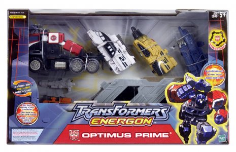
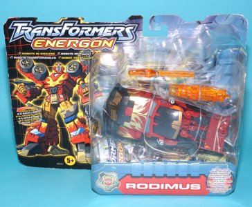
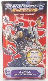
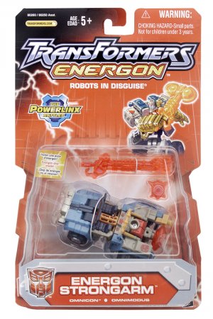
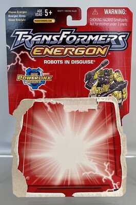
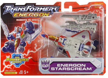
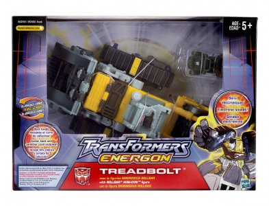
However distinct the toylines were from each other, Transformers: Energon's packaging continued along the track laid down by Armada's, following a lot of the conventions previously established. Packaging had the vertical cards for the Basic price point, had wider-than-tall cards for Deluxes, had no bios or tech specs (we'd get the latter back, more on this later), used multilingual text, had window boxes for Mega and up, all had Dreamwave or Dreamwave-esque art, and so on.

The bios were still absent from the packaging (as Sabrblade notes, these had largely been ported over to the website) but the packaging now had tech specs back, in a fashion. During Armada, Archer in his ORSON guise noted the fan demand for "tech specs". However, even at that time the discourse showed many belatedly realizing that they'd been conflating "bio" and "tech specs" under the latter term all this time. However it happened, what was demanded for and received was the tech spec numbers, which to be fair are easier to find room for. (These days they're sometimes represented by symbols, taking a multimodal tack toward accomplishing that goal.)

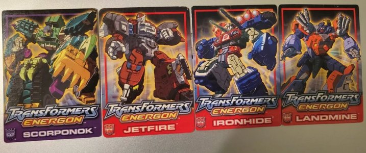
These numbers weren't on the packaging either, to be clear; they were on the back of the character trading card, another thing continuing from Armada (and still in that separate-piece form rather than the "cut this out from the packaging" of RID2001 and almost every line before that. These cards were on the right (our right) side/facet of the bubble for Deluxes, and in with the rest of the paperwork (iirc) for the bigger price points.

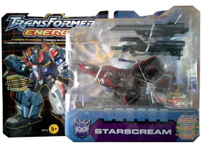
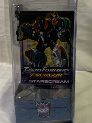
transformers-energon-starscream-combat-hasbro-UK-box-package-front-photo.jpg71XqcqXR+gL.jpgcan-anyone-tell-me-where-these-cards-are-from-v0-81jwltlp5cga1.jpg

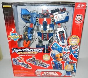
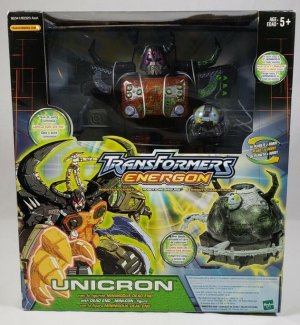
On that note, the new price point names Energon tried were Energon class, or Basics/Mini-Con teams; Combat class, or Deluxes; Mega class, or Megas XLR; Command class, or Ultras; and Leader class, or Super (this stuck around!); and Supreme class, which would no longer be a one-off for this line thanks to Omega Supreme (and Omega Sentinel) joining the redecoed Unicron. These names did appear on the packaging somewhere... by the time of the subline imprint! See the tops of the cards, in tiny "why bother" font. I'll just use the contemporary names this time.)

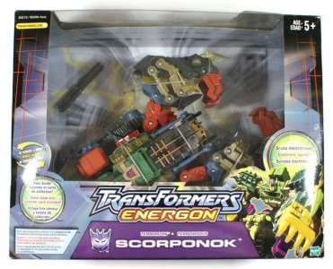
Hasbro seemed to be a bit more restrained with the card and box shaping as well. Eschewing the bubbly, rounded everything of Armada, Basic and Deluxe cards were now more straightforward affairs, being whole rectangles with die-cut edges corresponding to the hang tag on both carded price points, matching ridges on both sides for Basics, and for Deluxes, the new TransFormers Energon logo (continuing the RID2001/Armada style with a new subtitle in red-bordered yellow, with the yellow interior being a line-y lens flare effect). Mega and up were now back to being standard rectangular boxes with large plastic windows (this line had some BIG BOIS); the notches from the Basic cards were part of the box design but not cut out (like they would be in, say, ROTF), so still normal boxes. Sadly, this wouldn't last past this toyline.

Ener098_1195389458.jpghtfvb.jpgs-l300.jpg

The look of the packaging design... I genuinely struggle to pick a favorite from any of the Unicron Trilogy package designs, to be honest. Hasbro started on a roll with Armada (I liked RID2001 and still remember it fondly, but Armada felt more "complete"), and Energon was a strong followup that would be my favorite if not for (spoiler alert, not that I ever shut up about it) Cybertron, which I'll gush embarrassingly about in its own space.

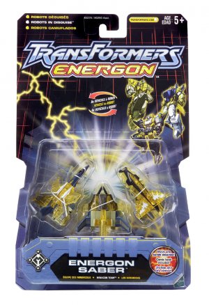
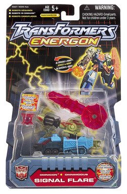
Basics got a vertical card that had a large trapezoidal bubble for the figure and accessories (I note that these tended to show off all the Energon weapons), a nice big nameplate that also showed the faction logo and a bubble touting the included minicomic, and a nice big TransFormers Energon logo. There was ample space between the logo and the bubble that was sadly not used for amply-big character art, instead having (from left to right) a long forked bolt of yellow lightning, the "vehicle/etc to robot" callout, and small character art. I'd have been fine with it centered abd bigger, even with half the body hidden behind the bubble (Super Link did this). At least these did get bigger character art on the right side of the bubble (later, combiner limb Basics had art of the full combiner, To Sell Toys).

D_883103-MLM82250574094_022025-C.jpggvvfcd.jpgDSC02575.jpggvcx.jpg

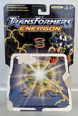
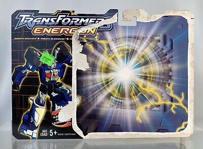
The card design had a blue-silver vault with a circular core touched by the lightning/electricity, and emitting strong white light that radiated behind (and spotlighted) the toy. This was set on a striking black backdrop that had red streaks of light forming a loose grid... except now this depicted the grid in three-point perspective, tapering toward the top at a subtle angle. (I'm sure there's some technical term I am simply blanking on for this right now, help.) There were a couple of Mini-Con 6-packs (a pair of trios) that basically stretched the card out further vertically and had small art of all six Mini-Cons up top, yay (the Energon Saber team did too, but Energon Perceptor only had combined-mode art up top). The same design was used on the wide Deluxe cards, with character art nice and big on the left side, below the line logo.

rdcv.jpg33eeed.jpg5tgvd.jpg

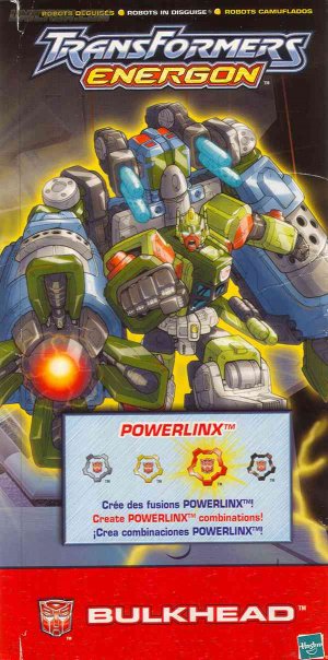
Boxed figures would have a similar look, with a nameplate centered on the lower front, a big window framing the toy, character art on the left or right, and the multilingual callouts and blurbs sometimes packed into circles. Character art would also be used on the box flaps, with the opposite side's flap typically having the basic lore of the line summed up in one paragraph per language.

itemimage_imgsrc.jpg765rfgbh.jpg4rewedew.jpgeffredc.jpg

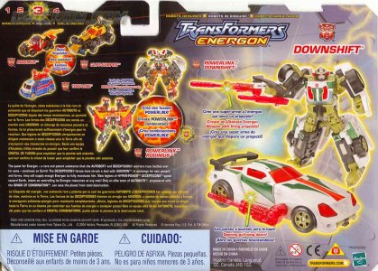
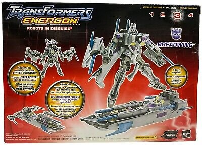
The backs of packaging featured (again) no bios or tech specs, but large toy photos in both modes with gradient glow effects (the Armada mold redecos that got shunted to this line still being in their original colors, along with preproduction stuff like the Street Speed team) and the typical blurbs for gimmicks and such. This first packaging color scheme was applied to the standard figures in the line as well as other items like the Role Play weapons and the Costco giftset redecoing Armada Optimus Prime and Overload.

I have to say, going back through these early years of Hasbro juggling all these layout demands kind of makes me appreciate how down-to-a-science they seem to have it now. Even the placement of co-sells and shown-off gimmicks is hard to visually follow; Takara's packaging pulls this off more neatly (but then they don't need to find room for the toyline backstory blurb in three languages).

But let's take one other element: take these "just put them somewhere", very-abstract-anyway "transformation difficulty" ratings, and compare them with today's also kinda "just put it somewhere" transformation-step total, and then with the standardized placement for that in the 2025 AOTP/Studio Series packaging. Of course, do that and you'll also have a hard time ignoring how... dead the contemporary box backs are with so little text.


Ener012_1195389519.jpg76ygferg.jpgtransformers-energon-powerlinx-battles-starscream-hasbro-usa-box-package-front.jpg770px-Ut_energon_boxed.jpg

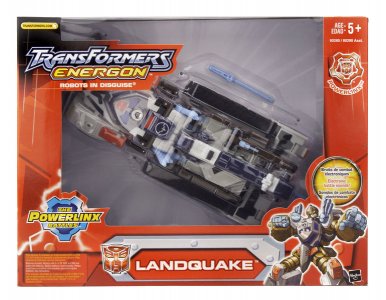
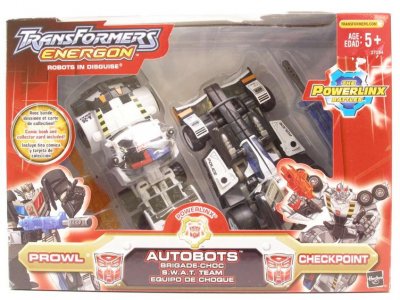
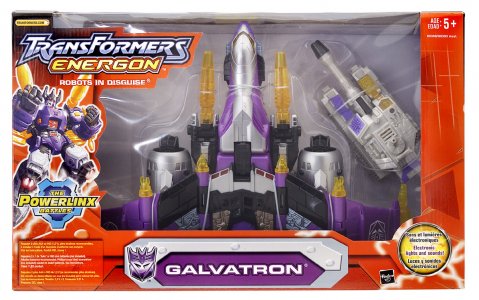
The Powerlinx Battles subline imprint had packaging changes that would go a step further than Armada's packaging changes did. Aside from a subline imprint logo (a blue Spark of Combination cog labeled The Powerlinx Battles) that partly obscured character art, the whole card's color scheme changed. The circular central core was now a square that emitted the radiating white light and white lightning, and the entire earlier card was now saturated in red (a touch bright for my tastes) and fading into black toward the top, with the grid being white/light red but fainter. Definitely stoking that 20th anniversary feel in part, but perhaps with some oversimplification. This did also make for some somewhat boring boxed figure packaging; the white-on-white background led to a bland interior tray for figures like the also-light gray Landquake.

Ener172_1195391274.jpgSWAT_1262045225.jpg300px-Energon_Micromaster_Protectobots.jpg


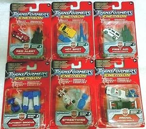
Later releases, including store exclusives and multipacks (Deluxe class Powerlinx Optimus Prime/Mega class Megatron; Checkpoint/SWAT Prowl; The Beast mk1 Mega-Dinobot) took on this packaging color scheme as well. It got a bit confusing as many earlier-wave releases were also reissued on these cards. Even outside the line, this card would keep popping up: it was also used for European releases of the US Micromaster Six-combiner imports, and eventually rebranded (literally) as Transformers Universe in the market-filler extension era of that line (which used this card and Universe's original nameplate/insert design).

In many, MANY ways, Energon is a fascinating study in How Not To Do A Goddamn Anime Dub. But the toys tended to be blocky fun that put homage-y looks and colors on new bodies, and it was an exciting time overall that looked very pretty on shelves. I'll readily admit that I was exhausted of the red cards before long, partly because they were everywhere (and the line put so much product on them) and partly because the somewhat-concurrent Universe line was also on reddish cards (and replaced them with these!). And there's still something so bland about the copious text in different languages; recent series have been very text-sparse to kind of keep it clean and avoid this, but that doesn't feel quite right either. I'm all for multilingualism and not shutting any out, but it's a shame a workable compromise has been be so difficult to balance with cost and aesthetics. Still, the early packaging had a great look: dark, understated packaging that didn't look like it was trying to look too cool to be toys, and showed off the toys inside well (even if it wasn't able to say much about them). This definitely paired well with the fresh ideas in fresh plastic, and made the line feel really worth latching onto.
 
Last edited:
lastmaximal

Administrator
Staff member
Council of Elders
Citizen
(continued)

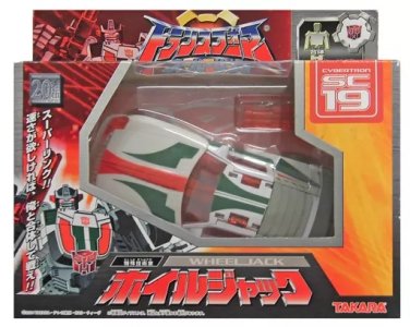
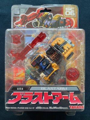
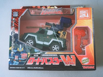
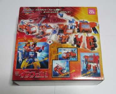
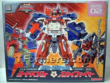
Takara's approach to their packaging for Super Link appeared to be a mirror of their Legends of the Microns packaging -- somewhat literally, down to a reversed application. This time, early releases of Deluxe and up got the windowless box treatment, and redecos and later waves were put in windowed boxes.

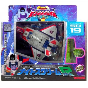
In a manner similar to Hasbro's, this sequel series' packaging design also continued some design standards from its predecessor: windowless boxes had the line logo on the solid hang tab and the character name in large print anchoring the front center base, with large robot mode character art/renders dominating the space and supplemented by toy photos of the altmode. Also taking forward a practice used in the previous series' Micron Team packaging, Basics were carded with full-front-coverage plastic bubbles that had edges/tabs wrapping around the card; we'd see this again to some extent in later lines.

il_fullxfull.5721332767_fcmn.jpg607090865.jpgil_fullxfull.5733152235_e6n6.jpg

The later window-box releases would be similar to the windowed Legends of the Microns releases, with small character art off to the side next to their name in large print. For the windowed boxes, there doesn't seem to be any faction-specific orientation mirroring, with most if not all facing up and to the left. Among other things, this allowed for a standard location in which to insert the featured pack-in Energon weapon (one each was included with 4 redecos), which was placed on our right.

transformers-super-link-SD-19-nightscream-reverse-japan-takara-box-package-front.jpg65rfre.jpgHot-Shot-Fire-Tech-Specs_1232885728.jpg

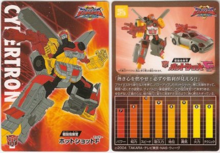
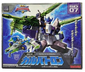
Cybertrons had fiery orange/red backgrounds for the artwork while Destrons had icy blue backgrounds; these colors would be used on the character nameplate as well. The Cybertron background also had with a pair of grids (top/bottom) trailing off into the distance (again, someone will hopefully know the proper term for this). This is a cool-looking background that's obscured by all the other elements, even on the windowless boxes that don't give up any real estate to viewing gaps. It's seen more clearly on the character card (still included as a Takara staple, but not back to being a displayed packaging element). The Micron backdrop seems to be a green version of this, and the Destrons seem to just have lots of icy blue-white lightning instead. (I also notice that they see to have a transformation difficulty chart -- the little 4-star "technical point" rating on the cardback-- as well; not sure if this was new for this line.)

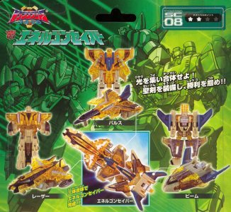
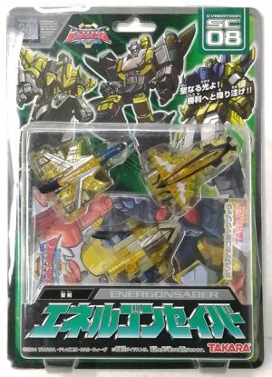
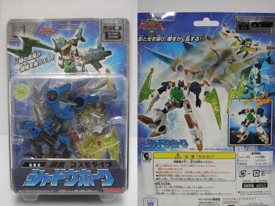
super-link-transformer-sc-08-energonsaber.jpgFIGURE-059644.jpg911szCvECUL.jpg

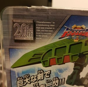
On boxed toys, the toyline logo is mostly left on the solid hang tag, and on the bigger windowless boxes it's small and off to the side, not taking up a lot of space. The character number is displayed prominently (on a faction-colored box/tab -- notably, Microns, Omnicons and Terrorcons got their own colors too) on the upper right-hand corner (our right). This was mirrored on our left by a silver "20th anniversary" logo, a big serif "Transformers 20th anniversary since 1984" on an Autobot sigil, that is itself accompanied by a little blurb -- "Transformers" is a transforming robot that was created in 1984, and has been loved by everyone in the whole world. I love gratuitous English (especially when it's actually conventionally accurate and comes off as oddly wholesome and sincere -- despite being an obvious exaggeration) and the many motivations that could be behind it. The same mirroring was done at the top of the card with the carded/skin pack figures, which put the character art nice and big right up into the hang tag, with the toyline logo also small and off to a side.

64eds.pngbggbvc.jpgqBYB8ZZ.jpg

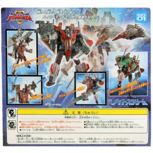
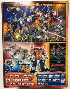
Like Legends of the Microns' packaging, the back of the box featured a quick motion-blur effect transformation sequence with bordered insets highlighting the gimmicks. For the superlinking Cybertrons, this meant allocating extra space to show off the combination (shunting some obligatory text to the bottom panel of the box). Later boxes such as Wing Saber's featured a glorious royal rumble of a battle mural (and has room for some headshot co-sells at the bottom). I think over this thread so far, this is the best such mural we've seen from the Japanese lines in a while.

transformers-super-link-SD-01-nightscream-takara-japan-box-package-back_480x480.jpg345544r.pnghtrfvbg.jpg

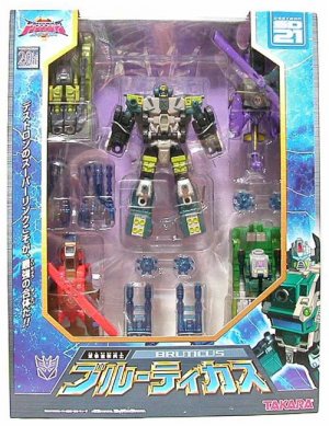
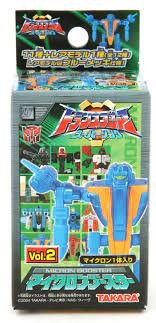
There weren't really versus packs in this line (continuing that absence), although we would see them again soon (in a different sort of execution than in the Beast era). However, it did make more sense for Takara to package super-linking pairs together, so they did that with windowless boxes. Other special packaging went to the combiners (luxuriously huge trays in windowed boxes), and to the Micron Booster sets (which I'd neglected to mention as part of Legends of the Microns, where they began with with set 0.) The individual Micron Booster boxes do continue the green-grid motif from the Basic cards for Micron teams.

sl-ss02-front.jpgsl-bruticus-box01.jpgTAK_micronbooster1.jpgyhgtrtg.jpg

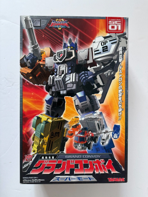
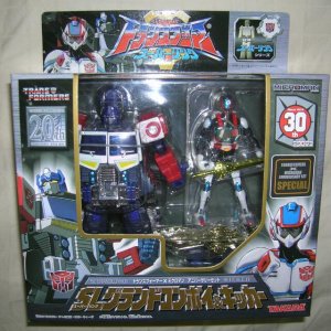
Of note is a special 20th anniversary 2-pack (30th for Microman) that featured the Deluxe class SL Grand Convoy and Kicker. A somewhat understated but classy (if very visually busy) black, silver, and gold box punctuated with the red, white, and blue both heroes share, this was a tidy little package.

transformers_superlink_microman_anniversary_grand_convoykicker__1421570120_b64e6321.jpg


This has really made me crave some Energon homages and remakes, damn.


Next: It Is The Year 2005, Which Was Twenty Frickin' Years Ago
 
Last edited:
Steevy Maximus

Well known pompous pontificator
Citizen
RiD is interesting because it was very much a stopgap, but it was such a success that it probably validated the direction they were planning on taking things with the UT anyway. Rebranding the Combatrons as Decepticons after the re-introduction of Autobots proved very popular was a no-brainer.


There's some self-fulfilling aspects with this take though. Not only did MW not get an animated show (again, a first for Transformers, even G2 got the G2 "remaster" of the Sunbow show) I don't think it even got commercials?

Like yeah... a toyline they dropped into a chain that almost exclusively existed in malls that had no advertising push and no media to support it didn't sell well. Shocker.
The weird deco choices were always going to be off putting to the older fans that a return to vehicles was supposed to appeal to, so the selling point should have been "well this is the style that's selling with kids."
But kids won't want it if you don't advertise to them or otherwise give them a reason to care.

I'm not 100% sure I buy the "rush job to live up to some off the cuff remarks at BotCon" story just given the production timeline of these things...
But so many of the choices with the line are just baffling.

I don't think we'll ever know why MW was done the way it was, and that's ok. It adds to the charm that it's just this unknowable WTF? moment.
My general vibe was that Beast Wars was a successful relaunch in 1996 and HasKen was looking for ways to capitalize on that. Transformers had been dominantly vehicles for most of its decade of existence prior, and I think Machine Wars, was a “testing the waters” thing since vehicular Transformers had nearly gotten the brand cancelled just a couple years prior.
It’s entirely possible that Machine Wars ended up a KayBee exclusive because nobody else wanted it (Kaybee would take almost anything in those days), that while offered to other retailers, nobody was interested in vehicular Transformers while Beast Wars was doing well. KB offered enough interest to buy into the line, but not enough to justify more than the bare minimum we saw of the end result.

It’s worth noting that HasKen DID vastly expand the line in 1998, with the addition of the Super price point and a second deluxe assortment (which would carry until the end of Beast Machines, and even into early stages of Transtech). It almost feels like that expansion was the result of the failure of vehicle Transformers to garner retailer interest in 1996/7.


But yeah, I think RiD, while a stopgap, did justify broader brand plans that had been in place- Beast Machines had vehicles as a major faction, while Transtech would have shifted to a full vehicle line (albeit, highly stylized). Some of the VERY early rumors for Armada might have even had origins in post-Transtech plans of reintroducing more traditional Transformers under Kenner’s banner. In general, it felt that “5 years” was the average lifespan for a given direction before the market dictated a significant shift in direction:
Beast Wars/Machines lasted from 1996 until 2001 (with plans to shift to vehicles in 2001)
Barring RiD as a transitional line, the Unicron Trilogy lasted from 2002 until 2006, with the original planned Transformers Heroes (Animated) shifting to a stylized hero style not dissimilar from where Animated ended up taking things.
Batman the Animated Series ran from late 92 until 97, where The New Adventures refresh took over until the completion of Hasbro’s license in 2001.
Even the movies had about 5 solid years before Age of Extinction started to show the brand weakening (at least domestically). Transformers Prime lasted about 5 years until the soft reset in RiD15.

I think a big issue afflicting the brand (and MANY long term franchises that make up the action toy segment) is that there IS a degree of stagnation occurring as corporations try to homogenize their franchises and become increasingly risk adverse as they continue to separate the “kids” and “adult fans/collector” segments.
But that’s a WHOLE other area of discussion.
 

Sabrblade

Continuity Nutcase
Citizen
This was mirrored on our left by a silver "20th anniversary" logo, a big serif "Transformers 20th anniversary since 1984" on an Autobot sigil, that is itself accompanied by a little blurb -- "Transformers" is a transforming robot cartoon that was created in 1984, and has been loved by everyone in the whole world.
I'm not seeing the word "cartoon" in any of the pics you posted.
 

Blot

Well-known member
Citizen
I wonder if you're planning to touch on the sublines that popped up at this time too-- Alternators, Robotmasters, and all that good stuff.


Top Bottom