The 2000s, 1: Turn Around, Go Forward
East and West of the Transformers world hit pause after the dust of the Beast era settled, with a new series -- Transformers: Car Robots, which would become Transformers: Robots in Disguise (2001) -- becoming the turnaround space within which both Hasbro and Takara would start over.
Car Robots would eventually be explicitly declared to be part of the 80s-on Japanese Transformers continuity (an intent also reflected in the production materials), but as a show lacked a lot of the features of such a continuation. In the West, Robots in Disguise (2001) was more clearly a fresh start... but not MUCH more clearly, as there were plenty of reused names and references to older characters and series in dialogue). This, combined with the notion of rebooting continuity still being fairly new to the US Transformers cartoons (the Beast era had continued on from a Generation 1, at least), created a somewhat confused impression at first.
Regardless, these lines had the simultaneous luxury and burden of being their own thing, not necessarily beholden to carrying a brand vibe from earlier series but also having to put in the effort to stand apart as a result. Thankfully, it wasn't solely the job of
packaging to do this, as there was a great deal of intrigue from the show (back to 2D animation, and certainly riding the burgeoning anime wave in the west) and toys (a handful of lavish, complex, all-new molds with a greater focus on vehicles, with some redecos and unexpected G1-2 mold reuses). Packaging mostly had to be eye-catching and stay out of the way of what it was showcasing... and it managed that.


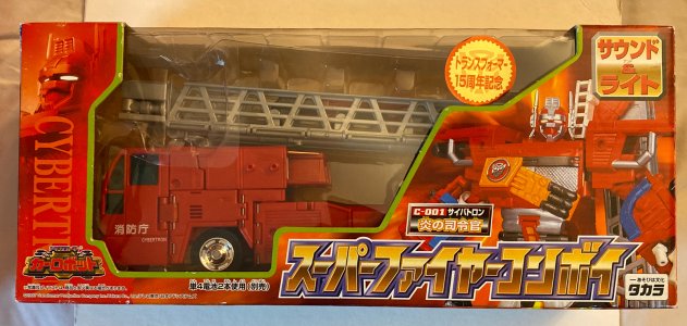
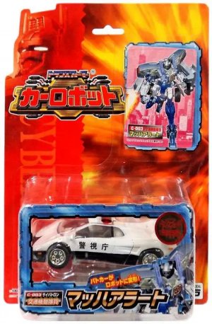
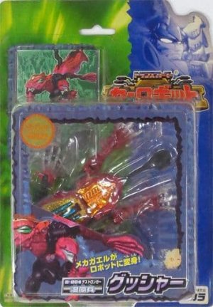
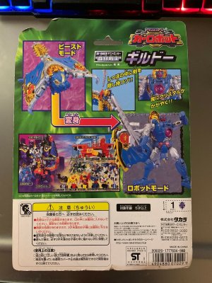
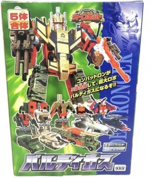
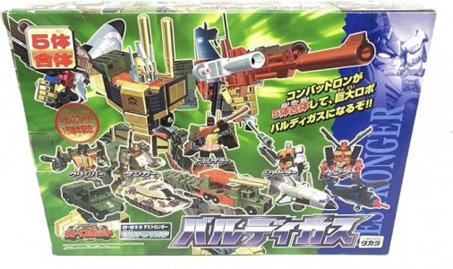
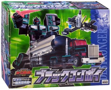
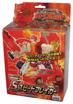
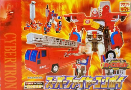
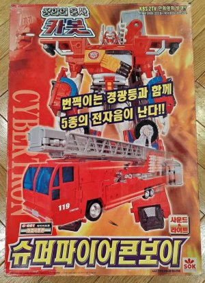
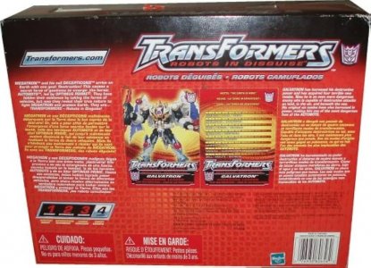
Takara's Car Robots packaging took on a somewhat simpler look with fully-colored cards/boxes with a cool, fire/light-streaming effect radiating from the center (red-orange with red borders for Cybertrons, and green with blue-violet borders for Destron...gers), each having their faction leader's (Super Fire Convoy/Gigatron) head in fading monochrome atop the faction color border (and above the name of the faction running up the package edge. This continued a trend that persisted throughout G1 and the Beast era in Japan, but had gone away in the US since about G2 -- distinct packaging variations between factions. Some packaged samples I found pics of have a sticker highlighting Transformers' 15th anniversary.
The first releases featured window boxes, and carded Basics/Deluxes in a departure from the still-everyone-in-a-box Beast era series. One apparent holdover from Metals was the focus on using character cards as part of the packaging (Takara toylines had tended to have cards, but not used this way), in lieu of packaging artwork. A closer look at the carded figures shows that they did also have character art as part of the cardboard border on the front of the bubbles, just obscured by the large character name text.
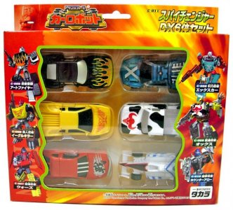
Versus packs were gone, but giftsets (such as for the Spychangers and Buildmasters) were still part of the line. The closest we got to a back-of-box mural seems to have been a static-pose group shot, with both factions having a class photo taken.
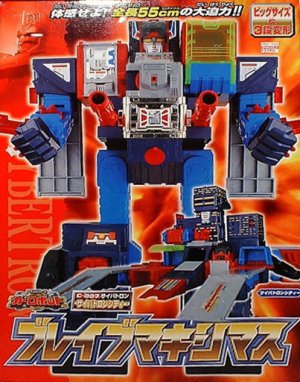
Later waves would shift to having more windowless packaging, for which the packaging art was huge renders of the toys in robot mode (and smaller pictures of the toy in altmode) that impressively dominated the packaging space. The larger real estate also allowed the light-streaming effect on the background to be more visible. This effect overall was especially pronounced with the bigger boxes, of which there were quite a few: the JRX gift set, the Baldigus git set, Super Fire Convoy, God Magnus, Black Convoy, Devil Gigatron, and certainly the God Fire Convoy giftset were quite large. None larger, of course, than Brave Maximus.
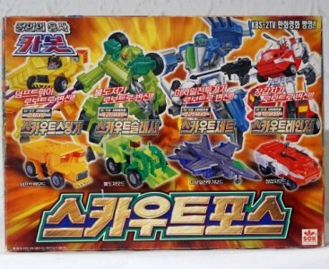
Car Robots also made it to Korea, who imported it as Jeonguiui Yongsa: Car Bot. Sonokong mostly brought products over in the same Japanese packaging style with new text. I actually associate some of the windowless packaging a bit more with Sonokong because I saw it so often as that (it became more common and easily-sourced locally in my backtracking years, after the original Japanese releases had dried up). Per the wiki, there were also apparently some wacky steps involved like re-releasing old Beast era product in Car Robots packaging... including repackaging their BW2 "Garba Tron" as
"Gigatron Z".


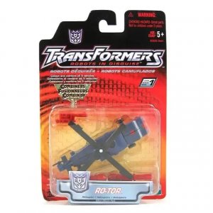
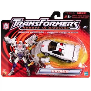
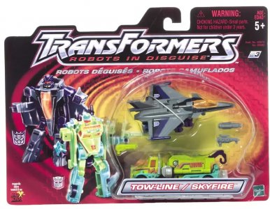
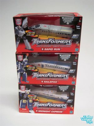
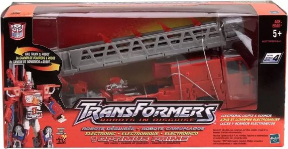
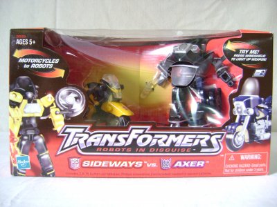
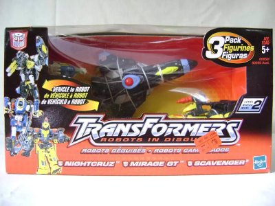
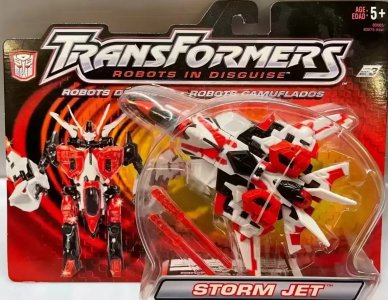
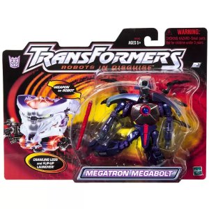
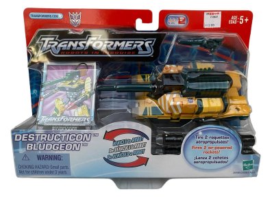
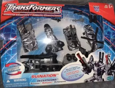
In the US, Robots in Disguise (2001) had packaging that was an intriguing balance of old and new. The design was, on the one hand, different from anything we'd seen -- a gradient from yellow (where the toys would be) to red to black around the edges, a ripple/swirl effect radiating outward, and a sort of 3D/embossed grid texture -- but it was in a sense still quite evocative of the classic 1980s packaging's grid-on-red (except now without the faction variance in packaging). It's like someone took apart the original packaging elements and reassembled them, throwing a new one in there to make it feel different overall (the ripple-swirl being so prominent and high-contrast does keep the eye from just "seeing" the old grid-on-color, especially as the grid itself is so light.)
This also, almost surely coincidentally, seemed to offer a better take on CR's also-mostly-red/yellow Cybertron packaging by grounding it with sharp contrast. Combined with a bold, easily-readable new logo (the "TransFormers" part of which we'd see for the next few years) and the proud return of classic Autobot and Decepticon faction symbols, this was a simple but effective call at the turn of the decade and millennium, when nostalgia for the classic series was percolating even outside the hardcore fandom.
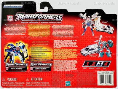
Carded figures took two forms -- small vertical cards (Basics, Spychanger pairs), and wider-than-tall cards (quite a big change from what was standardized throughout the beast era, for Deluxes). Boxed figures remained standard rectangular prism shapes, with large plastic windows showing off the Rail Racer team, and bigger toys like Optimus Prime, Ultra Magnus, Megatron, and so on.


RID2001 also brought back character art... in a fashion. Notably, and most likely due to the line's rushed conception, the line skipped hand-drawn (etc) artwork entirely and instead used edited toy photos, apparently with generous use of the Plastic Wrap filter (just a best guess) and some lens flares. (My own earliest experiments in Photoshop involved trying to imitate this.) This more or less did the trick, for the items that HAD packaging art at least (Deluxes and up). This art would also be used on the cut-out character cards on the back of the packaging; these cards were two-piece, affairs with one panel being the art, and one panel being the motto and Tech Spec numbers. Oddly excluded from being part of the "cards" was the character's bio (some of which, like "Speedbreaker" and the other Autobot Brothers'
first releases getting "new spark engines", hinted at the line's rushed production), just printed next to the cards.


This card-and-bio situation is of interest for a number of reasons: one, this would be the last we'd see of on-package bios for a while, and two, this may be the first line to show the widespread use of multilingual packaging text, which we'd definitely see for years and years to come as the toy industry's production standards grew and changed. We'd find out sometime during Armada (thanks to Aaron Archer as ORSON, iirc) that the latter played a role in the former.
Also of interest are a large, numerical "transformation difficulty scale" from 1-4 (I'd neglected to mention this as something they'd started adding to the card since somewhere mid-Beast era, with varying looks) and a dedicated "button" graphic for Transformers.com (Beast Machines had a "Check us out on-line at hasbro.com" somewhere near the bar code). Ah, simpler internet times.
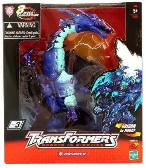
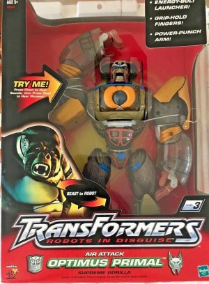
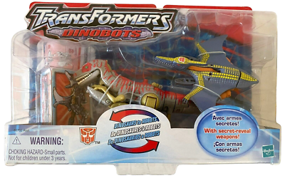
The line and show were very popular and pushed Hasbro toward an extension, bringing in redecos of molds old (Beast Machines Jetstorm, Mirage, Spy Streak, and Scavenger) and older (Transmetal 2 Megatron) and even older (G2 Laser Cycles) and, uh, newer (unreleased Megabolt Megatron and Supreme class Optimus Primal) to keep it going. Indeed, Robots in Disguise (2001) would live on -- without a subline imprint of its own, and somewhat BECOMING a subline imprint -- well into the midst of the next series as a subline mostly used for store exclusive releases.
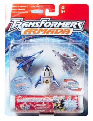
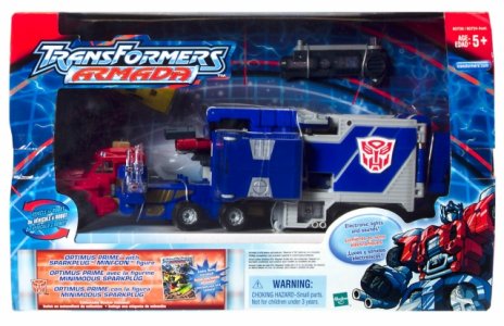
The logo for the subsequent waves would on Armada-themed cards for currentness/continuity, which we can discuss when we get to then, but it started out as a continuation of the RID2001 format, including packaging. Sadly, this would not include Brave Maximus, meaning the biggest representation of this design is Air Attack Optimus Primal... most of whose box was a large window.
Next: A massive undertaking

