I miss the "modernised and redesigned, yet still familiar" design ethos of the Classics range, which continued into Universe 2.0, RtS, etc. I mean, it's nice to have modern figures which match the Marvel comics/Sunbow cartoon design templates so closely, but it's all getting a bit too samey, really. (Perhaps Transformers is now too much of a "nostalgia based brand" to have as much divergence from established characters designs as was possible back in 2006?)Classics was a fantastic line. Such a game changer for us old-time fans.
You are using an out of date browser. It may not display this or other websites correctly.
You should upgrade or use an alternative browser.
You should upgrade or use an alternative browser.
Outside? Inside? No, thinking ABOUT the box: your thoughts on Transformers packaging
- Thread starter lastmaximal
- Start date
I remember youtube videos of Classics toys were my first contact with G1-style toys. Before that, G1 to me was just some backstory for Beast Wars. Because I never saw the toyline on shelves, I remember being a surprised when I saw pictures of the packaging for the first time many years after the toyline was current, and seeing that it wasn't actually CALLED classics. I love the style of the packaging, and your article has brought to my attention that destroyed (With the colors even sort of suggesting it's burning...) cityscape. It's oddly haunting, honestly. Like that's all that's left after 20-or-so years of the Autobots and Decepticons duking it out on earth. I know the designer probably just put it there to make it look more action-y and attractive for kids, and I think it succeeds at that, but as an adult it feels oddly heavy! It's a great design element either way. I'd also never seen those fold out two packs! They really went all in with the extra flaps on that toyline, love it, top 5 packaging style for sure.
The little joke at the beginning of the Henkei post makes me worried that you pronounce it as henk-eye...
The Japanese monochrome packaging for exclusives I always found equal parts lazy and brilliant. It stands out from the rest for sure, and makes it clear that the product inside is special.
I read a comment somewhere lamenting the lack of modern real world alt-modes, and honestly I agree. That comment made me conscious of the fact that the most recent vehicles depicted by Transformers are still almost a decade old, and how that really highlights how much of a nostalgia brand it's become, which is very bad for the future of the franchise and something I personally dislike very much and find very boring, as someone who grew up during the 1996 - 2010 era of Transformers, where new, contemporary, exciting iterations were the norm, not the exception.
I remember even being a bit aprehensive back when Kingdom leaked (which somehow is five years ago already??), fearing they would do the beast warriors as janky 3d animals. Fortunately, they went the realistic route instead.
So I agree that it's cool to have the cartoon accurate G1 stuff, but it's really high time they came up with something new to balance it out.
The little joke at the beginning of the Henkei post makes me worried that you pronounce it as henk-eye...
The Japanese monochrome packaging for exclusives I always found equal parts lazy and brilliant. It stands out from the rest for sure, and makes it clear that the product inside is special.
I miss the "modernised and redesigned, yet still familiar" design ethos of the Classics range, which continued into Universe 2.0, RtS, etc. I mean, it's nice to have modern figures which match the Marvel comics/Sunbow cartoon design templates so closely, but it's all getting a bit too samey, really. (Perhaps Transformers is now too much of a "nostalgia based brand" to have as much divergence from established characters designs as was possible back in 2006?)
I read a comment somewhere lamenting the lack of modern real world alt-modes, and honestly I agree. That comment made me conscious of the fact that the most recent vehicles depicted by Transformers are still almost a decade old, and how that really highlights how much of a nostalgia brand it's become, which is very bad for the future of the franchise and something I personally dislike very much and find very boring, as someone who grew up during the 1996 - 2010 era of Transformers, where new, contemporary, exciting iterations were the norm, not the exception.
I remember even being a bit aprehensive back when Kingdom leaked (which somehow is five years ago already??), fearing they would do the beast warriors as janky 3d animals. Fortunately, they went the realistic route instead.
So I agree that it's cool to have the cartoon accurate G1 stuff, but it's really high time they came up with something new to balance it out.
I did not enjoy Classics at the time but I appreciate it more as time goes on.
I kinda wish the Evergreen designs borrowed more from Classics. They'd fulfill the same role, but they'd be farther removed from the G1 toon based updates Hasbro's doing in their collector lines. As is the Evergreen designs are in the anti Goldilocks zone of being too far from the toon designs to be stand-ins but too close to be interesting in their own way.
I kinda wish the Evergreen designs borrowed more from Classics. They'd fulfill the same role, but they'd be farther removed from the G1 toon based updates Hasbro's doing in their collector lines. As is the Evergreen designs are in the anti Goldilocks zone of being too far from the toon designs to be stand-ins but too close to be interesting in their own way.
Well, there is a mispronunciation involved, but mercifully this isn't one of mine. That was more of a reference to people in my local community misreading HenkEI as HenkIE, and pronouncing it like "hankie". Some spell it i-e to this day. Just language thangs.The little joke at the beginning of the Henkei post makes me worried that you pronounce it as henk-eye...
The problems started in Universe 2.0, when they wanted to infuse some movie engineering and stylings into a G1 tribute line.I miss the "modernised and redesigned, yet still familiar" design ethos of the Classics range, which continued into Universe 2.0, RtS, etc. I mean, it's nice to have modern figures which match the Marvel comics/Sunbow cartoon design templates so closely, but it's all getting a bit too samey, really. (Perhaps Transformers is now too much of a "nostalgia based brand" to have as much divergence from established characters designs as was possible back in 2006?)
The Classics '06 lineup did a lot of good work modernizing stuff, but once you got into the realm of Universe Galvatron or Ironhide... yeah. I'll take the super G1 faithful versions over the creative redesigns in those cases.
It's not an either/or thing, but I do think sometimes problems get overthought.
With the hindsight we have now, it is clear that that was when Hasbro was firmly in their "early Binder work" mindset of "Everything (sans Animated) must be as grounded in reality as possible, like the 2007 movie was."The problems started in Universe 2.0, when they wanted to infuse some movie engineering and stylings into a G1 tribute line.
The Classics '06 lineup did a lot of good work modernizing stuff, but once you got into the realm of Universe Galvatron or Ironhide... yeah. I'll take the super G1 faithful versions over the creative redesigns in those cases.
It's not an either/or thing, but I do think sometimes problems get overthought.
Giant-sized Powerglide predominately colored gray was the biggest sign of that mindset.
Also muted grey camo Acid Storm. G-d forbid we have fun with a bright lime green F-15.With the hindsight we have now, it is clear that that was when Hasbro was firmly in their "early Binder work" mindset of "Everything (sans Animated) must be as grounded in reality as possible, like the 2007 movie was."
Giant-sized Powerglide predominately colored gray was the biggest sign of that mindset.
You'll have to speak up, I can't hear you over the sound of putting names on toys in L33TSP34K.
Total ownage, noob!You'll have to speak up, I can't hear you over the sound of putting names on toys in L33TSP34K.
Universe 2.0 had its moments. Hound is a darker green and a pile of weapons away from being the only Hound I'd ever need.
And in Lio Convoy's case, they did both at the same time!I remember even being a bit aprehensive back when Kingdom leaked (which somehow is five years ago already??), fearing they would do the beast warriors as janky 3d animals. Fortunately, they went the realistic route instead.
I endeavored to get the Henkei one as soon as it was revealed for that reason. All I'd ask is for different pegs for the hologram gun thing. And more weapons instead of Ravage (although that's a pretty good Ravage).Universe 2.0 had its moments. Hound is a darker green and a pile of weapons away from being the only Hound I'd ever need.
That Hound is pretty near timeless, and suffers none of the other design weirdness they were super into at the time. I haven't dug it out of storage in a while, but I don't THINK it has one of those dramatic head reveals they were obsessed with doing. And even the aesthetic is basically untouched by the same moviefying that compromised the Ironhide mold.
THAT'S how you do an update.
It probably helped that Hound being a Jeep made him already "realistic military" enough for Hasbro's Movie-influenced mindset at the time. Whereas Ironhide seemed to come about from a desire for Hasbro to distance themselves as far away from the 1980s Nissan Vanette altmode as possible. "Everything must be modern!"I endeavored to get the Henkei one as soon as it was revealed for that reason. All I'd ask is for different pegs for the hologram gun thing. And more weapons instead of Ravage (although that's a pretty good Ravage).
That Hound is pretty near timeless, and suffers none of the other design weirdness they were super into at the time. I haven't dug it out of storage in a while, but I don't THINK it has one of those dramatic head reveals they were obsessed with doing. And even the aesthetic is basically untouched by the same moviefying that compromised the Ironhide mold.
THAT'S how you do an update.
I like the legs. TOON ruined Hound with the stupid tiny feet. Hound has a huge chest. Having huge boots like the G1 toy balances out the proportions and makes that big chest work. Even with the inferior green, Universe 2.0 Hound is a more stylish looking bot than Siege. It reminds me more of Animated toys than other Universe 2.0 toys.
The only issue I have with Hound's legs are the feet. They're perfect... except due to the transformation he always looks like he's standing on his toes due to the back half of the foot basically not existing. From the outside? They're glorious. But any shot that lets you see the inside and he's just a cybertronian satyr. But other than that one small issue, Alex Kubalsky really nailed his goal of making sure his favorite Transformer was "done right".
The 2000s, 6: Hollywood Goes Moist
2007 was the game-changer year. Firmly and decisively establishing a new visual identity for the brand via the silver screen, the live-action movie brought us mesmerizing realism that permeated the world we saw, changing how we'd look at cars even in the parking lot after the movie, and enduring for the next decade along with a steady stream of... cringe writing and direction. It was the best of times, it was the blurst of times.
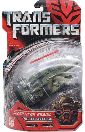
But that new visual identity was here to stay, creating a new mainstream feel for the franchise, which was now and forever a household name for reasons totally distinct from 80s nostalgia. And this was reflected in the packaging for the accompanying toyline, which took its own path toward a more grounded, slick portrayal of the brand as toys.
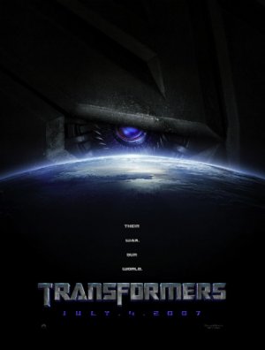
The movie toyline's packaging seemed to take a few signature cues from an early teaser image that just featured a shadowed closeup of the Autobot sigil's right eye, showing tech detail of a robot eye within it, positioned above a glowing closeup of the curvature of the Earth.
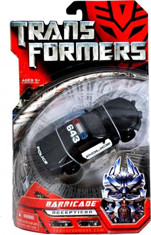
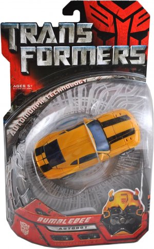
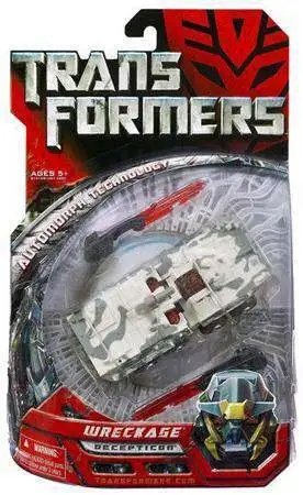
As applied to the toyline, these would be complemented by two recurring central design elements: rounded elements to the packaging, and a stark black/red/silver color scheme. This color scheme extended to the faction sigils that would be big visual anchors on the packaging, making for a strikingly red Decepticon sigil about a year before Shattered Glass would really make that a thing. This was interesting because it put the recognizable shapes and angles at the forefront, without the familiar color associations, and tied in neatly with the rest of the packaging theme. I remember thinking that giving the Decepticons in the line purple sigils with matching purple on the cards might have looked cool, but I see the value of this consistency now.
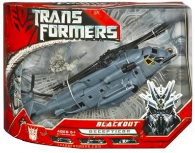
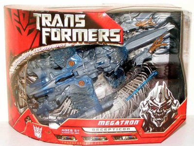
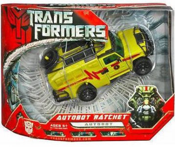
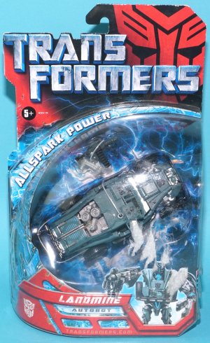
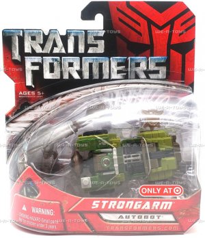
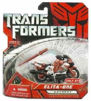
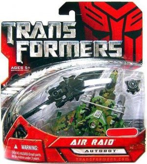
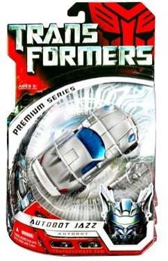
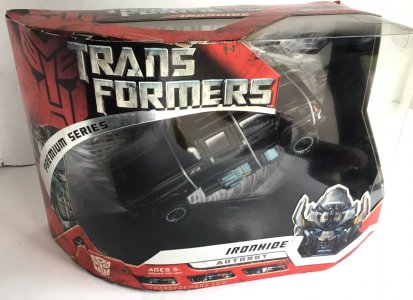
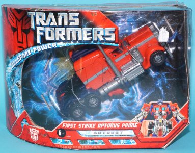
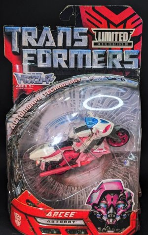
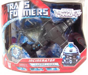
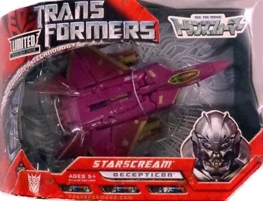
This was applied in varying ways to carded (Legends, Scout, Deluxe) and boxed (Voyagers, Ultras later, Leaders) figures alike, with this line having what seemed like a closer similarity across those. A large oval bubble and window framed the toy inside, packaged in the altmodes made familiar by their big-screen portrayal, backed by silver greebly details forming the central eye. This silver/gray/gold backdrop was a bit plain, but provided visual relief from all the red framing the package. The bubble/window would be bordered by a similarly greebly silver arc that boasted of the line's central gimmick, Automorph Technology. Similar beveled metal panels to Classics -- now red and with more of a grungy distressed texture -- with diagonal edges and insets and vents would accent the borders.
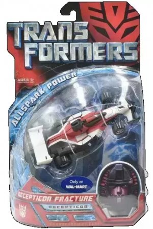
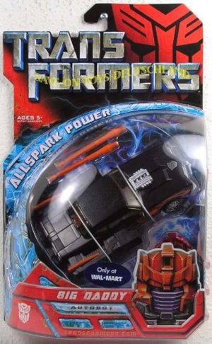
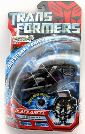
Carded figures would have a striking red-and-black faction sigil (its lower edges in shadow) at the top next to the j-hook/hang tag; this would be applied to the j-hook-less boxes as well in a different fashion, with the shadowy faction sigil on the left of the window border. The bubble would form a sort of half-teardrop shape at the base (tapering to our left end ending flat on our right).
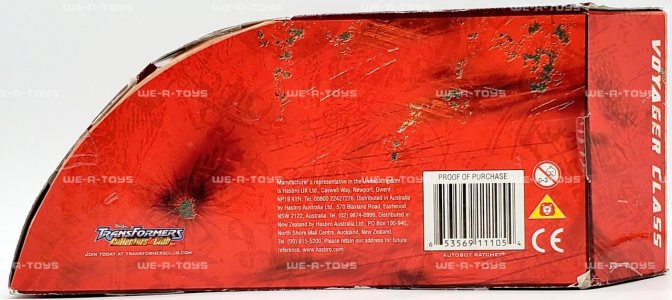
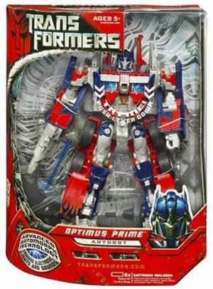
Boxed figures (Voyagers and Leaders, later with some Ultras) would have the entire box shaped like the carded bubble, ending with the same notched lower right corner, and having large windows to show off the altmode-packed toys. Leaders (the three molds in the main line) would be packed in robot mode in tall boxes, conveying the impressive heft and suitably complex-looking design of those movie designs.
The movie logo would be prominent up top, written in two lines (Trans Formers with the latter indented) and in weathered metal, a cool contrast to the red and black that was most of the packaging. On carded figures, with the faction sigil to the right of this text, the effect was kind of a twist on the traditional logo where the faction sigil would be between the halves of the name, except now the faction sigil loomed larger in shadow behind the text.
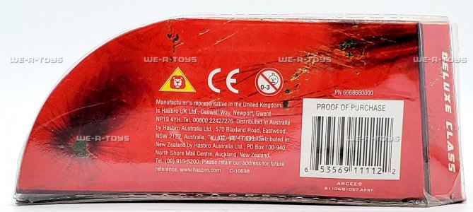
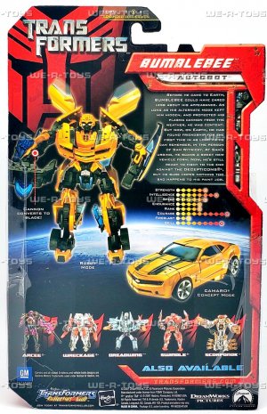
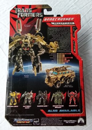
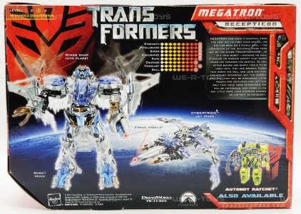
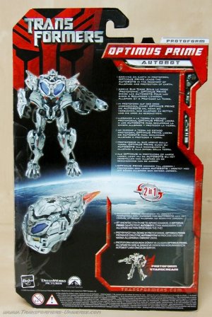
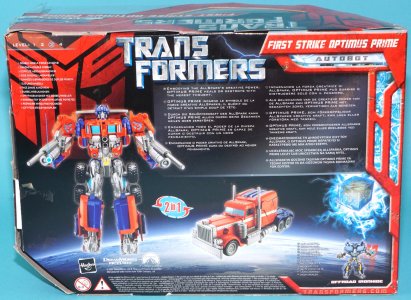
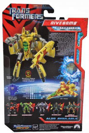
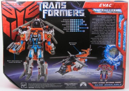
Names would be in white on red nameplates at the bottom, with a simple rendered straight-on headshot next to them. Sadly, this headshot would be the extent of the character art (still, it was a bit interesting to see the "offscreen" figures get their own as well). No other CGI character art was used anywhere on the box, with toy pictures of both modes being featured on the back alongside the bio and tech specs. The various logos of the vehicle sponsors, Paramount, and so on would also find placement on the back, with a neat row of co-sells covering the whole bottom line for carded figures (fewer in the corner for boxed), with a robot mode toy picture backed by the same shadowed red faction logo.
These were still in English in relevant markets; notably, multilingual-packaging markets got a short character bio AND gimmick callouts (as well as half-body shots of the toy on the nameplate instead of headshots).
Leveraging the other main element of the teaser poster, the main back-of-box backdrop was the darkness of space broken only by the glowing curvature of the Earth. This simple image provided a great backdrop for the toy photos of both modes, and lent the whole layout some gravitas even as it contrasted with the red edges. There's something just... understated, elegantly simple, and story-appropriate about the glowy Earth curve as a backdrop that makes it all work, highlighting all the more that these are alien robots coming to our world.
This dark, distinct packaging had a very slick feel to it, pairing well with the cool vibe of the hypercomplex engineering depicted onscreen. The somewhat corny gimmick callouts (like the WordArt-y "Advanced Automorph Technology/Triggers Lights and Sounds" plate) is offset by the "serious", subtle vibe of most of the packaging (and the use of the real Earth-surface graphic rather than the tech greebling seen in lines before and after), ending up with a handsome, unified, polished product overall. It takes itself just seriously enough, more sober than previous bright and action-y lines and packaging without being pretentious about it. I think of the first trilogy, this is the absolute home run (DOTM tries to cop some of the style because of the "moon" association and use of starry space, but it's nowhere as good). I might even go so far as to say no TF main movie line packaging since has really landed so well since.
Last edited:
(continued)
The movie being the runaway success that it was, a copious amount of ancillary product was churned out to meet demand, especially in the realm of store exclusives. Somewhat impressively, there weren't too many variations on the look resulting from this, and just as surprisingly, from experience in my neck of the woods, this didn't seem to burn audiences out as quickly as one might expect.
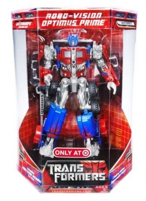
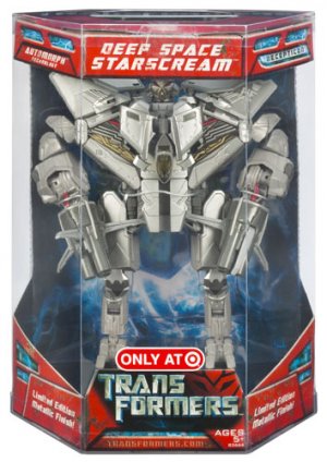
Even store exclusives kept to this theme for the most part, with Target's exclusives (Scouts) mostly taking on shortened versions of the Deluxe cards (no headshots next to nameplates). Other exclusives like Robo-Vision Optimus Prime and Deep Space Starscream took on unique octagonal packaging, carrying on the same design elements as much of the line.
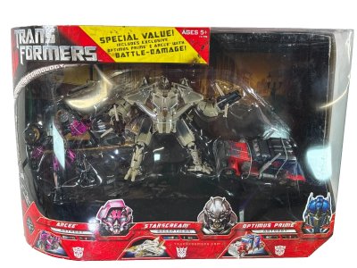
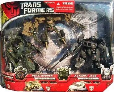
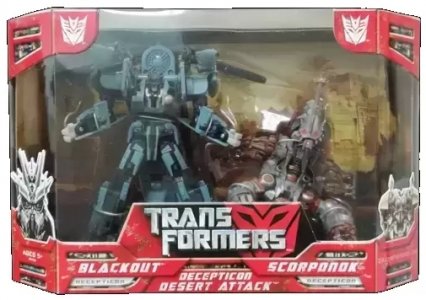
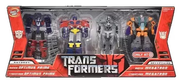
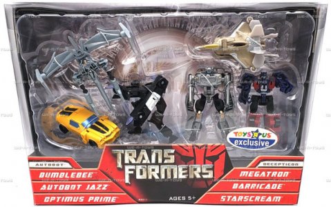
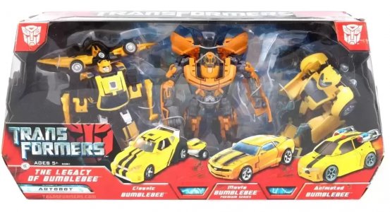
Some multipacks would have larger (some really large) versions of the boxed type of packaging, right down to just gathering the nameplates/headshots at the bottom; some would apply the packaging elements to smaller or different boxes, which might also pack the toys in robot mode or a mix of modes. The box shapes for some reflected some of the experimentation of recent years, going with single or combined trapezoids rather than the half-curve of the standard movie line boxes. (Look at those tiny altmode pics on the front of the larger-movie-style boxes! Never noticed those before.)
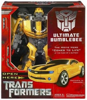
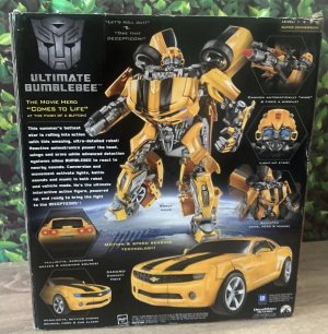
The biggest toy in the line, Ultimate Bumblebee, got a big red box (using the distressed metal and vents and such) with a flap (that had a foil Autobot sigil) that opened for a better view of the huge toy. A toy photo of the vehicle mode would be visible on both sides of the flap (and the robot mode in an action pose on the inside), with a bio and tech specs on a side panel and the back of the packaging maintaining the standard space/Earth design.
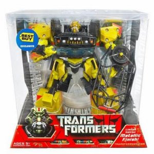
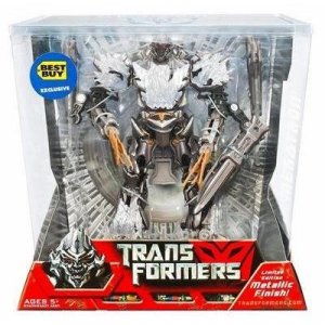
Later packaging variations, such as for the Premium Series, would use foil silver (bearing that subline name, replacing the Automorph callout) for the arc around the bubble/window, also replacing the nameplate with bright silver. This is after the first two (not actually labeled as Premium Series) Best buy exclusives Megatron and Ratchet, took on unique packaging of their own, being packed in robot mode in display-friendly large-window boxes. These had smaller versions of the flared base, trapezoid-on-trapezoid style design that Classics packaging-themed Masterpiece Skywarp would also get, but with a rearranged version of the movie packaging's red elements (and nameplate, headshot) at the bottom front.
The later Allspark Power subline imprint played with the base packaging design a bit, with the bordering arc electrified in blue and changing the backdrop for the figures to an energized Allspark cube, surrounded by blue tendrils creating a bright field of energy. An energized Allspark cube render would also be visible on the back of the card/box off to the side (the tech spec colors also shifted blue from the original warmer colors, a nice touch), with the Earth curvature arc still the main backdrop graphic. Cybertron redecos would reuse the graphics from their original line for the Cyber Key callouts (sadly, the Scout class redecos got no headshot art).
In terms of packaging shifts partway through the line, this was between Cybertron in the "small changes for subline imprint" sense and Energon/Universe's "change the card color enttirely", maintaining a degree of visual consistency that was juiced by some novelty. As with Cybertron, I can remember not questioning this at the time -- why bother when the original design was so strong -- but it does make sense to cement this new impression. This would not quite work out the same way even one movie later; I remember being very burned out by ROTF packaging. Not even necessarily that that did anything wrong (although it doesn't really touch the quality of this movie's), just... two extended runs in a row can be tough (especially since both were so heavy on the red... as was the Universe 2.0 toyline that ran alongside them).
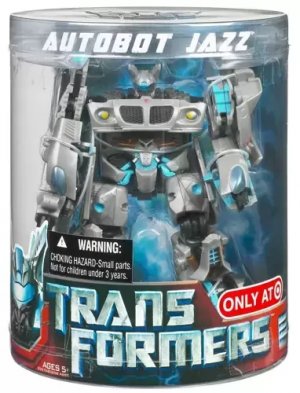
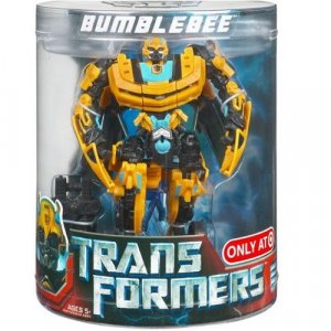
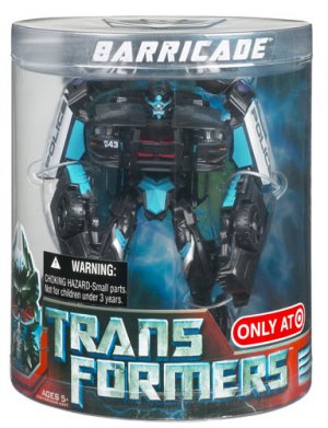
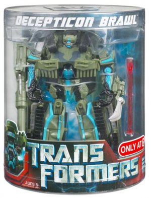
Some Allspark Power-era exceptions were deco-tweaked reissues of Deluxes with blue paint accents, which were packed in robot mode in full clear cylinders (with the standard packaging elements mostly confined to a strip at the bottom). Again, different stores all wanted in on the action, and Target (whose these were) didn't shy away from distinct packaging formats that would add visual interest.
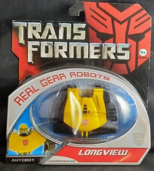
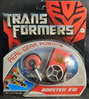
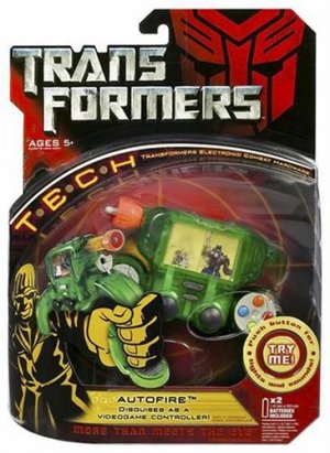
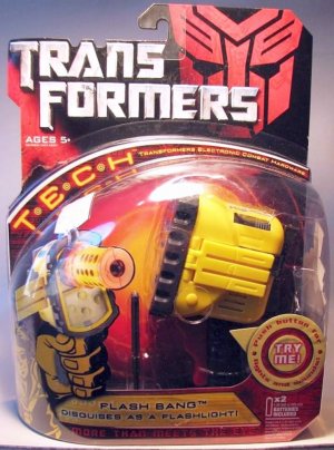
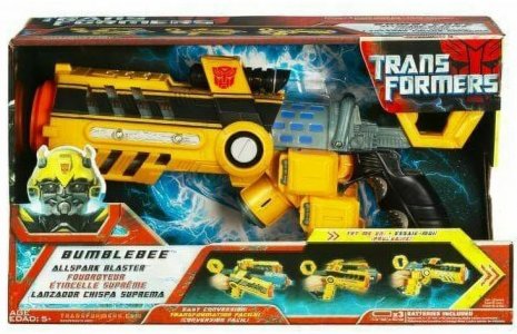
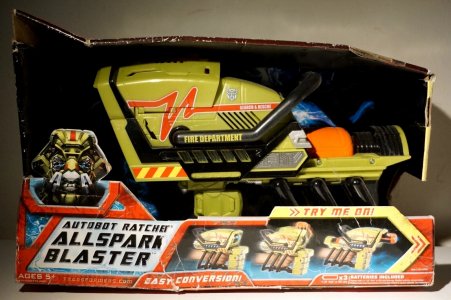
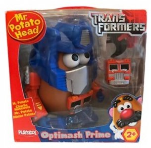
The core packaging look would be applied to some sublines (some contemporaneous and some later in the line's life cycle), like Real Gear Robots, T.E.C.H, roleplay items, nd even the Mr. Potato Head tie-in release, Optimash Prime (if only for the red on the box, the shadowed faction symbol, and the movie logo).
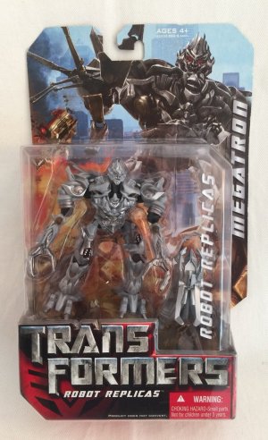
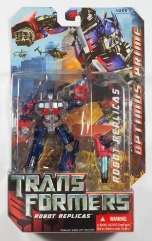
One departure from the packaging look was the non-converting Robot Replicas subline, which distinguished itself by having a squarish bubble without the signature curve, packing figures in robot mode (well, their only mode), and favoring a bright and busy backing card that was entirely taken up by a posed character render and a lot of text on the front (Robot Replicas twice, the character's name big on the backing card). I sometimes wonder what might've happened if the main line stuck with the altmode packaging but used similar cards. Maybe it wouldn't have worked as well.
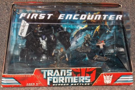
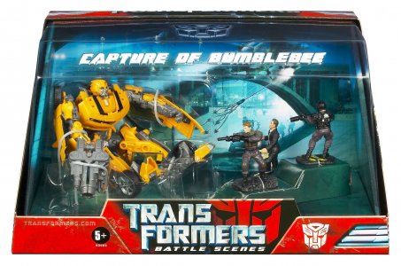
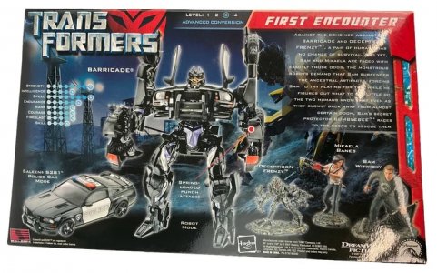
Screen Battles was a notable latter addition to the line, taking the toyline's design elements and applying them to a "display box" diorama structure. In what would be a sort of precursor to Studio Series' backdrop pack-ins, Screen Battles included a simple backdrop against which toys were posed in the package, all covered in a clear plastic shell that had the name of the scene embossed and picked out in white up top. The backdrop image would also take the place of the Earth-surface backdrop from standard packaging on the back of the box.
One interesting thing about the movie line is how it was a unified effort in the US and Japan, down to identical packaging for releases in both (save for some stickers denoting Japanese release). While this is more the norm now, this was kind of unusual at the time, especially after the UT. There were some unique deco releases that were exclusive to Japan, some even coming with their own little Allspark cube, but the line and its packaging were largely the same. Some retail and exclusive releases just reused existing boxes but at least one at least had her own packaging and recolored headshot.
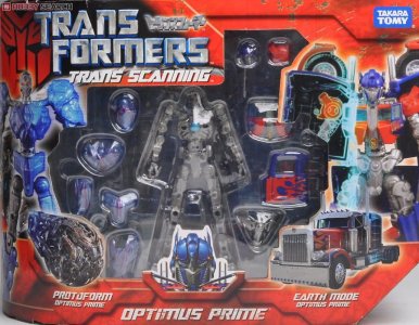
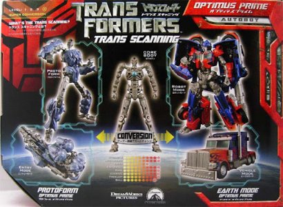
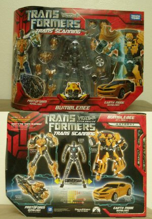
Japan did have a little Trans Scanning subline, consisting of just Optimus and Bumblebee. These had thinner versions of the curved-block boxes with the red borders more tightly enclosing a window that showed the trans-scanning skeletal frame and the kit parts; this was flanked by upsized toy images of the kit decked out in the protoform kibble and Earth altmode kibble. The back showed posed versions of the same, as well as the assembled "Entry Mode" and Earth altmode. The packaging was, like most of the imported US line, in English, except for subtitle-like Japanese translations for character names and a little blurb explaining "What's the Trans Scanning?" on the back.
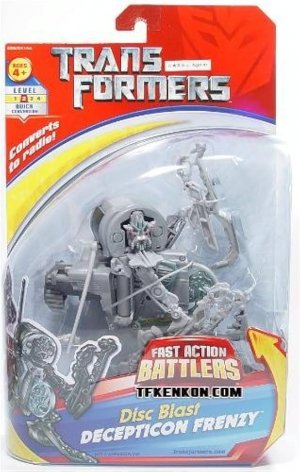
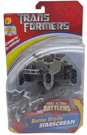
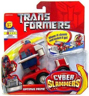
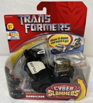
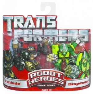
Other related sublines like Fast Action Battlers negotiated some of the packaging elements into a different, more kid-accessible overall look. This retained the mostly red card, shadowy faction sigil, movie logo, and silver backdrop, but used bright yellow and blue accents with somewhat softer-edged artwork of the robot mode. Cyber Slammers, another younger-audiences subline, also used this overall design. Robot Heroes started with mostly red packaging (and sigil) and a large, eye-catching movie logo with a clear plastic j-hook atop it, and used similarly rounded-edge, cute artwork of the paired characters.
There was a TON of product around this line, and I am missing probably 75% of it; I've meant to try and include as much of it as I could think of to illustrate the sheer scope of this new chapter in the brand's history -- as well as the pervasiveness of the line's main design elements, persisting either as is or remixed into something brighter and more accessible.
Last edited:
Oh yeah, this pushes my buttons. The movie was a hit, and I think this packaging was a hit. I've never felt anything at a line's debut quite like this one. I was there on day one when the street date for this line finally arrived. After all those months of speculation and flame wars over leaked prototypes and test shots, I don't know how to describe it but I felt something finally seeing this packaging on store shelves. I still feel it when I see the odd sample in a comic shop or wherever. We had no idea if this movie was going to be a success or not (though there were many loud saying absolutely definitely it was going to be a bomb and run everything forever), but that packaging made me feel confident.
I also had the experience of trying to describe this packaging to an oblivious non-fan who wanted to buy me a gift and not end up with a Gundam this time. Their hunt was successful, and I was told that my description helped. Just reading the logo wasn't enough for some reason (hence all the Gundams) but I mentioned the half curve, and that was the first thing to catch their eye in the store.
If I was able to describe this packaging and get what I wanted, kids were able to describe this packaging and get what they wanted. Hasbro hit a home run here.
We had no idea if this movie was going to be a success or not (though there were many loud saying absolutely definitely it was going to be a bomb and run everything forever), but that packaging made me feel confident.
If I was able to describe this packaging and get what I wanted, kids were able to describe this packaging and get what they wanted. Hasbro hit a home run here.
I love these two points. I'm right there with you in being weary of the online discourse (locally I was in a bubble of hype and positive vibes because we were partnering with the distributor to promote the toyline and movie, but elsewhere, even here, woof), and just wanted to Get There Already. Seeing the toys on shelves was strangely comforting and even boosting. Like you KNEW you could show anyone these and they'd take it seriously. And it was instantly recognizable with a few anchor elements that stuck with you and set it firmly apart from other stuff on shelves at the time.
There was just something about the way everything just... fell into place with this packaging. It was attention-getting, but also cool enough to let you come to it rather than flag you down. It lent the brand a more modern, grown-up feel, but didn't show any shame about it being a toyline for kids (not with those clunky gimmick callouts everywhere, and Try Me lights and sounds still being a thing). Part of this was letting the realistic sculpts and the toy photos of robot mode speak for themselves, with no artwork other than the headshot (which in turn gave them a face and cued them up enough as characters). The age-old formula of tickling the imagination and leaving it at that, making a person want to buy the toy to find out how it got from one mode to another was definitely the way to go.

