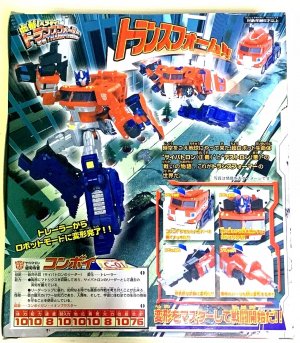
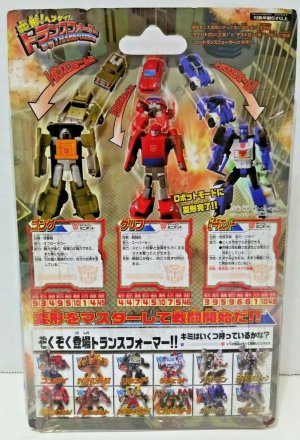
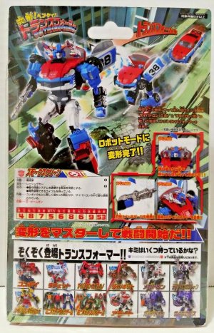
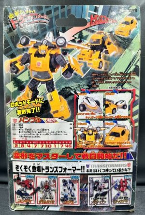
I still don't know what Alternators Smokescreen looks like. Every camera captures its blue differently.
You are using an out of date browser. It may not display this or other websites correctly.
You should upgrade or use an alternative browser.
You should upgrade or use an alternative browser.
Outside? Inside? No, thinking ABOUT the box: your thoughts on Transformers packaging
- Thread starter lastmaximal
- Start date
I got a Dollar Store KO of the Victory Saber set and didn't wind up getting the original. Skipping that, Reverse Convoy, and the Beasts is one of my biggest collecting regrets from that era.I still deeply regret not getting Robot Masters Victory Saber before it became insanely expensive. It's weird how that line is so expensive while it otherwise seems to be so under appreciated.
I was also caught off guard by how expensive Robotmasters stuff got. I think it fluctuates for some pieces, but it's generally more than I'm expecting or comfortable with.
I remember spotting the Victory Saber 2-pack for actually a decent price shortly before the pandemic (this has become my sense of time), so I'm a bit thrown by prices I see now. It took me a while before I found an R-Blade and Wingstun I was happy with. And the latter was part of a fodder lot. I'm glad I got the ones that I did at the time, but I too never managed to go back for a Reverse Convoy.
I remember spotting the Victory Saber 2-pack for actually a decent price shortly before the pandemic (this has become my sense of time), so I'm a bit thrown by prices I see now. It took me a while before I found an R-Blade and Wingstun I was happy with. And the latter was part of a fodder lot. I'm glad I got the ones that I did at the time, but I too never managed to go back for a Reverse Convoy.
Last edited:
That's probably because the Takara version is one of the instances where the toy actually looks different from the English version. While the US version uses a flat blue plastic, all the blue of the Takara version has a metallic shine to it.I still don't know what Alternators Smokescreen looks like. Every camera captures its blue differently.


It's so PRETTY. I can't believe I don't own one. MP Blurstreak is kind of tiding me over at the moment.
And that shininess got lot of fans angry at Hasbro for going with flat blue instead.
Hasbro's Alternators Silverstreak had the same shiny silver that Takara's Binaltech Streak had, so it's kinda irksome that Hasbro didn't think to use the same shininess for Smokescreen.
Additionally, one less notable difference between the Alternators and Binaltechs is that the former all had dashboards with the steering wheel on the left side of the cars like on American vehicles, while some of the latter actually had mirrored dashboards with the steering wheel on the right side like on Japanese and European cars.
That decision was probably made by a bean counter who had no earthly idea what the product actually was or who it was for. It was just another price on a spreadsheet, and it looked a little high.
I remember when those Binaltech Smokescreen pics first dropped. The fandom (rightfully) lost its mind.
It's strange. At the time, I was like 14-15 and I wanted one so bad but never got one. Then my collector habits evolved in such a way where I don't think I need one.
Strange for one of my earliest cases of OMG AWESOME NEW THING MUST HAVE
It's strange. At the time, I was like 14-15 and I wanted one so bad but never got one. Then my collector habits evolved in such a way where I don't think I need one.
Strange for one of my earliest cases of OMG AWESOME NEW THING MUST HAVE
Cybertron is great. It manages to be stylish, communicate the features and story of the line clearly and showcase the toy perfectly. I love the weird polygon shapes, anything but squares please. Universe feels very much like a continuation from Robots in Disguise.
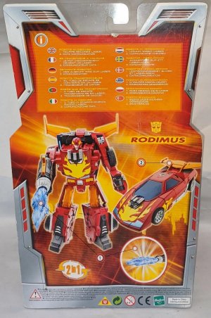
I always find multilingual packaging being such a big deal for americans pretty funny, given most of the rest of the world has been dealing with it since the beginning of the franchise. I get it, though, it's ridiculous to want to cram more than three languages in a single box. I miss the bios. When they tried to do them digitally during Legacy, anything beyond the first wave didn't work in my country, and because of how the QR redirected you I couldn't access the US version of the site. I'm sure there was some way to avoid the redirect, but that sure is a lot of work to get to see the toy's bio.
I believe the purpose of the circular cutout on the top of the Robotmasters packaging is not so much to let people see the figure from the top as it is to let light into the packaging so that the figure is more visible and better illuminated inside the box. Studio Series did something similar with its packaging before they removed the plastic windows.
I'm surprised that they didn't use the model car bubble style of packaging from the get-go, honestly. I'd never seen the Kiss Players packaging before, that character art is questionable as hug, wow. I'd seen it out of context in the wiki, but I had no idea it was box art.
Cybertron was when they finally refined the UT ideal of chunkiness, articulation, and gimmickry.
I kind of wish they'd gone back to redo some of the Armada designs at the tail end of Cybertron, but that wasn't how the brand was functioning back then.
I kind of wish they'd gone back to redo some of the Armada designs at the tail end of Cybertron, but that wasn't how the brand was functioning back then.
Multilingual packaging is just always going to be tricky to balance with having a few different kinds of text (especially back then, when line story/rationale had to be part of it) and an uncluttered layout. Of those three, Hasbro's typically picked two, and sometimes even with just one type of text (the line story paragraph) it was still cluttered (this would typically be the case for Energon and early Universe). Cybertron packaging does have the unfair edge of not having to play by those rules, but it also felt in general like every aspect of the line was falling into place, including how to best lay out the packaging to highlight things without a cluttered feel (and now they had even more control over that).
Kiss Players is a bit frustrating. I'm surprised by how much I like the art style. I was always aware of it but never really looked at it so closely or so often, but the painterly style is so unusually... Pleasant? Chill? Not edgy or intense, not action oriented.
There's also the way they executed the colored art/text on white packaging -- I guess I really like white packaging when the other elements around it come together (I've spoken about Cybertron, but BW2 did it well too.) It's just such a fresh look, with the soft tones in the colors and the almost magazine like graphic design. Thin fonts, simple color scheme. Nothing else at the time looked like it, and if it were depicting something else (and, y'know, not supported by media that seemed to revel in it) it would've been lovely. I kinda want to see something similar based on those chibi toon shorts they did to promote the Bumblebee movie, with Bee and Charlie just goofing around, depicted in this watercolor-y style.
Asterisk was also cool; I never really saw much of it here at the time (again, Binaltech/Alternators was not something I could keep up with alongside the main line), so I'd forgotten how much they did for the presentation. The old "human standing on the giant robot's shoulder" visual is really charming, especially when it's not the nth time it's used with Optimus Prime. Based on what little I've seen of the stories via the wiki, it's exactly the kind of wholesome peacetime shenanigans I was hoping to see, without any phallic-tongued nonsense.
Last edited:
I agree that stylistically it's very unique and cool. It's just that I find it ruined by that box art, or rather, its subject. But I'm totally down for "chill" Transformers. Them giving guns and guns only to everyone, for example, has always been a pet peeve of mine. Siege Ratchet and the upcoming Alpha Trion are the only recent exceptions to that rule I can think of, despite Transformers in general and Autobots in particular actually having a pretty wide breadth of occupations and functions.
What's really cool in an uber-nerdy sense about Autorooper's packaging is what's on the inside of the box. The interiors of that set had something that the Convoy and Hot Rodimus sets did not have: Lore!


More pics at the bottom of this gallery page and the top of this gallery page.


More pics at the bottom of this gallery page and the top of this gallery page.
Thanks for that! Insane how much they packed in there.
The encyclopedia on the bottom and side even provided the first in-universe explanation for why Daniel never aged between the time of TFTM and Season 3 of the G1 cartoon, as the Japanese dub of Season 3 moved it to be set in the year 2010 instead of 2006, while TFTM was kept in 2005, creating a five-year time gap between the two that did not originally exist in the English version, and thus required an explanation for why Daniel never aged during those five years.
According to the encyclopedia entry, Daniel was in an accident at some point after TFTM but right before or at the start of Kiss Players (which is set in 2006) and was put into Cold Sleep so that his body could heal from its injuries. This stasis-like healing process kept his body from aging during that time.
According to the encyclopedia entry, Daniel was in an accident at some point after TFTM but right before or at the start of Kiss Players (which is set in 2006) and was put into Cold Sleep so that his body could heal from its injuries. This stasis-like healing process kept his body from aging during that time.
But I'm totally down for "chill" Transformers. Them giving guns and guns only to everyone, for example, has always been a pet peeve of mine. Siege Ratchet and the upcoming Alpha Trion are the only recent exceptions to that rule I can think of, despite Transformers in general and Autobots in particular actually having a pretty wide breadth of occupations and functions.
Well, TR Seaspray *did* come with a pizza delivery box, so there's that!
The 2000s, X: The Space Between, 3
The 20th anniversary was definitely an occasion that Hasbro and Takara capitalized on, and the circumstances were ripe for them to be able to do that. The brand was riding high on a contemporary main line that the kid audience was heavily into, lapsed fans were drifting back and continuing older fans had found more things in the brand to keep investing in, and the brand was on solid footing 20 years from its inception. What's not to celebrate?
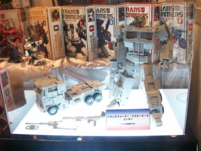
Fittingly, the main icon of the occasion was a 20th Anniversary "Masterpiece" Optimus Prime, revealed in the same time frame as the Binaltech/Alternators series, and sparking a strangely deep, Velveteen Rabbit-esque nostalgia and affinity that made people unironically go "I had that as a kid". There would be improvements and revisions(and indecisions which a minute will reverse) with subsequent versions, but this landmark toy showed us what was possible -- and what Hasbro and Takara would occasionally be willing to invest in.
And indeed, "what was possible" was a whole line of these "Masterpiece" figures, high-end toys that brought the classics back in faithful, upgraded forms with premium detailing and engineering. The line would grow very slowly over the 2000s before Takara would really lean into it (with Hasbro occasionally importing and innovating, colorwise at least, on their own) in the 2010s on. This long runner of a toyline had packaging that tended to stay the same in Japan, while taking on its contemporary toylines' looks in the US. This current segment will focus on the Japanese packaging, which has comparatively largely remained consistent.
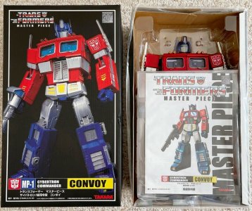
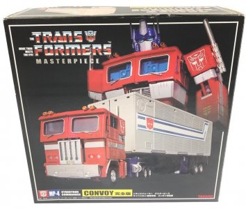
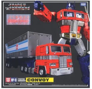
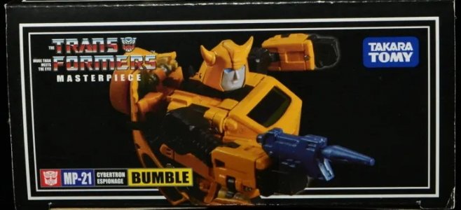
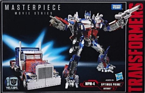
The box orientation tended to vary, with MP-1 Convoy (packed in robot mode) being a vertical box and the later MP-4 and MP-10 Convoy (packed in robot mode with trailers) having more even, squarish boxes, and the cars (packed in altmode) typically getting horizontal/wide boxes.
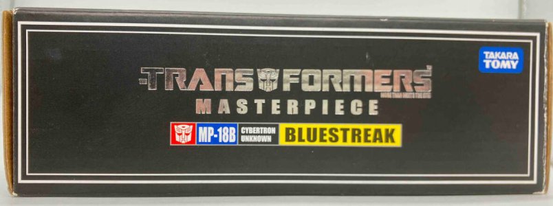
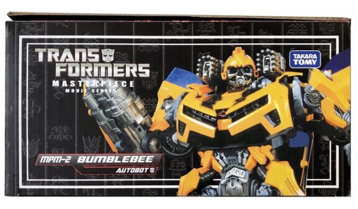
Other sides of the box would get similarly understated treatment, with no extensive blurbs or co-sells. Each side would typically get a closer look at the toy in robot and altmode, and the top would have just the Masterpiece logo and the name/number nameplate bar. While this did kind of have the effect of icing out the rest of the line (co-sells tend to help market other items as well as create the vibe of an ecosystem), it did also help make each release feel self-contained, more like an event.
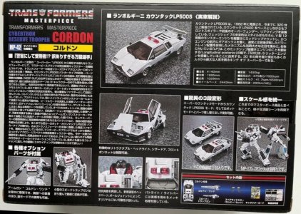
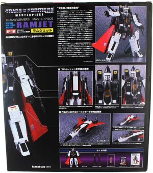
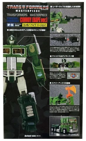
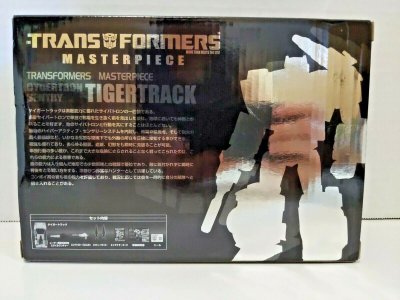
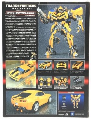
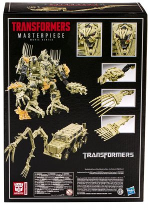
The back of the box gets the typical detailed Takara treatment, with a large robot mode photo and many insets showing the details and features that these higher-end toys are loaded with. A blurb also describes the toyline and the approach taken to create the figure. (MP-1 Convoy's includes a small look at his original G1 box art, a nice touch.) There would also be a profile for the character represented by the toy, which seemed to get more detailed as the line went on. Some releases would change things up, giving the robot mode a front view that would be linked by lines to the insets. As time went on, an inset detailing the accessories included would also be part of this layout.
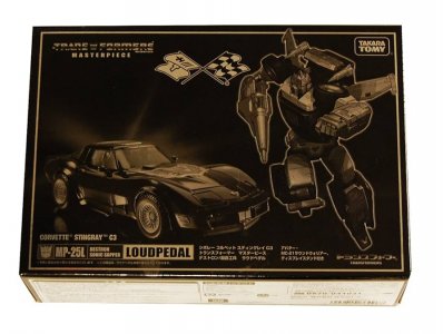
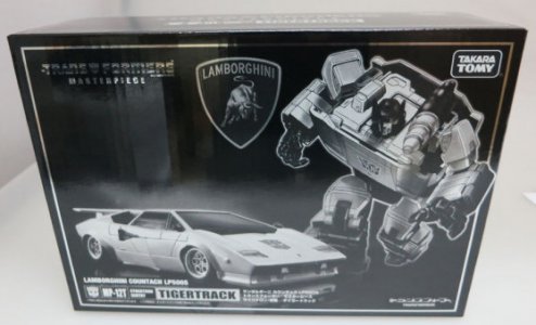
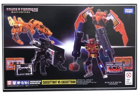
This being a high-end mainly-Takara line, Masterpiece would be no stranger to "special editions" (per the wiki). These mold-maximizing releases would typically be assigned the original release's number plus a unique initial or symbol signifier (i.e., MP-1 Convoy vs. MP-1L Last Production Convoy, or MP-31 Delta Magnus vs MP-14C Clampdown), although regular releases (per the wiki) did get that too (MP52+ Thundercracker, MP56+ Riggorus). Sometimes these would get unusual packaging, such as Loudpedal and Tigertrack getting monochrome, reflective/foil-like packaging. MP-1516E also gave us the biggest little multipack so far, with four cassettes in a neat little box.
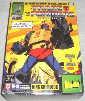
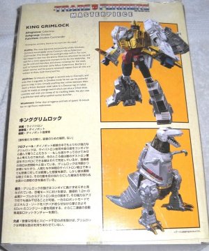
Particularly noteworthy was the unique packaging given to MP-8X King Grimlock, which packed the comic-inspired figure in a similarly comic-designed box that emulated the style of a classic Marvel Comics cover (with the back evoking a Transformers Universe profile-book page, with profiles in both English and Japanese).
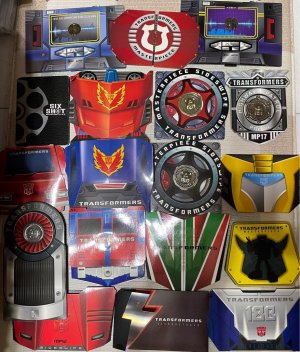
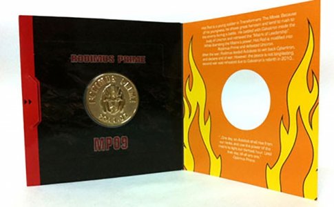
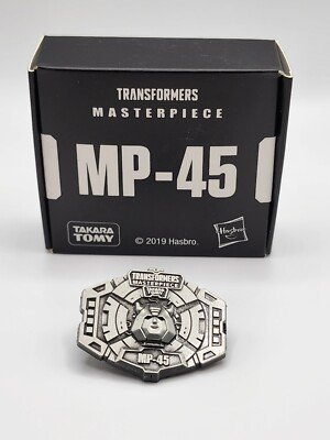
Special mention here might as well go to the neat packaging for the collector coins that would come with some Masterpiece and other collector-oriented releases, particularly those released in Asian markets outside Japan. These would typically be in simple opening-flap affairs with elaborate colored designs, themed after the character or set they were paired with; the later pin replacements would be in simpler black-and-white boxes.
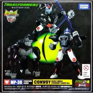
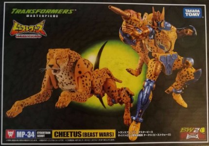
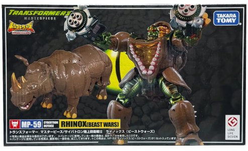
As the line grew, the Masterpiece treatment would also reach different corners of the Transformers brand. Later releases branched out from G1 into Beast Wars; the boxes for these characters would replace the radiant spotlight with the yellow-green dino-eye from the packaging, with the scales serving as a gray background. Character names on the familiar yellow bar would have (Beast Wars) appended to them. These releases also got the Japanese BW logo (and changed the "Transformers" half of the Masterpiece logo to match the US BW logo), and for the ones released in the appropriate year a small "BW20" logo as well.
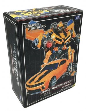
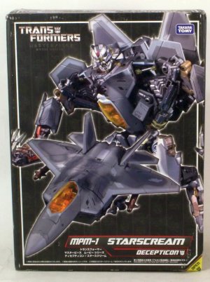
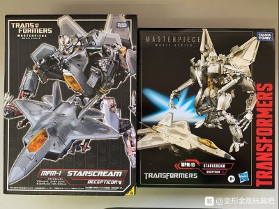
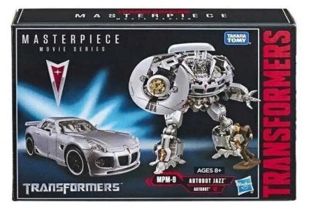
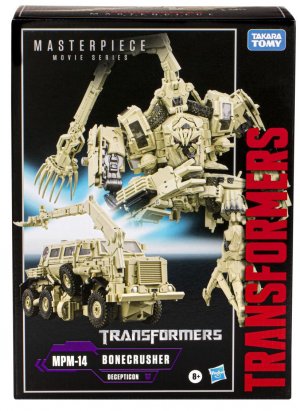
The live-action movies also got some Masterpiece attention, still mostly keeping to the same black-box presentation. The first iteration would retain the same logo (plus "Movie Series") but have a new nameplate format with angular borders. The initial releases (repurposed mainline molds) would be followed by a more dedicated, more regularly-paced line of releases later on. These early releases, MPM-1 (2010 Leader class Starscream) and MPM-2 (Battle Ops Bumblebee mold) had packaging that was informed by the Revenge of the Fallen packaging design, with desaturated columns of Cyberglyphics providing the background.
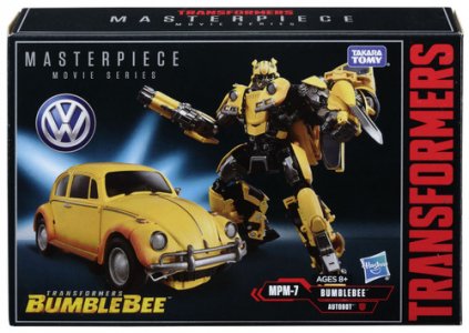
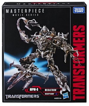
The later (2017 on) movie-based Masterpieces would pick up a more even pace, and use all-new sculpts. The typical features would also be visible on the front, such as the vehicle manufacturer logo in some cases, the new Masterpiece Movie Series logo (now all the same slender font), the relevant movie's logo, and for the 2017 releases a "10th anniversary" logo for the movies. There would also be a different nameplate format that furthered the earlier Masterpiece Movie Series', and the then-contemporaneous red TRANSFORMERS text running up the right side (not enclosed by the white border). These would also notably bear both the Takara Tomy and Hasbro logos on the front of the box.
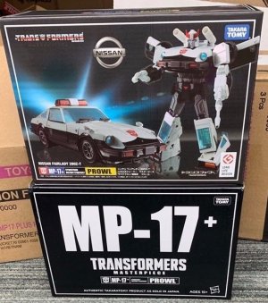
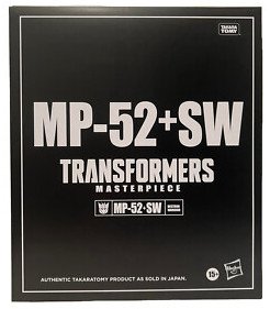
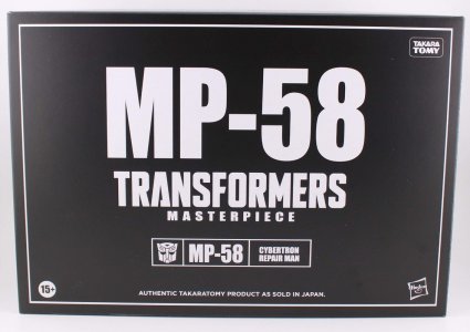
The wiki notes that at some point both releases would sync up thanks to the ~2018 brand unification approach, releasing Masterpiece items simultaneously for Japan and the US. For importation to the US, releases would also get black slipcases; these would typically be the same simple white text on black, mainly the character's number label in large font on the front (with the sigil/number/function below), with a note attesting that this was "authentic Takara Tomy product as sold in Japan".
The Masterpiece line would be concluded in 2022, to be replaced with MPG (Masterpiece G, for gattai/combine, giant, and great).
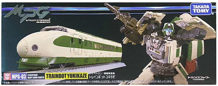
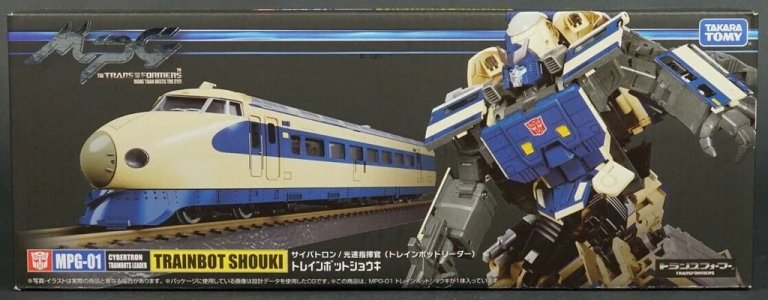
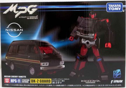
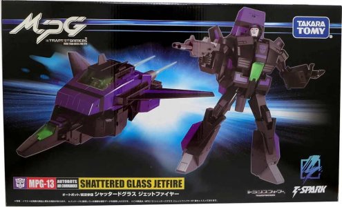
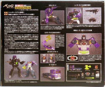
This line would look a lot like its predecessor, mainly just replacing the white box border with a blue stripe (and a thinner blue stripe) running across the top, and overlaid with the new MPG logo in foil. The T-Spark logo would be added to the box front as well. The box back approach would also largely be the same, also continuing the later-MP practice of adding an inset with a flat lay/knolled display of the accessories.
Next: You have to realize, eventually it'll be time to return...
The 20th anniversary was definitely an occasion that Hasbro and Takara capitalized on, and the circumstances were ripe for them to be able to do that. The brand was riding high on a contemporary main line that the kid audience was heavily into, lapsed fans were drifting back and continuing older fans had found more things in the brand to keep investing in, and the brand was on solid footing 20 years from its inception. What's not to celebrate?
Fittingly, the main icon of the occasion was a 20th Anniversary "Masterpiece" Optimus Prime, revealed in the same time frame as the Binaltech/Alternators series, and sparking a strangely deep, Velveteen Rabbit-esque nostalgia and affinity that made people unironically go "I had that as a kid". There would be improvements and revisions
And indeed, "what was possible" was a whole line of these "Masterpiece" figures, high-end toys that brought the classics back in faithful, upgraded forms with premium detailing and engineering. The line would grow very slowly over the 2000s before Takara would really lean into it (with Hasbro occasionally importing and innovating, colorwise at least, on their own) in the 2010s on. This long runner of a toyline had packaging that tended to stay the same in Japan, while taking on its contemporary toylines' looks in the US. This current segment will focus on the Japanese packaging, which has comparatively largely remained consistent.
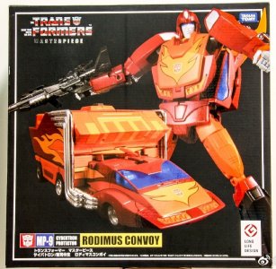
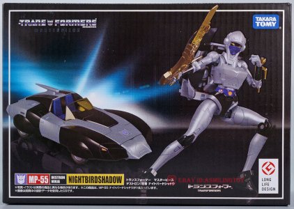
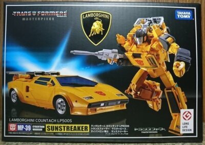
Takara's Masterpiece packaging has typically been a handsome black windowless box, with the front showing off toy pictures in robot and altmode, typically with a radiating blue-white spotlight behind them. The traditional sigil/number/name on yellow bar for the character is on our lower left, below a label denoting the car manufacturer and model for licensed vehicle modes where applicable (in such cases the manufacturer logo is usually also prominent on the packaging). The understated Masterpiece logo (the classic G1 English logo with bold sans serif "Masterpiece" below it) is prominently visible up top, and all of this is tied together by a solid white border. (Another logo that would appear on later releases and reissues of older ones would be the Long Life Design logo, as the line had won this award in 2016 from the Good Design Awards.)The box orientation tended to vary, with MP-1 Convoy (packed in robot mode) being a vertical box and the later MP-4 and MP-10 Convoy (packed in robot mode with trailers) having more even, squarish boxes, and the cars (packed in altmode) typically getting horizontal/wide boxes.
Other sides of the box would get similarly understated treatment, with no extensive blurbs or co-sells. Each side would typically get a closer look at the toy in robot and altmode, and the top would have just the Masterpiece logo and the name/number nameplate bar. While this did kind of have the effect of icing out the rest of the line (co-sells tend to help market other items as well as create the vibe of an ecosystem), it did also help make each release feel self-contained, more like an event.
The back of the box gets the typical detailed Takara treatment, with a large robot mode photo and many insets showing the details and features that these higher-end toys are loaded with. A blurb also describes the toyline and the approach taken to create the figure. (MP-1 Convoy's includes a small look at his original G1 box art, a nice touch.) There would also be a profile for the character represented by the toy, which seemed to get more detailed as the line went on. Some releases would change things up, giving the robot mode a front view that would be linked by lines to the insets. As time went on, an inset detailing the accessories included would also be part of this layout.
This being a high-end mainly-Takara line, Masterpiece would be no stranger to "special editions" (per the wiki). These mold-maximizing releases would typically be assigned the original release's number plus a unique initial or symbol signifier (i.e., MP-1 Convoy vs. MP-1L Last Production Convoy, or MP-31 Delta Magnus vs MP-14C Clampdown), although regular releases (per the wiki) did get that too (MP52+ Thundercracker, MP56+ Riggorus). Sometimes these would get unusual packaging, such as Loudpedal and Tigertrack getting monochrome, reflective/foil-like packaging. MP-1516E also gave us the biggest little multipack so far, with four cassettes in a neat little box.
Particularly noteworthy was the unique packaging given to MP-8X King Grimlock, which packed the comic-inspired figure in a similarly comic-designed box that emulated the style of a classic Marvel Comics cover (with the back evoking a Transformers Universe profile-book page, with profiles in both English and Japanese).
Special mention here might as well go to the neat packaging for the collector coins that would come with some Masterpiece and other collector-oriented releases, particularly those released in Asian markets outside Japan. These would typically be in simple opening-flap affairs with elaborate colored designs, themed after the character or set they were paired with; the later pin replacements would be in simpler black-and-white boxes.
As the line grew, the Masterpiece treatment would also reach different corners of the Transformers brand. Later releases branched out from G1 into Beast Wars; the boxes for these characters would replace the radiant spotlight with the yellow-green dino-eye from the packaging, with the scales serving as a gray background. Character names on the familiar yellow bar would have (Beast Wars) appended to them. These releases also got the Japanese BW logo (and changed the "Transformers" half of the Masterpiece logo to match the US BW logo), and for the ones released in the appropriate year a small "BW20" logo as well.
The live-action movies also got some Masterpiece attention, still mostly keeping to the same black-box presentation. The first iteration would retain the same logo (plus "Movie Series") but have a new nameplate format with angular borders. The initial releases (repurposed mainline molds) would be followed by a more dedicated, more regularly-paced line of releases later on. These early releases, MPM-1 (2010 Leader class Starscream) and MPM-2 (Battle Ops Bumblebee mold) had packaging that was informed by the Revenge of the Fallen packaging design, with desaturated columns of Cyberglyphics providing the background.
The later (2017 on) movie-based Masterpieces would pick up a more even pace, and use all-new sculpts. The typical features would also be visible on the front, such as the vehicle manufacturer logo in some cases, the new Masterpiece Movie Series logo (now all the same slender font), the relevant movie's logo, and for the 2017 releases a "10th anniversary" logo for the movies. There would also be a different nameplate format that furthered the earlier Masterpiece Movie Series', and the then-contemporaneous red TRANSFORMERS text running up the right side (not enclosed by the white border). These would also notably bear both the Takara Tomy and Hasbro logos on the front of the box.
The wiki notes that at some point both releases would sync up thanks to the ~2018 brand unification approach, releasing Masterpiece items simultaneously for Japan and the US. For importation to the US, releases would also get black slipcases; these would typically be the same simple white text on black, mainly the character's number label in large font on the front (with the sigil/number/function below), with a note attesting that this was "authentic Takara Tomy product as sold in Japan".
The Masterpiece line would be concluded in 2022, to be replaced with MPG (Masterpiece G, for gattai/combine, giant, and great).
This line would look a lot like its predecessor, mainly just replacing the white box border with a blue stripe (and a thinner blue stripe) running across the top, and overlaid with the new MPG logo in foil. The T-Spark logo would be added to the box front as well. The box back approach would also largely be the same, also continuing the later-MP practice of adding an inset with a flat lay/knolled display of the accessories.
Next: You have to realize, eventually it'll be time to return...
Last edited:
The 2000s, 5: Classic Hasbro
The whole time the Unicron Trilogy was rolling (and indeed before, as a pervasive rumbling underneath), there was talk of a live-action movie being developed. This undertaking missed the 20th anniversary mark, but eventually got some momentum under it and a calendar started taking shape for a summer 2007 release (pushed back from a late 2006 plan). This left a window in between what became the final leg of the Unicron Trilogy (Cybertron) and the Movie line, and this was filled with a line dedicated to revisiting and updating Generation 1. This speaks to where the brand team was at this time, where such a sure seller of a nostalgia mine was last-minute filler between lines that continued to build the road forward. There's a totally different balance these days (and both are solid status quos I enjoy, to be clear), but it's interesting to see the roots -- and, looking back, to see how a line intended to be a stopgap of sorts took on a life of its own, just like the previous one in RID2001 had.
Classics kicked off what fans would call the CHUG cycle (Classics, Henkei, Universe, Generations, with modern lines basically furthering Generations), and interestingly even the packaging had elements that would echo in lines to come.
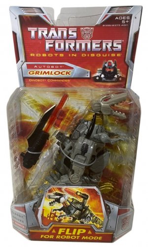
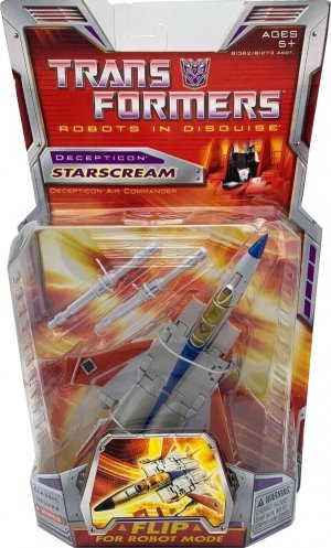
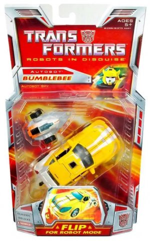
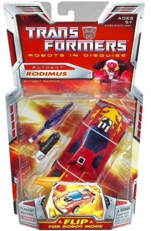
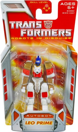
As befits its planned status as a filler line, Classics started out modest, with just Deluxes and Voyagers, joined by Legends with Cybertron redecos and Mini-Con packs with new molds intended for Cybertron. These carded figures were on predominantly red cards with beveled, brushed-metal panels around the edges, with vents and faction-colored panels cut into them. These formed very tech/industrial-feeling borders that tended to follow packaging edges and add more corners and cutouts to them; these added good framing overall but sometimes felt a bit distracting.
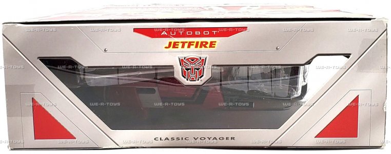
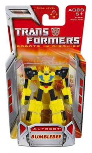
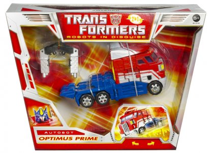
The Deluxes were vertical cards shaped similarly to the Cybertron tapering trapezoid, with the toy packaged in vehicle mode. The top of the card had the cardboard dipping to form a lower edge, with clear plastic filling the space to form the J-hook/hang tab for hanging on pegs. Fancy. The logo was fairly straightforwardly aligned with the nostalgic nature of the line: the classic beveled Transformers logo (faction sigil included, based on the toy) with "Robots In Disguise" in yellow underneath. "Classic" only really appeared in a lower corner of the front in-bubble card (and on a panel of the boxed figures), labeling the toy as Classic Deluxe or Classic Voyager.
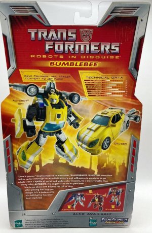
The character name, below the faction in a faction-color cut-out, was in yellow-glow-bordered faction-color text on a silver nameplate, next to a headshot of the robot mode fading in from the background (no character art). Interestingly, the character's function (Bumblebee has "Autobot Spy") is listed underneath the nameplate, a feature not commonly seen at that point.
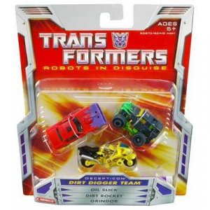
A lot of this was retained for the Legends and Mini-Con cards, which were generally smaller versions of the Deluxe cards. The Mini-Con Team packs would list all members' names in the center below the team name, and the back would give one team bio and individual Technical Data.
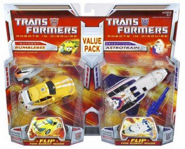
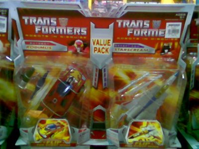
Conversely, there would also be "larger" versions of these, which were basically (similar to how Cybertron and Universe did it) 2-packs of Deluxes on conjoined cards, with a label proclaiming them as a Value Pack.
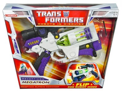
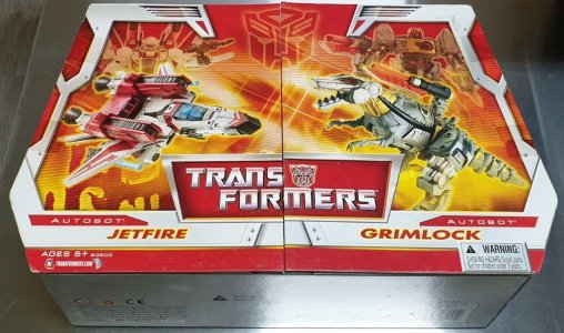
Boxed figures (Voyagers) had much the same treatment, with a predominantly red design with the logo (such as it was) in the top center, above a large window (that tended to spill over to the sides) for the toy. The nameplate and the headshot are on our lower left. Like the Deluxe boxes, these were also similar in shape to their Cybertron predecessors, except for being flat instead of faceted on the front. The top panels had fairly large cutouts for clear windows as well. There were also Deluxe/Voyager and Voyager/Voyager two-packs, which received longer/wider versions of the Voyager box, with the two figures packed in robot mode and with large foldout panels (more on this below) covering the front window.
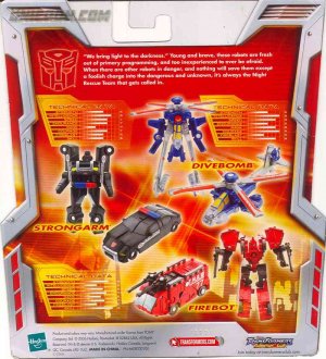
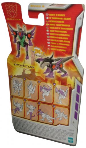
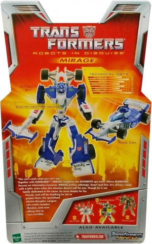
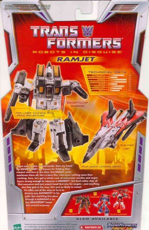
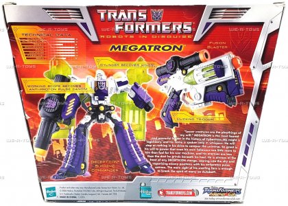
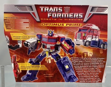
The back of the packaging (still back to English-only in relevant markets) tended to feature large pictures of either mode, with callouts for accessories and features, and labels for the altmodes (Bumblebee is a "Cruiser", and Optimus' cab is a "Tractor Trailer". Sure.). Very welcome among these was a sizeable bio (and quote!) and Technical Data. Co-sells would have a corner to themselves, and the neat new logo for the Transformers Collectors Club (and a keyboard key-esque logo for Hasbro.com) were also clearly visible. Mutlilingual cards would dispense with most of this, in now-familiar fashion, to fit the multitude of translations in.
Two notable things about Classics, other than the predominant red tone and preponderance of silver metal panels as border pieces, are [1] the use of fold-out panels with velcro closures and [2] the graphics used with the red/yellow backdrop. The latter is only really notable to me, but then, that's been the theme of this thread, no?
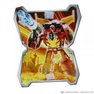
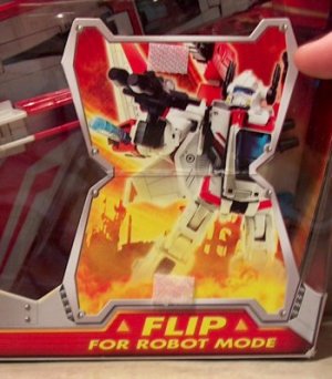
The fold-out panels were something we'd never really seen in Transformers packaging, due to a number of factors that probably included cost for the specific extra shapes and velcro and glue, and concerns about breakage in transit or on the shelf. But they were very neat. Deluxes and Voyagers alike received small panels on the front of the packaging that showed a toy photo of the altmode, with a helpful label inviting consumers to "FLIP FOR ROBOT MODE" (multilingual packaging just had arrows). (I flipped for the line as a whole, tbh.) Flipping the tag would show the promised mode, a nice and actually fairly unnecessary touch (particularly nice BECAUSE it was so extra).
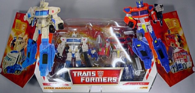
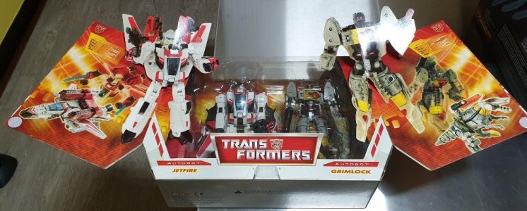
The larger two-packs would take this up an order of magnitude, with panels covering half the box front opening like a pop-up book to reveal a large portrait of the toy on its side in robot mode (in a pose not really repeated from any of the other toy photos on the packaging), with Technical Data and a simple transformation sequence!
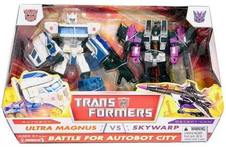
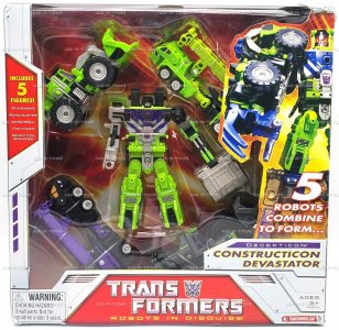
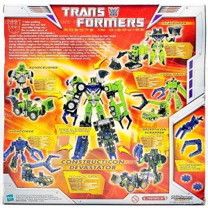
Sadly, this wasn't every two-pack, as the Ultra Magnus vs. Skywarp "Battle for Autobot City" pack was basically a wider version of the Voyager box (but with the trapezoid inverted, flaring out toward the base before tapering again). Likewise, the 5-pack for Constructicon Devastator avoided any such fanciness, being a straightforward box that packed the four limbs in altmode around robot-mode Scavenger.
The red-and-yellow backdrops are somewhat interesting in terms of the CHOICE of graphics to be used. These were, well, a bit unexpected. While the front of the card/inner box tray tended to have huge lens flares with crisscrossing lines to spotlight the altmode-packaged toy with not much more visible, the back of the packaging -- especially on the boxed figures -- tended to show us a bit more. Rather than the usual abstraction of a grid or central element that provided a glowing spotlight, the Classics card used a silhouette of what seemed to be a (ruined?) cityscape, with various archways and vertical structures, set at an angle. Overlaid on this was what seemed to be a scanline filter or two, with the lens flares also appearing with lower opacity. This apparently fiery battlefield was a low-key element to the Classics packaging I am still strangely drawn to.
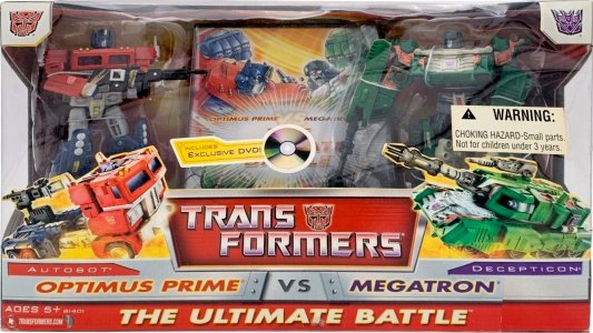
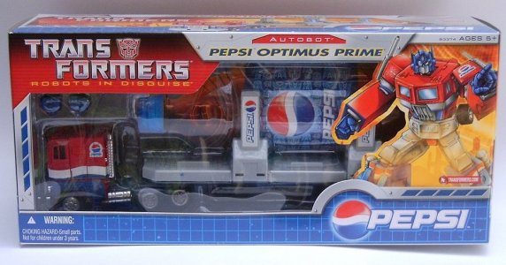
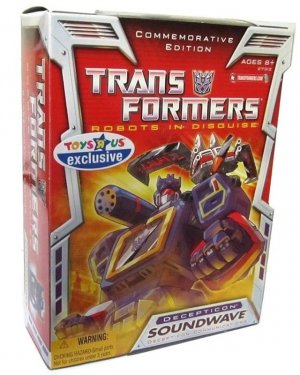
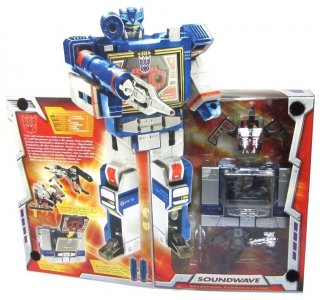
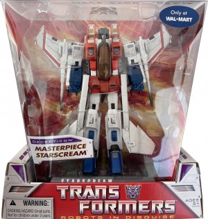
This general trade dress would be applied to a lot of other products, similar to how the Universe (2003) packaging style was. This included the Ultimate Battle 2-pack, the 2007 Pepsi Optimus Prime (which received character artwork and arefreshing cool nice-looking white-grid-on-BLUE-background twist), "Commemorative Edition" Soundwave (who also got the fancy fold-out panel treatment and character artwork, the latter a staple of Commemorative Series reissues), and Masterpiece Starscream.
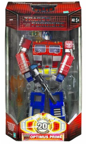
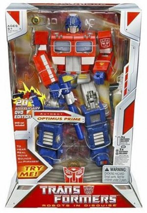
On that Masterpiece note, this packaging style was also applied to the "1986 movie's 20th Anniversary" rerelease of Masterpiece Optimus Prime (with DVD and display base), whose original packaging was decidedly different, being a more straightforward nostalgia-based look with the grid on red and a large window to show off the toy in robot mode (and a large Matrix graphic with text highlighting the 1984-2004 anniversary. The DVD-packed reissue, as well as the US release of Masterpiece Starscream, would start a trend of US-released Masterpieces generally adopting the packaging of contemporaneous main toylines. Interestingly, the packaging for Starscream in particular -- with the main "box" being a huge clear plastic window -- kind of evokes an approach to specialty packaging that would be more heavily used later on.
As noted, this was an overall packaging vibe that would influence the look of the US-based nostalgia line to varying degrees over about the next decade.
The whole time the Unicron Trilogy was rolling (and indeed before, as a pervasive rumbling underneath), there was talk of a live-action movie being developed. This undertaking missed the 20th anniversary mark, but eventually got some momentum under it and a calendar started taking shape for a summer 2007 release (pushed back from a late 2006 plan). This left a window in between what became the final leg of the Unicron Trilogy (Cybertron) and the Movie line, and this was filled with a line dedicated to revisiting and updating Generation 1. This speaks to where the brand team was at this time, where such a sure seller of a nostalgia mine was last-minute filler between lines that continued to build the road forward. There's a totally different balance these days (and both are solid status quos I enjoy, to be clear), but it's interesting to see the roots -- and, looking back, to see how a line intended to be a stopgap of sorts took on a life of its own, just like the previous one in RID2001 had.
Classics kicked off what fans would call the CHUG cycle (Classics, Henkei, Universe, Generations, with modern lines basically furthering Generations), and interestingly even the packaging had elements that would echo in lines to come.
As befits its planned status as a filler line, Classics started out modest, with just Deluxes and Voyagers, joined by Legends with Cybertron redecos and Mini-Con packs with new molds intended for Cybertron. These carded figures were on predominantly red cards with beveled, brushed-metal panels around the edges, with vents and faction-colored panels cut into them. These formed very tech/industrial-feeling borders that tended to follow packaging edges and add more corners and cutouts to them; these added good framing overall but sometimes felt a bit distracting.
The Deluxes were vertical cards shaped similarly to the Cybertron tapering trapezoid, with the toy packaged in vehicle mode. The top of the card had the cardboard dipping to form a lower edge, with clear plastic filling the space to form the J-hook/hang tab for hanging on pegs. Fancy. The logo was fairly straightforwardly aligned with the nostalgic nature of the line: the classic beveled Transformers logo (faction sigil included, based on the toy) with "Robots In Disguise" in yellow underneath. "Classic" only really appeared in a lower corner of the front in-bubble card (and on a panel of the boxed figures), labeling the toy as Classic Deluxe or Classic Voyager.
The character name, below the faction in a faction-color cut-out, was in yellow-glow-bordered faction-color text on a silver nameplate, next to a headshot of the robot mode fading in from the background (no character art). Interestingly, the character's function (Bumblebee has "Autobot Spy") is listed underneath the nameplate, a feature not commonly seen at that point.
A lot of this was retained for the Legends and Mini-Con cards, which were generally smaller versions of the Deluxe cards. The Mini-Con Team packs would list all members' names in the center below the team name, and the back would give one team bio and individual Technical Data.
Conversely, there would also be "larger" versions of these, which were basically (similar to how Cybertron and Universe did it) 2-packs of Deluxes on conjoined cards, with a label proclaiming them as a Value Pack.
Boxed figures (Voyagers) had much the same treatment, with a predominantly red design with the logo (such as it was) in the top center, above a large window (that tended to spill over to the sides) for the toy. The nameplate and the headshot are on our lower left. Like the Deluxe boxes, these were also similar in shape to their Cybertron predecessors, except for being flat instead of faceted on the front. The top panels had fairly large cutouts for clear windows as well. There were also Deluxe/Voyager and Voyager/Voyager two-packs, which received longer/wider versions of the Voyager box, with the two figures packed in robot mode and with large foldout panels (more on this below) covering the front window.
The back of the packaging (still back to English-only in relevant markets) tended to feature large pictures of either mode, with callouts for accessories and features, and labels for the altmodes (Bumblebee is a "Cruiser", and Optimus' cab is a "Tractor Trailer". Sure.). Very welcome among these was a sizeable bio (and quote!) and Technical Data. Co-sells would have a corner to themselves, and the neat new logo for the Transformers Collectors Club (and a keyboard key-esque logo for Hasbro.com) were also clearly visible. Mutlilingual cards would dispense with most of this, in now-familiar fashion, to fit the multitude of translations in.
Two notable things about Classics, other than the predominant red tone and preponderance of silver metal panels as border pieces, are [1] the use of fold-out panels with velcro closures and [2] the graphics used with the red/yellow backdrop. The latter is only really notable to me, but then, that's been the theme of this thread, no?
The fold-out panels were something we'd never really seen in Transformers packaging, due to a number of factors that probably included cost for the specific extra shapes and velcro and glue, and concerns about breakage in transit or on the shelf. But they were very neat. Deluxes and Voyagers alike received small panels on the front of the packaging that showed a toy photo of the altmode, with a helpful label inviting consumers to "FLIP FOR ROBOT MODE" (multilingual packaging just had arrows). (I flipped for the line as a whole, tbh.) Flipping the tag would show the promised mode, a nice and actually fairly unnecessary touch (particularly nice BECAUSE it was so extra).
The larger two-packs would take this up an order of magnitude, with panels covering half the box front opening like a pop-up book to reveal a large portrait of the toy on its side in robot mode (in a pose not really repeated from any of the other toy photos on the packaging), with Technical Data and a simple transformation sequence!
Sadly, this wasn't every two-pack, as the Ultra Magnus vs. Skywarp "Battle for Autobot City" pack was basically a wider version of the Voyager box (but with the trapezoid inverted, flaring out toward the base before tapering again). Likewise, the 5-pack for Constructicon Devastator avoided any such fanciness, being a straightforward box that packed the four limbs in altmode around robot-mode Scavenger.
The red-and-yellow backdrops are somewhat interesting in terms of the CHOICE of graphics to be used. These were, well, a bit unexpected. While the front of the card/inner box tray tended to have huge lens flares with crisscrossing lines to spotlight the altmode-packaged toy with not much more visible, the back of the packaging -- especially on the boxed figures -- tended to show us a bit more. Rather than the usual abstraction of a grid or central element that provided a glowing spotlight, the Classics card used a silhouette of what seemed to be a (ruined?) cityscape, with various archways and vertical structures, set at an angle. Overlaid on this was what seemed to be a scanline filter or two, with the lens flares also appearing with lower opacity. This apparently fiery battlefield was a low-key element to the Classics packaging I am still strangely drawn to.
This general trade dress would be applied to a lot of other products, similar to how the Universe (2003) packaging style was. This included the Ultimate Battle 2-pack, the 2007 Pepsi Optimus Prime (which received character artwork and a
On that Masterpiece note, this packaging style was also applied to the "1986 movie's 20th Anniversary" rerelease of Masterpiece Optimus Prime (with DVD and display base), whose original packaging was decidedly different, being a more straightforward nostalgia-based look with the grid on red and a large window to show off the toy in robot mode (and a large Matrix graphic with text highlighting the 1984-2004 anniversary. The DVD-packed reissue, as well as the US release of Masterpiece Starscream, would start a trend of US-released Masterpieces generally adopting the packaging of contemporaneous main toylines. Interestingly, the packaging for Starscream in particular -- with the main "box" being a huge clear plastic window -- kind of evokes an approach to specialty packaging that would be more heavily used later on.
As noted, this was an overall packaging vibe that would influence the look of the US-based nostalgia line to varying degrees over about the next decade.
Last edited:
(continued)
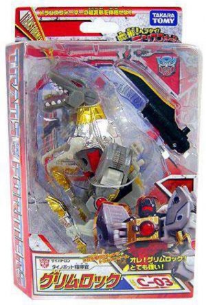
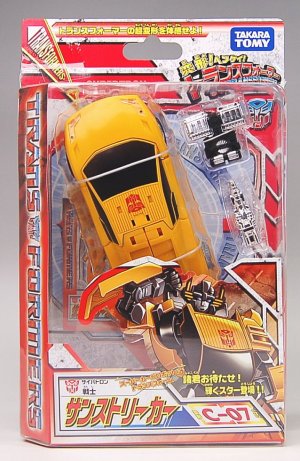
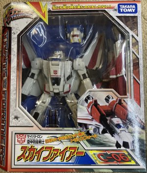
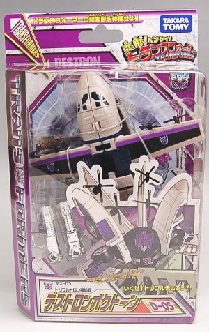
The Japanese counterpart to Classics and Universe 2.0,Hentai Henkie Henkei! Henkei! Transformers continued the Japanese packaging vibe that had largely been sustained in previous lines. The line mostly kept to its US counterparts' format, sticking to Deluxes and Voyagers (some redecoed Ultras were imported as USA Editions), sometimes packing multiple Legends together into one Deluxe-packaging team; this kept the packaging to two main variations (carded and boxed) without smaller or larger versions.
A lot of the packaging staples remained in place, applied onto a new box aesthetic that was mostly white/light gray, offset by faction-color shapes with black borders. Boxes and bubbles alike were mostly rectangular with one added facet on our left, a diagonal on which a large TRANSFORMERS logo in the classic chrome-esque finish with blue and red/purple highlights atop a faction-color background was printed.
Henkei packaging for carded figures had them in altmode, angled up and to our left irrespective of faction (except for the Minibots, who are jerks about it). Voyagers were consistently packaged in robot mode ("consistently" is easy when there's only a few of them, I guess.), visible through an octagonal window. In both cases, the line logo was up top in a corner (our upper left for boxed, upper right for carded). A large nameplate with a somewhat simpler, more readable Japanese typeface was on the bottom front, below a photo of the toy in the mode it was not packaged in (robot mode for carded, altmode for boxed). (Later releases would get character artwork.) Both would have an additional TRANSFORMERS! in diagonal word art up top (for boxed figures, stretching across the top flap and over the clear cutout window); boxed figures would use the side panels for co-sells and toy photos.
The octagon shape would be echoed on the inner tray/backing card, where an octagon enclosed a circle, which was in turn labeled with arrows and the word TRANSFORMERS, atop a central streaming light burst. Ostensibly, the mostly two-toned (white/light gray and faction color) packaging would be visually simple and straightforward, but all put together there ends up being a lot going on.
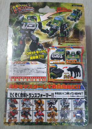
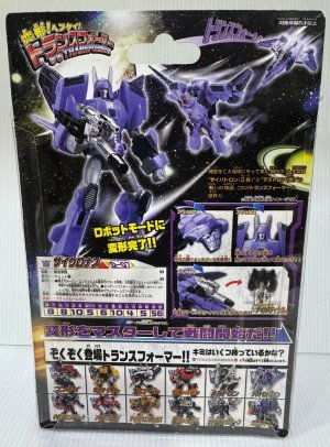
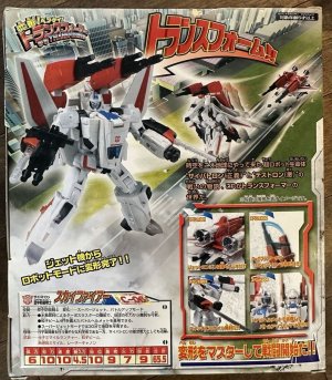
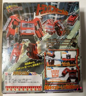
The back of the packaging echoes previous Japanese toylines with the motion-blur toy-photo transformation sequence, now framed going down to the left. (Even the Minibot 3-packs get in on this, with their transformations going from a foreshortened top to the center.) For most, the familiar insets highlighting gimmicks and details would be on the lower right to give way to the transformation sequence, and next to this block would be a bio for the toy. The bottom quarter of the back would be a lineup of co-sell boxes.
What may be the most interesting thing about Henkei packaging is the backdrops on the rear face of the packaging. Rather than being on a uniform abstract background, these would be on character-related backdrops (some shared) -- the Minibot attack team would be in an urban setting with buildings, Skyfire would be taking off on an airstrip in the city, Hound would be in an open area with lots of plants, Cyclonus would be among the stars in space, and so on. This is reminiscent of some of the inner trays the BW2 figures would have, albeit a better (more visible) way to execute that intent, kind of like how Binaltech Asterisk did it. I like it a lot, and this adds a lot to each character and toy.
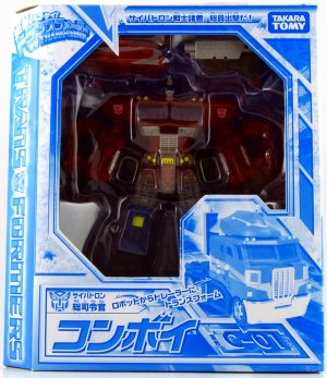
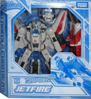
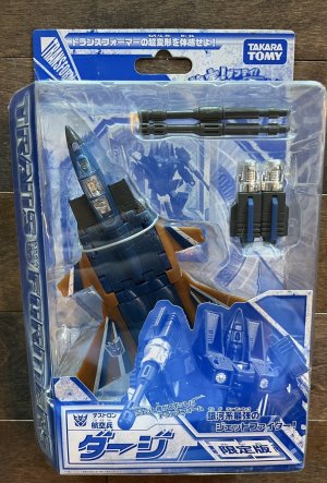
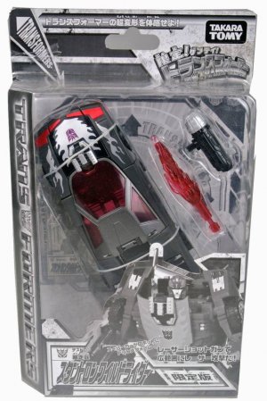
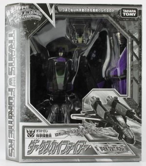
Aside from convention exclusives like Convoy Clear Version andSkyfire Jetfire (and some Microns that were mostly bagged), exclusives for the line were released under their own subline, the cleverly-named Gentei! Gentei! Transformers (language is awesome).
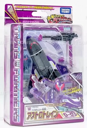
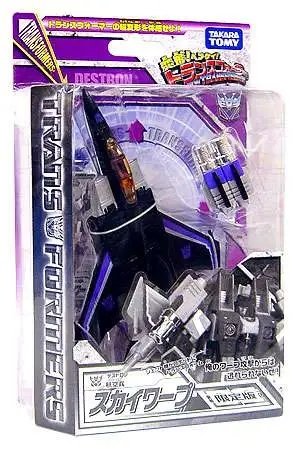
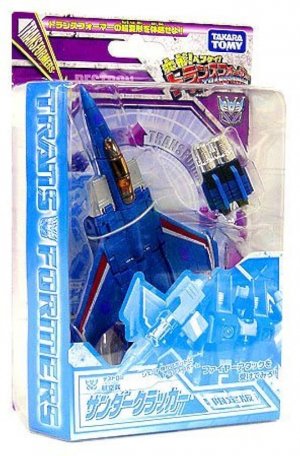
A familiar approach to Japanese TF exclusives (that I haven't really covered in depth), the fully-monochromatic box, was used for most of these. Some of these, like Thundercracker and Skywarp, would play with the color change, having monochromatic front/inner cards and a regular full-color Starscream card. There's a certain laziness to it in general, sure, but there's a charm to how it definitely stands out as well amidst the other toys (while fitting in with a group display).
The Japanese counterpart to Classics and Universe 2.0,
A lot of the packaging staples remained in place, applied onto a new box aesthetic that was mostly white/light gray, offset by faction-color shapes with black borders. Boxes and bubbles alike were mostly rectangular with one added facet on our left, a diagonal on which a large TRANSFORMERS logo in the classic chrome-esque finish with blue and red/purple highlights atop a faction-color background was printed.
Henkei packaging for carded figures had them in altmode, angled up and to our left irrespective of faction (except for the Minibots, who are jerks about it). Voyagers were consistently packaged in robot mode ("consistently" is easy when there's only a few of them, I guess.), visible through an octagonal window. In both cases, the line logo was up top in a corner (our upper left for boxed, upper right for carded). A large nameplate with a somewhat simpler, more readable Japanese typeface was on the bottom front, below a photo of the toy in the mode it was not packaged in (robot mode for carded, altmode for boxed). (Later releases would get character artwork.) Both would have an additional TRANSFORMERS! in diagonal word art up top (for boxed figures, stretching across the top flap and over the clear cutout window); boxed figures would use the side panels for co-sells and toy photos.
The octagon shape would be echoed on the inner tray/backing card, where an octagon enclosed a circle, which was in turn labeled with arrows and the word TRANSFORMERS, atop a central streaming light burst. Ostensibly, the mostly two-toned (white/light gray and faction color) packaging would be visually simple and straightforward, but all put together there ends up being a lot going on.
The back of the packaging echoes previous Japanese toylines with the motion-blur toy-photo transformation sequence, now framed going down to the left. (Even the Minibot 3-packs get in on this, with their transformations going from a foreshortened top to the center.) For most, the familiar insets highlighting gimmicks and details would be on the lower right to give way to the transformation sequence, and next to this block would be a bio for the toy. The bottom quarter of the back would be a lineup of co-sell boxes.
What may be the most interesting thing about Henkei packaging is the backdrops on the rear face of the packaging. Rather than being on a uniform abstract background, these would be on character-related backdrops (some shared) -- the Minibot attack team would be in an urban setting with buildings, Skyfire would be taking off on an airstrip in the city, Hound would be in an open area with lots of plants, Cyclonus would be among the stars in space, and so on. This is reminiscent of some of the inner trays the BW2 figures would have, albeit a better (more visible) way to execute that intent, kind of like how Binaltech Asterisk did it. I like it a lot, and this adds a lot to each character and toy.
Aside from convention exclusives like Convoy Clear Version and
A familiar approach to Japanese TF exclusives (that I haven't really covered in depth), the fully-monochromatic box, was used for most of these. Some of these, like Thundercracker and Skywarp, would play with the color change, having monochromatic front/inner cards and a regular full-color Starscream card. There's a certain laziness to it in general, sure, but there's a charm to how it definitely stands out as well amidst the other toys (while fitting in with a group display).
Last edited:

