I am! Universe (2003) too. Maybe separately after the UT.
You are using an out of date browser. It may not display this or other websites correctly.
You should upgrade or use an alternative browser.
You should upgrade or use an alternative browser.
Outside? Inside? No, thinking ABOUT the box: your thoughts on Transformers packaging
- Thread starter lastmaximal
- Start date
I mean, if you want to keep things consistent chronologically, Universe and Alternators were both launched around Energon (Universe shortly before, Alternators practically alongside).
I did want that earlier on, but wanted to keep the UT segments together more. And now it's too late.
The 2000s, 4: IT is our MISSION
The final leg of the Unicron Trilogy began as early reveals of toys and show models from "Transformers Galaxy Force" trickling out in late 2004 with the show debuting in Japan not long after, and there was quite a bit of interest right off the bat.
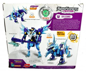
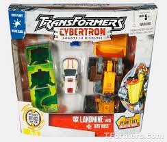
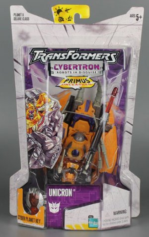
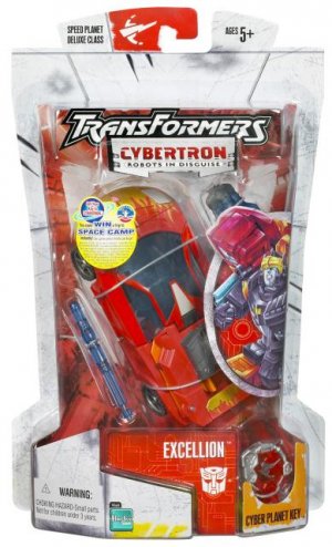
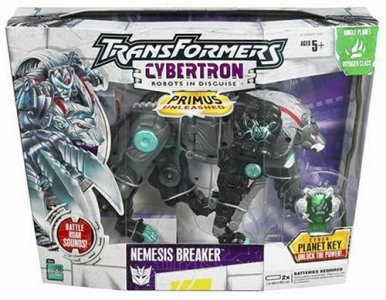
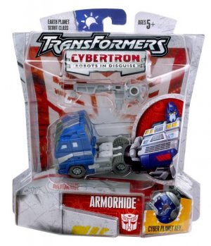
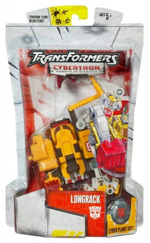
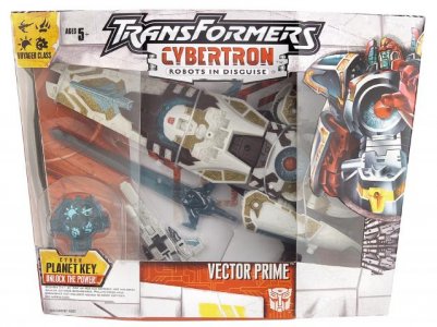
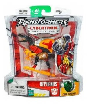
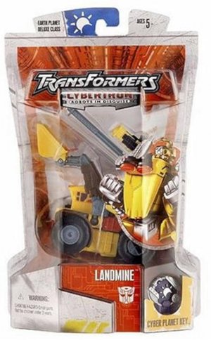
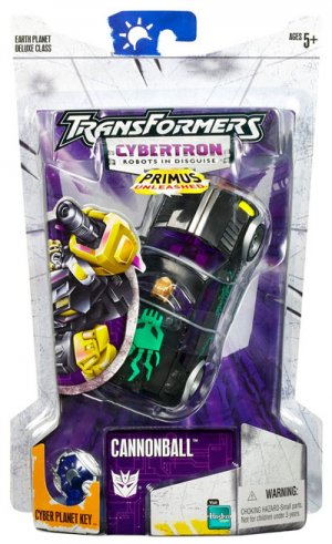
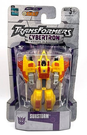
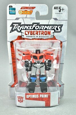
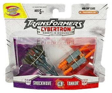
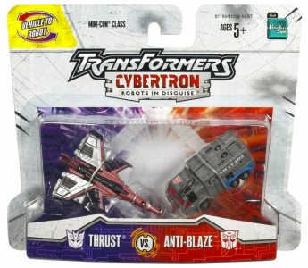
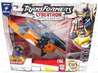
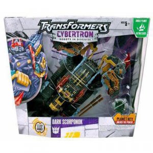
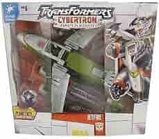
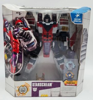
When the line hit US shelves as Transformers: Cybertron in 2005, it was in packaging that was refreshingly distinct from the sea of red that Energon had ended its run with. The overall packaging design now had white/light gray cards (shaped vaguely like the two main faction symbols) as the base, with darker gray detailing that evoked circuit boards or even old-computer punch cards. A faction-color-saturated wall of pipes and circuitry leading to a central vanishing point, with a large white faction sigil overlaid on it, was behind the toy (with gunmetal pipes and vents and such elsewhere on the card/box).
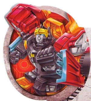
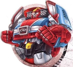
VERY nice waist-high portraits for character art -- a closeup of the character's posed upper body -- were framed in a circle on one side (Autobots faced our left, Decepticons faced our right), with their name and faction sigil on a small nameplate in the bottom center. On carded figures, to the side of the nameplate was a dedicated cutout with an orange highlight on the inner card, surrounding and showing off the Cyber Planet Key that came with the figure. Boxed figures would have the Cyber Planet Key off to the side as well with a similar call-out label below the key, and the planet "affiliation" in a small tab in an upper corner.
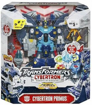
At the top was the TransFormers Cybertron logo, using the RID2001-originating top half one last time with an all-new subtitle, that itself also had the subtitle Robots In Disguise in an inset rounded-rectangle bubble.
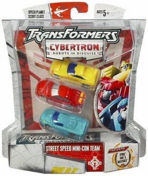
Carded figures (Basics -- now Scouts -- and Deluxes) shared the same design with the latter being on taller/vertical cards, differing from the last three lines. (Scouts were on particularly short cards that were nearly squares; these card sizes were well-proportioned to the toys). A new small price point (Legends of Cybertron/Micro Series, later Legion class) had miniature versions of these cards minus the Cyber Planet Key, and packed the figures in robot mode. There were also Mini-Con "versus" packs, which would have paired side-by-side versions of the standard design (a white Mini-Con sigil on half Decepticon/half Autobot colored background) in sizes that suited Mini-Con scale.
Boxed figures (Mega, now Voyager; Ultra; and Leader) had similarly "one's just bigger" designs. The packaging shaping was back, sort of a cross between Armada's ambitious shapes and Energon's restrained standard-boxes. Bubbles and the overall box shape were sort of trapezoidal prisms, wider at the top (Scouts and Deluxes had the bubble flare out to a wide boot/base below the tapering to let them stand on a shelf, although they did also have hang tags -- that sported the planet colors and sigil!).
The Supreme class figures - a Key-empowered Starscream, and frickin' Primus -- had a unique box design to accommodate the sheer size of the toy. This was a wider, less tapered version of the boxed figure packaging, to give the figure a solid, wide base. Some releases of Primus came with a Unicron head (what might usually be a running change wound up as a shipped-together variant), which was highlighted by a Unicron Head Included! callout on the box but not a special cutout or separate window.
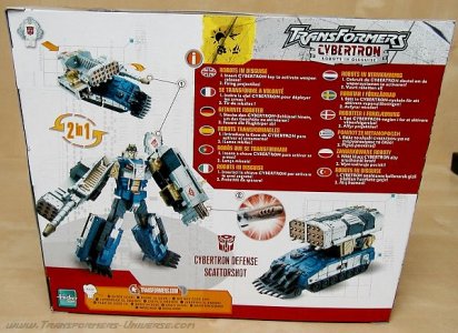
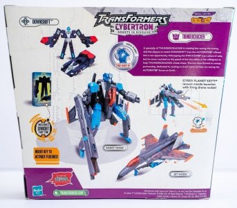
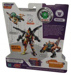
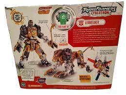
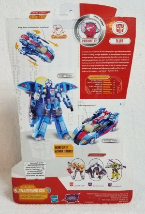
The back of the packaging was similarly neat: a section in our upper right was a faction-color background for the text, the Cyber Planet Key (highlighted in a circular inset) separating its left edge from the white backdrop. This quadrant contained a faction badge and character name (on a rounded rectangle plaque), and... a bio and tech specs!
Blessedly, Cybertron wasn't hamstrung by multilingual packaging for the most part like Armada and Energon were. The wiki reports that this was because the choice to shift in the first place was a cost-cutting measure that, around this time, the Transformers team convinced Hasbro was backfiring by negatively affecting sales. The shift back, which would last for a decade, was a welcome change.
This was matched by a judicious layout for pictures (each mode, the gimmicks highlighted with a "Cyber Planet Key activates ___ call-out" making good use of the space. Another nice touch was having drop shadows instead of glow borders, and a dark gray circle with a white faction symbol on it laid down at an angle, essentially looking like a showroom floor turntable. This is something they still do now, with Kingdom being a recent example, and plays with how the eye views the flat card space.
The transformation difficulty indicator was on the upper left, co-sells small below/under, and a faction color border along the base. There's something so elegantly simple and clean about having a mere flat colored box (no bevel or stroke or anything) separate the bio/tech specs from the rest of the cardback. Really it's like Hasbro took all the elements from previous lines and finally figured out how to cleanly lay them out to form a consistent look that didn't look cluttered.
(This was only true for packaging for the US and some markets, as European packaging -- which had been multilingual well before RID2001 -- would shift to only toy photos, with the box for bio/tech specs would be dedicated to gimmick callouts in up to TWELVE languages.)
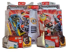
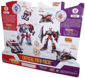
Cybertron had its share of special release formats and packaging, including Walmart exclusive Deluxes with Tiny Tin-encased Mini-Cons (these were similar to a Voyager box). There were also Target exclusive Deluxe two-packs that basically just welded two cards together and had a strip up top labeling them with the storyline pairing title of the pair (Critical Path Pack, Drag Race Pack, etc) and a quick blurb giving a rundown of the feud or story. The cardback had the bios and toy photos in a mirrored layout.
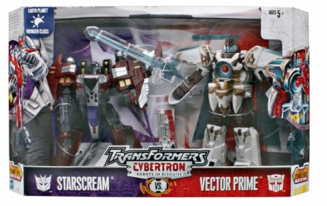
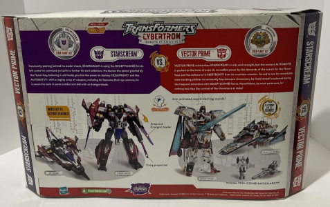
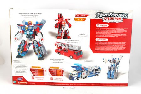
A versus pack featuring Vector Prime and maroon Voyager Starscream had similar paired packaging with artwork on opposite sides and bios aligned in the center of the box. This was similar to the look of the Costco RID2001 Optimus Prime/Ultra Magnus 2-pack, which got the full Cybertron treatment with box art. Where the versus pack had bios clashing and the figures on the bottom half under each's bio, this tandem pack got an enlarged version of the usual back-of-box with two bios in the bio box and two sets of tech specs in a separate area.
In a somewhat unexpected move after Energon's huge packaging shift for its subline imprint, Cybertron barely changed things for Primus Unleashed. It did even less than Armada did for The Unicron Battles, just adding a somewhat clunky gold trapezoid with the title below the original logo's Cybertron/Robots In Disguise plate. I didn't really mind this minimal change, though, considering how Energon's new card look felt like too much of a change (especially over time) and how Cybertron's look seemed too good to change much from.
I've made no secret of how Cybertron may be in my top 3, if not my favorite Transformers line of all time. Everything about it just works, from having something for everyone and being driven by a fun narrative that offered a melting pot sort of backdrop for that. The linewide gimmick was cohesively applied and mostly external to the main toy, and simple enough (a single piece of plastic that at the time they could afford to paint the details of... In chrome!) relative to a whole second toy that it didn't impact the main figure budget too much. Plus the gimmick bits were really pretty clear plastic, which I love.
A lot of this is also informed by my nostalgia for the surrounding circumstances (this was a great time in my life personally, probably because the heavier demands of adulting and professional growth hadn't quite settled in yet to dampen things). However, that just makes the positive vibe of the line indelible; the line and its packaging deserve that appreciation on their own merits.
I didn't really like how the Masterforce etc-era white boxes worked out and I'm having trouble phrasing why, but my latest guess: maybe there wasn't enough white to serve as a base. There'd be a giant colored field with a white grid on the front (this being a flat color was not in its favor), big box art and backdrop in a vertical strip next to it and then up top a few logos on white, reducing that white to just one more of the panels. The three kind of fought each other for visual prominence and no one really won.
Here, the white is a solid border that concentrates a burst of color behind the bubble/window, and leaves a neutral-color spotlight on the toy itself. The little things work out well too: the cohesive line gimmick is shown off in a cohesive, purposive manner across price points (Energon had multiple gimmicks and tended to not showcase them strongly). What could've been a confusing jumble of symbols and factions and other info was handled tastefully with the planets being identified on the hang tag (or a small panel by the window, for boxed figures) and often the key, and so on.
If anything, my one complaint is that the positioning of the artwork tended to cover up ~1/3 of the toy (altmode packaging, facing away from the artwork to try and get away from it). Well, that and the trapezoidal prism boxes. I just miss standard rectangular prisms, man. Boring, easy-stack rectangles.
Last edited:
(continued)
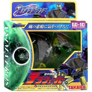
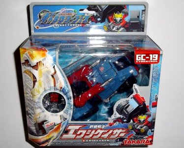
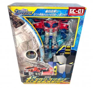
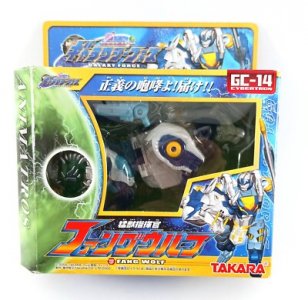
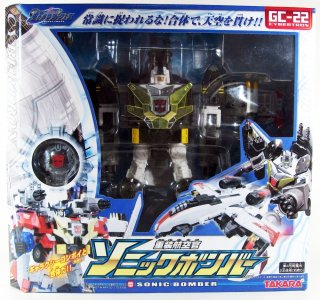
I remember having gotten a throwback vibe at the time from Galaxy Force's packaging, but I could never put my finger on why. Even now I'm not a hundred percent sure. Maybe it's that they're window boxes again (for Deluxes and up), or maybe it's just the way the backgrounds were offset by yellow piping/borders (save for a few later releases like the Vanguard Team). Maybe it's the vaguely similar feel to their BW Metals packaging. Or maybe it's that everything's so (equally) saturated again, in contrast to Super Link's tamer backgrounds (speaking of, both factions are on a blue background this time).
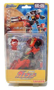
In any case, while it's not necessarily my favorite of Takara's Unicron Trilogy packaging, a lot about the Galaxy Force box design has some nice choices. The usual Takara packaging staples are there: faction color-coded tabs showing the character number, solid hang tabs with logo and character art, big nameplate at the bottom (like Super Link, the name in English is also there), and even the old "text running down the sides" (in this case, the name of the planet represented by the toy in a serif font on our left, and a ghostly white-stroke "GALAXY FORCE" on the right).
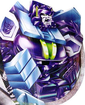
The new elements are one side having a large closeup of the planet (with a small window for the Force Chip, for boxed toys) on an extra, angled facet with the planet name on top (note how Cybertron looks different on sone releases like the Vanguard Team). Carded figures are on taller, narrower cards than Super Link's had, with a large yellow front card bearing the character's name in Japanese and English.
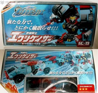
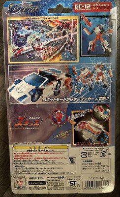
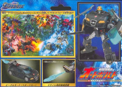
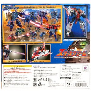
The back of the box is more like standard Takara fare, with inset boxes highlighting the various gimmicks. However, for boxed figures the motion-blur transformation tended to be moved to the top of the box (which also shows the Technical Point/difficulty scale, on the top half of the faction-colored number tag). Notable here, though, is that for some boxes the back features another fun battle scene that seems to be filled with posed toys.
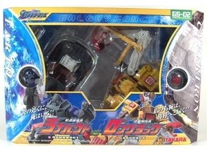
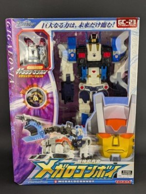
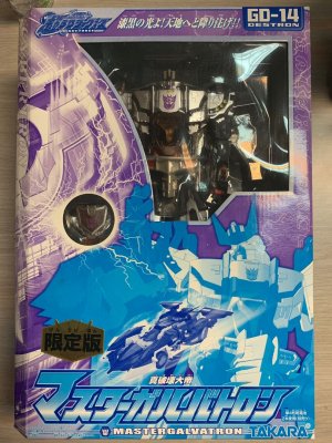
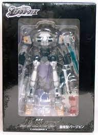
Special or unusual packaging formats were part of the line as well. Versus packs returned, but featuring non-show retools (Buzzsaw vs. Blurr, Runamuck vs. Longrack) that were later on brought to the US toyline; their Takara packaging neatly paired opposing versions of the regular packaging (featuring two opposing planetary hemispheres) and the toys' separate artwork in the middle. The four planetary Convoys have unique robot-mode packaging with a close-up profile as front-of-box art (Megalo Convoy's pack-in EZ Collection Convoy was also in robot mode), as did Master Megatron (and the unique, somewhat monochromatic-box Master Galvatron redeco).
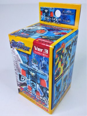
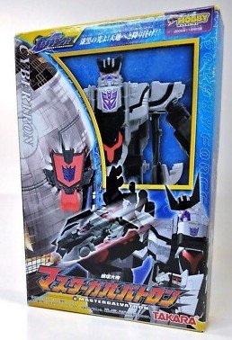
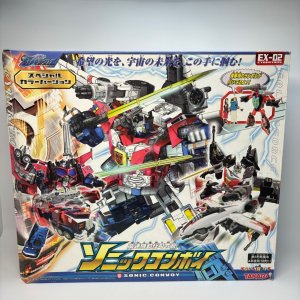
Robot mode packaging was also the format for three DVD pack-in Deluxe redecos (of Exillion, Chromia, and Noisemaze) in basic, black boxes with large windows on both sides. The Micron Booster set accompanying the line continued to feature a miniaturized version of the regular packaging (yellow border and all) with pictures of each blind-boxed figure on the side as before; miniaturized packaging was also used for the Dengeki Hobby exclusive EZ Collection release of Master Galvatron, who had a teeny faux-window-box version of the Leader class packaging). The EX-02 Sonic Convoy giftset was a large windowless box that had a mostly-white background with blue borders instead of the standard blue-with-yellow border; I wish they'd gone with this color scheme for the whole line instead. Then again, that might've been too similar to the Super Link packaging.
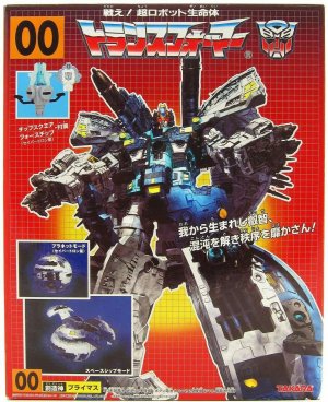
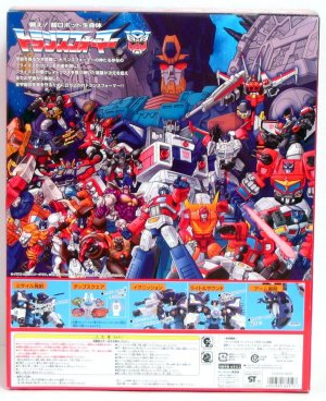
Arguably the ultimate in special (if nostalgia-baiting) packaging went to Takara's G1-themed windowless box for Primus. This was technically not part of the Galaxy Force line, although it was certainly informed by the current line's approach. It featured many contemporary touches such as insets that showed off the gimmicks and posed toy packaging instead of the steps-of-transformation demo photography; however, it did all this on the most G1-style backdrop we'd seen outside of reissue lines. White grid on black-to-red gradient, simple yellow spotlight behind the render of the character, G1 logo, character number (00) on a yellow box, all the hits. The back of the box featured pretty neat artwork of Primus in robot mode overlooking a myriad of Autobot leaders, a range of Convoys past and then-present.
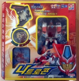
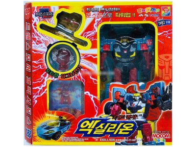
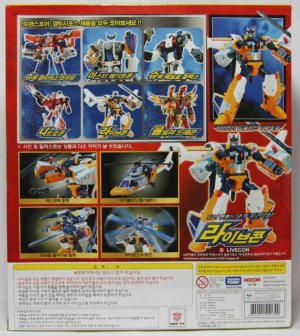
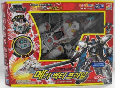
Korean importation of the Japanese toyline resumed in 2007 under a new licensee, Mocom, who released Transformers Galaxy Force after success importing the live-action movie toyline. The selection was again a mostly-show-based excerpt from Takara's full slate (as well as two of the versus packs), with new names for some and some having their price point included (Nitro Convoy became "Nitrocon", Vector Prime became "Mega Vector Prime", Sonic Bomber became "Ultra Jet", Flame Convoy became "Ultra Dragon"...).
Packaging was mostly akin to Takara's with red replacing the blue backgrounds for the most part, and Korean text instead of Japanese. The planets also seemed to no longer be part of the background, with the red space being punctuated mostly by streaks of light and electricity streaming from the cutouts highlighting the key and weapons (and card? for some). Some (Fast Aid, Autovolt, Mega Liger) have blue light streaks and/or electricity.
Next: Spoiled for choice
Last edited:
The 2000s, __: The Space Between, 1
The 2000s saw Transformers at arguably its most high-potential since its 80s heyday. The Beast era had given it an immense shot in the arm and cultivated a new generation of fans, and taken the brand far enough out from its roots that fans new and old started to feel a tug toward those vehicle-based roots. Plus, a generational wave of nostalgia was cresting, and Armada proved to be a good move for the brand to cash in on this and the increasingly mainstream popularity of anime in the west. By 2002-2003 this rising tide (to sorta mix metaphors) was lifting all boats, including ancillary stuff like comic books, a niche/exclusive fan club, and whole supplementary toylines like Universe (2003), which felt even then like an expansion of RID2001's line-extending, shelf-filling offscreen merch.
Here was a toyline with a just-substantial-enough Excuse Plot to create a narrative justification to cram a bunch of redecos and retools under one banner and put it on shelves. It was an amazing opportunity to get a wide range of molds, including late G1, G2, and the Japanese part of the Beast era, albeit sometimes in... wildly unexpected decos. It was Selects before Selects was cool, and if Selects had been created in an era where The Done Thing was to have accompanying fiction/media for a toyline. Here, it was a comic and a CD-ROM (with various games/multimedia stuff).
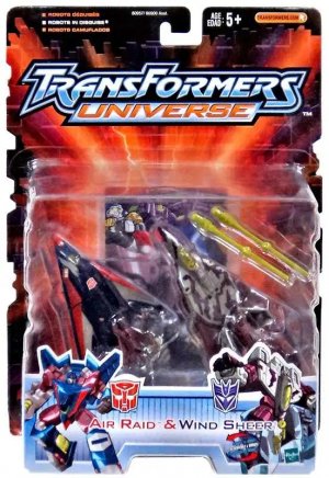
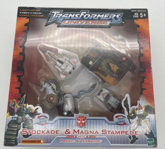
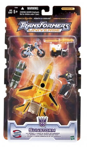
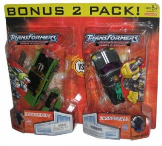
Universe started out as a toyline of two price points (Deluxe and Ultra), meaning one carded and one boxed packaging type. These would sometimes be mixes of smaller toys bundled together to stack up to the price point, whether as tandems/teams or versus packs; in all cases the packaging for these regular-retail multipacks never really took on a unique design like Japanese versus packs would (mostly just faction-specific colors for names).
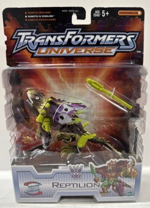
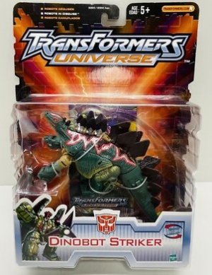
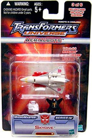
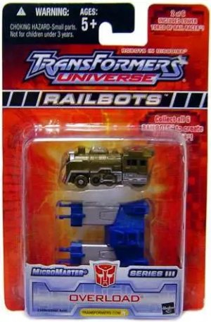
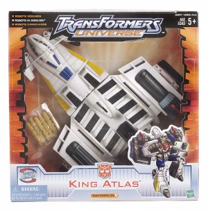
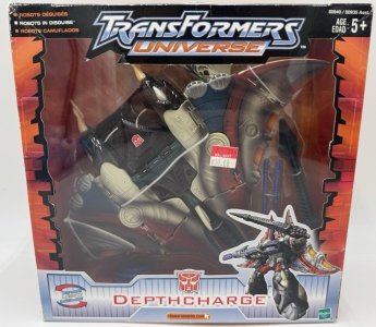
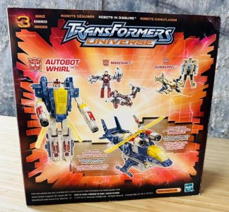
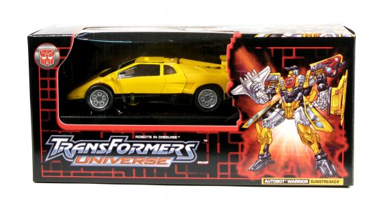
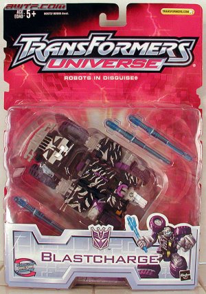
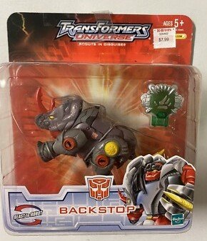
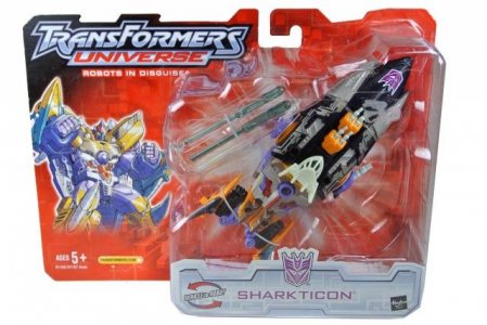
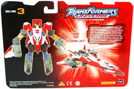
The packaging design was actually pretty cool, quite a bit removed from what a cynical reading of its role as a supplementary toyline would suggest. The vertical (but wide) cards depicted an explosion radiating light outward (framing the toy) on a red-orange surface, with some grid and lightning effects we'd also see in Energon. A unique touch was that the card itself was notched on the sides to embody the uneven, jagged edges on the fringe of the explosion. Toys were packed in altmode in a square bubble on the front, with a big TransFormers Universe (replace Armada with Universe, in a new font, still on the same capsule/canister-looking shape) logo and a thickly-bordered, panel-lined nameplate at the bottom. Small character art (on the blobbier end of the DW spectrum) and the reciprocal "___ to robot" arrows flanked the character name, which appeared to be in the pretty-2000s Bank Gothic font.
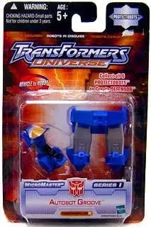
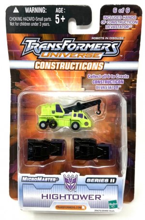
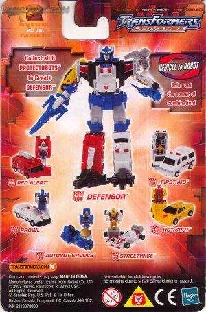
This carded packaging style would be used for smaller stuff like the individually-packed Micromaster Six-combiners as well, minus the character art and notching on the sides. The team name would be somewhere on the front of the card -- Protectobots had it in one upper corner atop a badge-like star shape, and everyone else got a strip below the logo with the team name on it. These would also get labels noting the figure was x of 6, and what combiner parts were included. Then they somehow fit the combined mode and teeny tiny pictures of each member in both modes on the back.
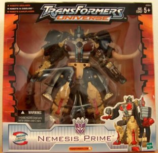
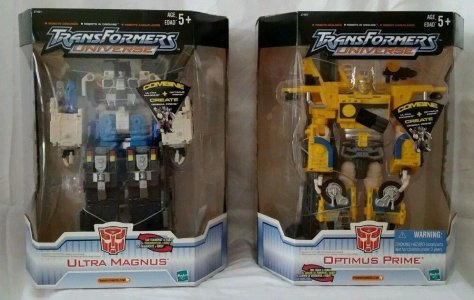
The same overall design (including nameplates) would be used for boxes, except these were still standard mostly-squares with none of the shaping shenanigans that the contemporary Armada toyline would be playing at. The notched explosion edges instead wrapped around to the front of the very large (almost the entire front) window, framing the toy/s inside. One side of the box would have the multilingual line backstory, and the other would have co-sell pictures. Toys would get character artwork in most cases, although this tended to be small on the packaging.
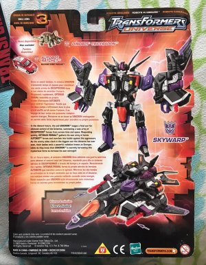
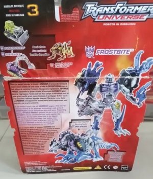
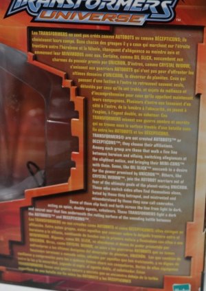
The back of the packaging for both was basically what you'd expect from Armada or Energon: very large toy photos in both modes with multilingual call-outs for accessories/gimmicks, a few co-sells in a corner, a transformation difficulty scale (just a number), and multilingual versions of a paragraph establishing the toyline lore. Along with Armada and Energon, it's notable that at this point it was still important enough to sell kids on the overall story for each toyline that there had to be a fairly extensive blurb (a whole few sentences) on the packaging establishing it. And under the circumstances of only being able to allocate x amount of space to text, that won out over individual character bios (admittedly, it probably also saved a few pennies to not need to hire someone to write more.)
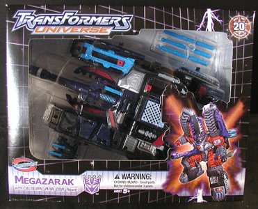
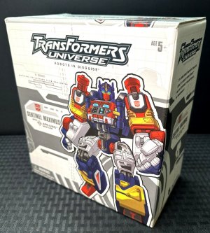
At Hasbro's direction, Botcon would adopt Universe as a sort of proto-Timelines umbrella for its exclusives, pivoting from their Wreckers storyline to make it happen. OTFCC 2003 and 2004 released toys in unique packaging -- 2003 had black boxes with a red grid, 2004 (Megazarak) had black box with a white isometric grid and unique layout on the back, including a large Allspark logo gear for the tech spec numbers. Both repurposed the standard Universe card design as explosion spotlights behind character art. (Sentinel Maximus was released later on in 2004, branded as Universe in handsome white-and-gray packaging that looked more like Cybertron's -- which they may have been working on at the time.)
Later retail-Universe card design would have a much redder card (still notched) with Energon's The Powerlinx Battles card -- which I now notice replaced the perpendicular crisscrossing lines with what appeared to be a 3-D "raised blocks" texture that evoked the classic grid, and add "ROBOTS IN DISGUISE" in outer-glow-bordered white text below the Universe logo. This would go on a few vertical cards before being applied to the Energon-style wide cards (they probably didn't even need to cut new cards, just use the Energon template, since even the logo tops were identical). For Deluxes, character art would be on our left and the toy (in altmode) off to our right, now in a square-bottomed bubble whose top half was in a more uneven shape to match the uneven top of the card. By the time of the wide-card shift, Universe had mutated into a more transparently catch-all brand for stuff that would go to retailers who just wanted more Transformers stuff on their shelves. (These were also late enough that Hasbro had shifted back to English-only cards.) Scouts would get a squarer card laid out like the original vertical Universe cards.
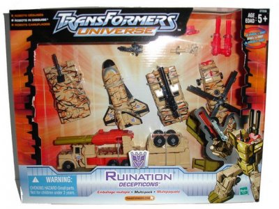
Like RID2001 before it, Universe transitioned away from a mass-retail line into a brand for store exclusives, and here was where unique packaging tended to be used. Many, like the veiny desert camo Ruination giftset, would be in bigger versions of the usual card/box design.
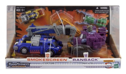
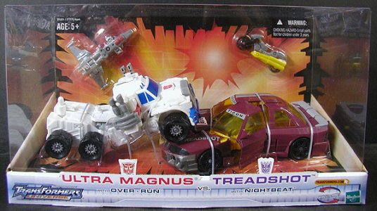
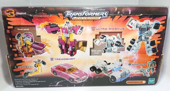
However, the Market 6-exclusive "Battle in a Box" versus packs would have unique bottom-and-back cards that made for diorama-ish packaging. This displayed the figures in altmode, in a battle scene (Ultra Magnus driving over Treadshot) and the included Mini-Cons were skin-packed onto the vertical "back wall" card. Copious amounts of plastic trays and ties held the toys in position, and a big plastic box contained the entire battle. Unboxing this was a chore I thankfully mostly dodged, having had to get these loose internationally.
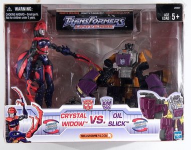
These sets had the typical box backs, with toy photos/callouts and no bios (or toyline lore). The exception to this was Crystal Widow vs. Oil Slick (exclusive to K-Mart), which had the toys packaged in robot mode in a mostly-typical Universe box that uniquely had the line logo as an inset that the overall plastic shell actually dipped in to showcase. The box back was typical, but since this packaging had sides one carried the multilingual line lore and the other had multilingual versions of a paragraph that was as close to a bio as we'll get, describing the Universe conflict and namedropping the two (Oil Slick joined the conflict out of a hunger for power, and Crystal Widow defected to the Autobots out of fear of universal destruction).
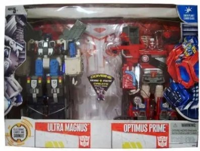
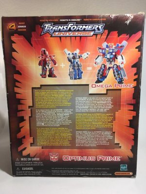
Perhaps the coolest unique packaging was that for the Sam's Club exclusive redecos of RID2001 Optimus Prime and Ultra Magnus, which got big-window boxes with solid edges that had a wraparound front window. This splendid display arrangement showed off the toys (packed in robot mode!) from the front and both sides. The back got the typical box-back design, a simple mathematical display showing [Super Optimus Prime] + [Ultra Magnus] = [Omega Prime], with all three toys in the original-release colors. Below this was a wall of text showing the usual multilingual Universe lore paragraphs... AND a set of multilingual paragraphs that gave a bio for the character.
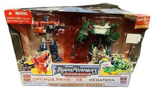
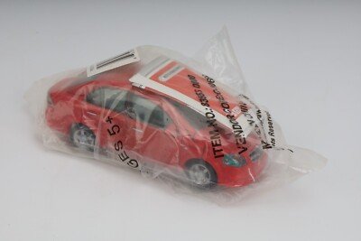
Universe stretched on into Classics and the live-action movie era, with new Cybertron 2-packs getting Universe-card releases (and Universe Micromasters getting Cybertron-card releases), the Classics "Ultimate Battle" 2-pack getting Universe packaging, and the licensed Chevy Aveo LT toy named Swerve -- supposedly the last Universe (2003) toy -- being "released" (the wiki has the full story, such as it is) in a two-piece plastic tray within a polybag.
Last edited:
(continued)
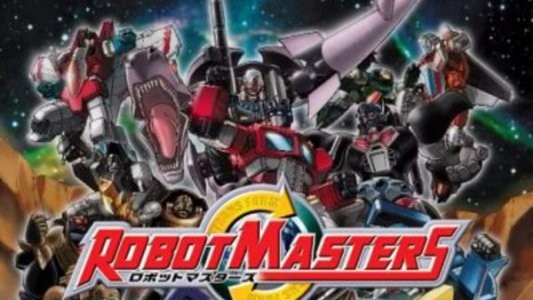
Japan would have its owncross-universal redecofest, although one that also debuted some new molds. I think this was also less of a retailer-demanded filler line and more just one of the many side lines they do. This was a 2004 line that featured a range of random-feeling redecos alongside some transparently nostalgia-mining new molds (some the first new molds for these characters in a decade or more), which made sense for a toyline released during the 20th anniversary.
Like Universe, this toyline had a rudimentary story -- in parts as rudimentary as it gets, with Beast Megatron just... showing up one day at Autobot City, a harbinger for a multiversal clash over solitarium. Combatants seeking to acquire and control this new element (weren't we just fighting over Energon?) would travelto this world through the Blasty Zone Bloody Zone Minelba Blastizone, and buy our toys. Anyway, this did receive a bit more story support than Universe, with online and print stories (comics and prose) and a couple of simple, shortened DVD adaptations of the overall story. Not that I really need much prodding to go after fun redecos and another chance to get some older molds. (I don't think I ever did get any of the new molds at the time, despite them being the only game in town pre-Classics. But some 20 years later I did stumble upon a good deal on a loose, mostly complete Black Lio Convoy... in the same year I got the Legacy one.)
This modest line ran about a year and maintained the same packaging throughout. As such, not as much to say here, so enjoy lots of picture padding.
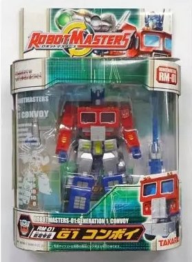
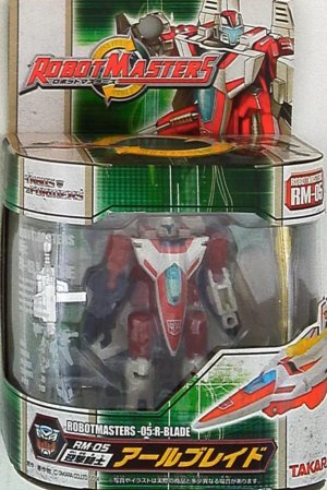
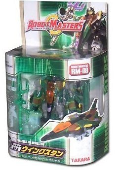
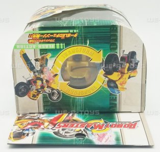
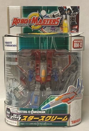
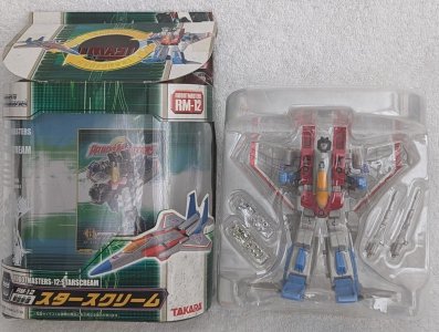
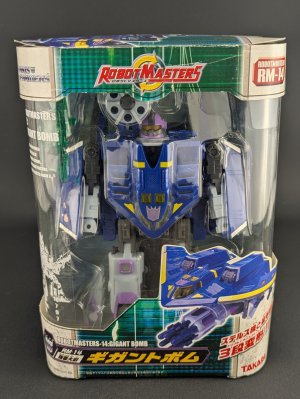
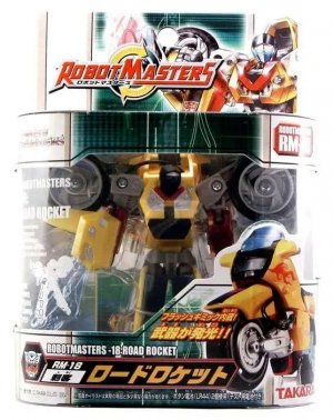
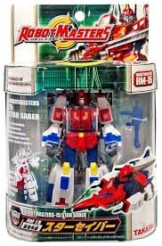
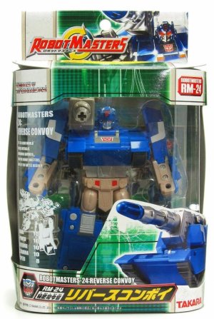
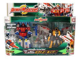
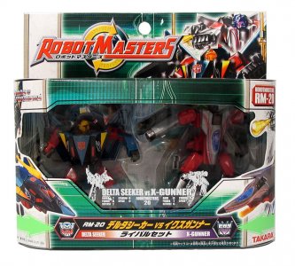
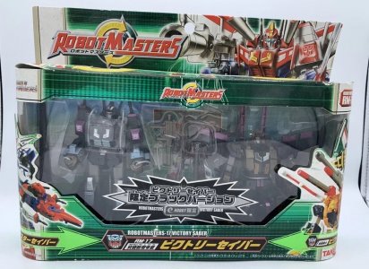
The standard design that all the regular Japanese retail releases used was a white base with a green stripe running down the center and repeating on the sides. The green stripe would have various monochromatic tech-y detailing including a texture reminiscent of a grid, and some thin lines; almost like what your flatscreen TV would look like if you yeeted a chancla into it. There would be plenty of English text running parallel to a side -- "robot mode", "vehicle mode", "Robotmasters", and so on. There would also be the occasional callout for a feature (Road Rocket has "Flash Action", thanks to the retained Laser Rod gimmick). The RobotMasterS logo (with reciprocal yellow Transform! arrows) would be on the punched hang tab (now usable for actual hanging on pegs), opposite robot-mode character art. These reciprocal arrows would also be used on the top rim of the box (showing toy pictures of each mode), framing a circular cutout... so you could see the character from the top, if that was something you wanted to do.
The packaging wasn't quite window-style packaging, which would have a box enclosure with a cut-out for a solid panel of plastic attached to the cardboard walls. Here the inner tray had its own plastic shell on all sides, and the cardboard half just sort of wrapped around it on the top and bottom, and to a lesser degree on the sides. This exposed the front and sides of the inner bubble and tray without an attached window.
A closer look at that top half reveals the US G1 logo, and opposite that (on the other side of the center stripe) the character number. The bottom half would have the character nameplate (English and Japanese) and a toy picture of the altmode. Interestingly, and somewhat less luxuriously for Japanese toys/packaging/paperwork, the character card was to be cut out of the inner cardboard backing. Later release Gigant Bomb (a redeco of BW2 BB, somewhat unconventionally sold separately from the Smokesniper/Starscream partner) had a suitably larger box that omitted the hang tab and moved the toyline logo to the center of the upper half.
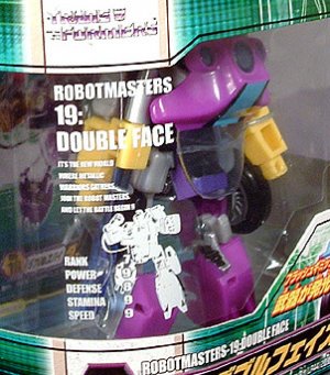
Robotmasters packaged everyone in robot mode, and next to them atop the bubble there was a white-ink-on-clear-sticker print with the character's name and number, a blurb about the toyline ("It's the new world where metallic warriors gathers… Join the Robot Masters and let the battle begin!"), artwork of the character in robot mode, and some tech specs (Rank, Power, Defense, Stamina, Speed).
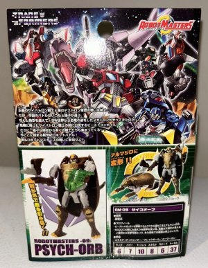
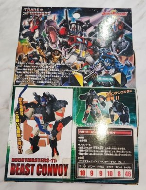
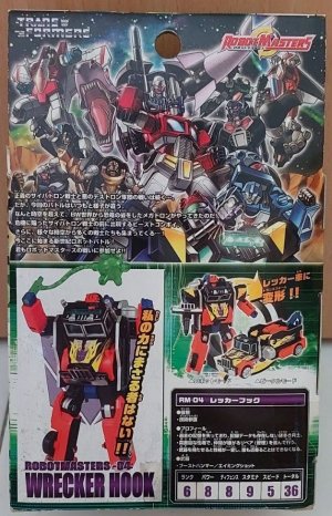
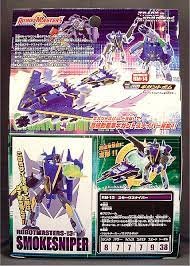
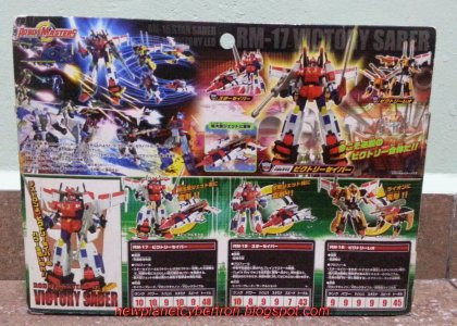
The back of the box would have a picture of the robot mode with a faction sigil behind it, a picture of both modes atop the Japanese language bio and tech specs (repeated from the front sticker), and a big mural of the characters together. Later release pair Smokesniper and Gigant Bomb would replace the mural with toy pictures showing their combination, and Victory Saber has toy photos depicting the combination, a CGI mural depicting the combination in space amid CGI versions of the rest of the cast, and three separate bios/tech spec sets (both partners and the combined mode). They were really happy to be able to revisit this pair.
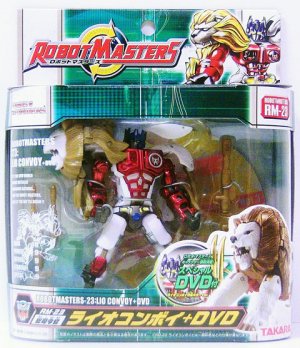
Packaging variations at regular retail amounted to a slightly wider box for figures that came with a DVD. A much wider box would be used for two-packs (tandem, like Star Saber/Victory Leo -- who were also available individually -- or versus, like Delta SeekerX-Gunner). These expanded boxes widened the central green strip as well, and two-packs added a green arrow pointing to the center under each figure's altmode toy photo. Delta Seeker and X-Gunner, the lone versus pack, had artwork for both on the hang tab opposite the logo.
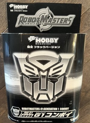
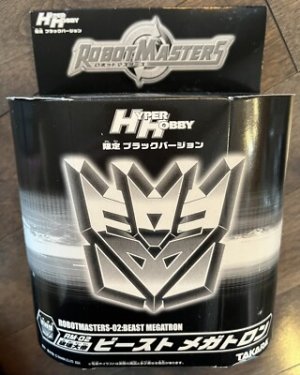
Later "black redeco" exclusives had monochrome windowless boxes with large beveled faction logos (note that everyone was Autobot or Decepticon only in this line) on the front, below the logo of the magazine whose exclusive it was. These were set on a black, art-less box, atop what seems like a horizontal version of the central stripe (now white) where the window would be. (Black Victory Saber wouldn't even get this or the typical monochrome version of regular packaging -- just regular packaging with a sticker.) Finally, apparently there was also a very rare rerelease of Brave Maximus as Cybertron Base, in a plain white box.
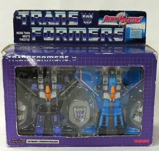
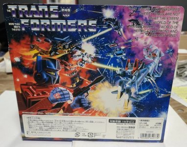
The last release in the line (a regular release?) -- the Skywarp/Thundercracker 2-pack -- leaned fully into the nostalgia, and packaged these remade Seekers in a G1-themed box (solid purple with a white grid and the classic US logo) that nevertheless had a recognizable Robotmasters influence: a pasted-on-looking strip of Robotmasters-themed packaging with the logo opposite the US G1 logo, a plaque-like label saying Robot Masters Edition, and packaging the pair in robot mode within a large plastic window. The back of the box was pure G1, however, being just the original back-of-box mural (no tech specs).
Next: Can we stay here forever
Japan would have its own
Like Universe, this toyline had a rudimentary story -- in parts as rudimentary as it gets, with Beast Megatron just... showing up one day at Autobot City, a harbinger for a multiversal clash over solitarium. Combatants seeking to acquire and control this new element (weren't we just fighting over Energon?) would travel
This modest line ran about a year and maintained the same packaging throughout. As such, not as much to say here, so enjoy lots of picture padding.
The standard design that all the regular Japanese retail releases used was a white base with a green stripe running down the center and repeating on the sides. The green stripe would have various monochromatic tech-y detailing including a texture reminiscent of a grid, and some thin lines; almost like what your flatscreen TV would look like if you yeeted a chancla into it. There would be plenty of English text running parallel to a side -- "robot mode", "vehicle mode", "Robotmasters", and so on. There would also be the occasional callout for a feature (Road Rocket has "Flash Action", thanks to the retained Laser Rod gimmick). The RobotMasterS logo (with reciprocal yellow Transform! arrows) would be on the punched hang tab (now usable for actual hanging on pegs), opposite robot-mode character art. These reciprocal arrows would also be used on the top rim of the box (showing toy pictures of each mode), framing a circular cutout... so you could see the character from the top, if that was something you wanted to do.
The packaging wasn't quite window-style packaging, which would have a box enclosure with a cut-out for a solid panel of plastic attached to the cardboard walls. Here the inner tray had its own plastic shell on all sides, and the cardboard half just sort of wrapped around it on the top and bottom, and to a lesser degree on the sides. This exposed the front and sides of the inner bubble and tray without an attached window.
A closer look at that top half reveals the US G1 logo, and opposite that (on the other side of the center stripe) the character number. The bottom half would have the character nameplate (English and Japanese) and a toy picture of the altmode. Interestingly, and somewhat less luxuriously for Japanese toys/packaging/paperwork, the character card was to be cut out of the inner cardboard backing. Later release Gigant Bomb (a redeco of BW2 BB, somewhat unconventionally sold separately from the Smokesniper/Starscream partner) had a suitably larger box that omitted the hang tab and moved the toyline logo to the center of the upper half.
Robotmasters packaged everyone in robot mode, and next to them atop the bubble there was a white-ink-on-clear-sticker print with the character's name and number, a blurb about the toyline ("It's the new world where metallic warriors gathers… Join the Robot Masters and let the battle begin!"), artwork of the character in robot mode, and some tech specs (Rank, Power, Defense, Stamina, Speed).
The back of the box would have a picture of the robot mode with a faction sigil behind it, a picture of both modes atop the Japanese language bio and tech specs (repeated from the front sticker), and a big mural of the characters together. Later release pair Smokesniper and Gigant Bomb would replace the mural with toy pictures showing their combination, and Victory Saber has toy photos depicting the combination, a CGI mural depicting the combination in space amid CGI versions of the rest of the cast, and three separate bios/tech spec sets (both partners and the combined mode). They were really happy to be able to revisit this pair.
Packaging variations at regular retail amounted to a slightly wider box for figures that came with a DVD. A much wider box would be used for two-packs (tandem, like Star Saber/Victory Leo -- who were also available individually -- or versus, like Delta SeekerX-Gunner). These expanded boxes widened the central green strip as well, and two-packs added a green arrow pointing to the center under each figure's altmode toy photo. Delta Seeker and X-Gunner, the lone versus pack, had artwork for both on the hang tab opposite the logo.
Later "black redeco" exclusives had monochrome windowless boxes with large beveled faction logos (note that everyone was Autobot or Decepticon only in this line) on the front, below the logo of the magazine whose exclusive it was. These were set on a black, art-less box, atop what seems like a horizontal version of the central stripe (now white) where the window would be. (Black Victory Saber wouldn't even get this or the typical monochrome version of regular packaging -- just regular packaging with a sticker.) Finally, apparently there was also a very rare rerelease of Brave Maximus as Cybertron Base, in a plain white box.
The last release in the line (a regular release?) -- the Skywarp/Thundercracker 2-pack -- leaned fully into the nostalgia, and packaged these remade Seekers in a G1-themed box (solid purple with a white grid and the classic US logo) that nevertheless had a recognizable Robotmasters influence: a pasted-on-looking strip of Robotmasters-themed packaging with the logo opposite the US G1 logo, a plaque-like label saying Robot Masters Edition, and packaging the pair in robot mode within a large plastic window. The back of the box was pure G1, however, being just the original back-of-box mural (no tech specs).
Next: Can we stay here forever
Last edited:
I still deeply regret not getting Robot Masters Victory Saber before it became insanely expensive. It's weird how that line is so expensive while it otherwise seems to be so under appreciated.
Wow, that's a pretty narrow window.By 2003-2003
Born out of one-half of the original premise for Armada's sequel that never was, Transformers: Super Cross (the other half of the premise gave us Energon instead).Here was a toyline with a just-substantial-enough Excuse Plot
All courtesy of Brian Parrish's vivid imagination, inspired by work he had done on Star Wars toys at the time.albeit sometimes in... wildly unexpected decos.
"a fairly extensive..." what "on the packaging"?Along with Armada and Energon, it's notable that at this point it was still important enough to sell kids on the overall story for each toyline that there had to be a fairly extensive (a whole few sentences) on the packaging establishing it.
Hasbro.com picked up the slack on the lack of bios (most of which were actually just abridged versions of the extended profiles published in the back of the Universe comics released at OTFCC).And under the circumstances of only being able to allocate x amount of space to text, that won out over individual character bios (admittedly, it probably also saved a few pennies to not need to hire someone to write more.)
This decision was actually mandated directly from Hasbro, who told 3H to make their exclusives part of the Universe line and to produce the Universe comic in spite of the fact that 3H was right in the middle of their Wreckers storyline at the time. Hasbro's words were "We don't care about Wreckers. Kill the story. Do Universe instead."Botcon would adopt Universe as a sort of proto-Timelines umbrella for its exclusives, which made sense as the narrative and setting were a great fit.
What about the unique packaging of the previous years' BotCon exclusives?2002's "Expanded Universe" (RID2001 logo, replace Robots in Disguise with that subtitle) Cyclonus had a purple box with raised-cube grid texture.
---
This is what the early fandom believed at the time due to their likening it to the story of Universe, but it wasn't true. RobotMasters only involved time travel within the same single universe, and only seven individuals had traveled through time via the Blastizone: Optimus Primal, Beast Megatron, Psycho-Orb, Star Saber, Victory Leo, Gigant Bomb, and Lio Convoy. The rest of the line's roster of characters were all native to the JG1 world circa 2004-2005.Japan would have its own cross-universal
Plus a blurb of text on the mural that changed with each toy wave, describing story summaries specific to the toys featured in each wave (Wave 1's story text was just a repeat of the general blurb found at the back of the first toy catalog, while each wave after varied things up per wave, and exclusives got their own character-unique story texts).The back of the box would have a picture of the robot mode with a faction sigil behind it, a picture of both modes atop the Japanese language bio and tech specs (repeated from the front sticker), and a big mural of the characters together.
Last edited:
I have tremendously fond memories of Universe (the core 2003-2005 retail line, anyway). By 2003, I was “adulting” enough to be able to buy my own Transformers on a regular basis, and Universe was the best chance I (and I presume other late-comers or those who otherwise missed the pre-2002 stuff) to get some really fine designs at a much better price than the secondary market.
I liked the packaging: the change in orientation allowed the line to “stand on its own” and not directly compete with Armada/Energon (unlike today where Studio Series and Age of the Primes is damn near identical), but the lightning and blocks (which very subtly evokes the old G1 grid pattern) and blue finish vibed with the direction of the rest of the brand’s design direction. The odd-orange tone, I feel, also helped the line stand out on retail shelves, which tends to skew heavy on black, blue, white and red.
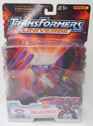
While the color selection was, often…odd…I think that also contributed to the line having a slightly more unique identity than the primary colored mainline. And it definitely seemed to vibe with the “Kenner sensibilities” of eccentric color palettes (as noted by Saberblade, the main designer WAS a Kenner ex-pat). Aside from a small number of offerings (Purplebolt, debatably Stryka, Tankor and Optimus Primal), the line, on the weighted average generally offered solid decos, with some (like Depth Charge, Skywarp, and King Atlas) being downright FANTASTIC. Many of the later Beast Wars and Beast Machines (especially the Maximals) particularly benefitted from the new colors. And again, even the questionable decos benefitted from being available with molds than had often not been available at retail for years (Optimus Primal’s ultra figure was last available in 1997, as was Machine Wars Starscream, and Silverbolt’s original toy hadn’t been around since 1998. More than 5 years, and you’re hitting, effectively, a new generation of buyers)
A few of the early Universe toys had splotchy streaks of red with silver at the center, which tended to also contrast with the rest of the figures' decos. These particular parts of the decos were specifically meant to represent areas of infection on the body by a "Unicron virus".
The figures that had this particular deco element were:
The figures that had this particular deco element were:
- Silverbolt (beast mode back)
- Snarl (beast mode mane)
- Blackarachnia (top of beast mode head and parts of abdomen)
- Striker (beast mode head and back)
- Optimus Primal (top of beast mode head and neck)
- Technically Crystal Widow since she uses the same deco layout as Blackarachnia, just with BA's orange plastic swapped out for red
Universe was the best chance I (and I presume other late-comers or those who otherwise missed the pre-2002 stuff) to get some really fine designs at a much better price than the secondary market.
*raises hand*
That was me. Universe was a huge deal to me. Up til then I assumed that if I missed out on some mold, that was it and I just missed out forever. eBay was a thing but I didn't trust it yet. There was so much FUD about eBay back then. I did try it in 2004 and never looked back, but there was this brief window when Universe was the best thing ever. People make fun of purple Silverbolt but I challenge anyone to tell me it's not beautiful.
And as weird and "just for fun" decos have largely disappeared, Universe has gradually become the best thing ever again.
That's how quickly the tide rose. Fixed!Wow, that's a pretty narrow window.
Added "blurb"!"a fairly extensive..." what "on the packaging"?
Just went with the ones the wiki lumped in with "Universe".What about the unique packaging of the previous years' BotCon exclusives?
*raises hand*
That was me. Universe was a huge deal to me. Up til then I assumed that if I missed out on some mold, that was it and I just missed out forever. eBay was a thing but I didn't trust it yet. There was so much FUD about eBay back then. I did try it in 2004 and never looked back, but there was this brief window when Universe was the best thing ever. People make fun of purple Silverbolt but I challenge anyone to tell me it's not beautiful.
And as weird and "just for fun" decos have largely disappeared, Universe has gradually become the best thing ever again.
That was also me. Universe was absolutely my jam, and a lovely field to pick from for repurposing and whatnot. BW solidified the notion of "offscreen" characters to me (obviously G1 couldn't put everyone onscreen too, but here was a much more consistently tight cast with not much ancillary media at the time, and so a much clearer line between onscreen and off). I've always loved having that, so a whole toyline effectively made up of characters I could either take as that or repurpose was a delight.
Aside from a small number of offerings (Purplebolt, debatably Stryka, Tankor and Optimus Primal), the line, on the weighted average generally offered solid decos, with some (like Depth Charge, Skywarp, and King Atlas) being downright FANTASTIC. Many of the later Beast Wars and Beast Machines (especially the Maximals) particularly benefitted from the new colors.
The initial decos were absolutely jarring, but not necessarily terrible. I think aside from the unexpectedness of the colors, there was a tendency to do too many or to add in certain ones whether or not they really worked (Sabrblade has explained the Unicron virus bit; I get why these intentionally had to clash or stand out but a rationale doesn't necessarily make them more appealing). But you get used to it, I guess. Purple Silverbolt grew on me fairly quickly (it helps that his silver/red is more or less centered on the back, so it looks good). Primal took longer, but now I look back at that and there's some charm to that look.
But yeah, it quickly became great, diverse experiments with decos that resulted in triumphs like Depth Charge and King Atlas (the latter of which I sadly never got, a running theme with me and that mold).
Last edited:
Also realizing I still haven't gotten around to getting this version of Dinobot Striker, who -- along with Fox Kids TM Waspinator, BM Hammerstrike (SO pricey now) and a complete Armada Rhinox and Armorhide -- is among the oldest things on my backtracking list.
What, not counting Reptilion's mane and one foot? Eh, that's alright, the most interesting part of his deco is that one simple paint app that turned Iguanus's fanged nightmare of a face into a simple charming grin.A few of the early Universe toys had splotchy streaks of red with silver at the center, which tended to also contrast with the rest of the figures' decos. These particular parts of the decos were specifically meant to represent areas of infection on the body by a "Unicron virus".
The figures that had this particular deco element were:
- Silverbolt (beast mode back)
- Snarl (beast mode mane)
- Blackarachnia (top of beast mode head and parts of abdomen)
- Striker (beast mode head and back)
- Optimus Primal (top of beast mode head and neck)
- Technically Crystal Widow since she uses the same deco layout as Blackarachnia, just with BA's orange plastic swapped out for red
The 2000s, X: The Space Between, 2
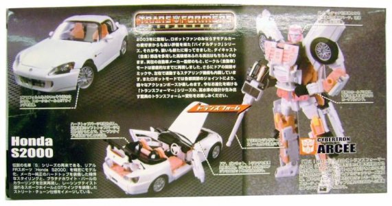
It's pretty interesting to read up on and unpack the conceptual and commercial roots of a subline, especially when contrasting it with the fan perspective. Alternators/Binaltech was apparently born of a number of things, from a desire to deliver on fan demand for "real cars" (a working name for the line apparently) in the wake of Armada's made-up vehicle models, to a move for greater (paid) partnership between Hasbro and car manufacturers in the wake of Car Robots/RID2001's realistic vehicles.
At the time, all of this was stuff I could reasonably assume to be the case, but comfortably in the back of my mind... because at the time what was firmly in the driver's seat was the experience of simply being stunned by the line, right from its initial reveal.
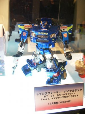
A Japan-based toy show revealed Smokescreen, and message boards (try to keep up, fellow kids) were lit on fire. Here was a toy -- a TOY -- that seemed set to check every box on the list. Realistic vehicle mode, down to opening doors and hood. A bit of the ol' super-articulation (especially for the time, after the budget/engineering shift for Armada). Reasonably-faithful G1 look. LAVISH amounts of paint detailing (Takara was right to choose the rally car version over Streak to debut the line), would be rubber tires and clear windows. A lot of these are commonplace features in 2025, of course, where budget permits -- you can look up or pick up a Studio Series toy right now that is a licensed vehicle with accuracy and articulation, or a Masterpiece that may up the ante on THAT. But in 2000-dickety-three, this was our first 'modern' taste of that, before the live-action movies would make it an easier sell to car manufacturers.
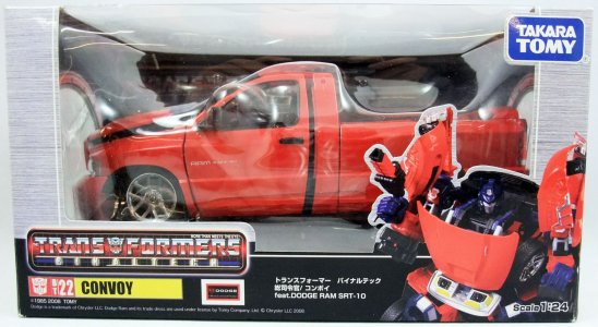
In 2003, these would hit shelves in Japan and then the US, with the former getting the die-cast parts (it's a lost art) and fully-painted treatment and the latter being all-plastic outside of the rubber tires. Both started out in packaging that would be a fairly serious-looking, understated and mature look for a line that delivered great sophistication. This would be most true of at least the first of Alternators' three packaging variation eras, although the next two aren't bad (and the last is the best).
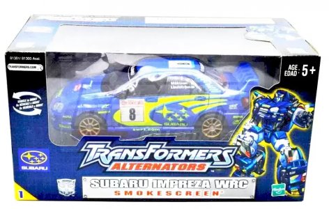
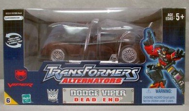
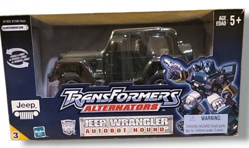
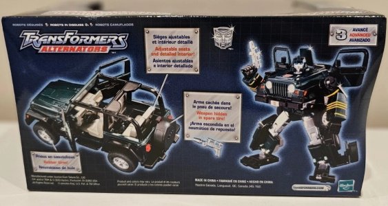
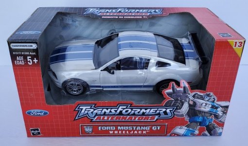
The first Alternators boxes were dark blue with a thin white grid overlaid, with a central front-and-top window offering a display-friendly feel, almost like you were just buying a finished 1:24 model car. I remember them looking bigger in person than in pictures, which tend to highlight how much text/graphics surrounded the vehicles. A big nameplate (with the car model bigger and getting top billing over the character name) was on the bottom center, below the TransFormers Alternators logo (replace Armada with Alternators, in a new font, on a solid plaque shape that didn't evoke a capsule/canister). The logo would also appear on the top of the box, above the top edge of the display window. This was flanked by robot mode character art and the car manufacturer logo. A yellow tag in one of the corners (I originally at the base, moving to the top) gave us the toy's number in the line, not really something Hasbro used to do often prior to this.
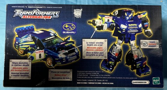
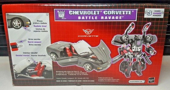
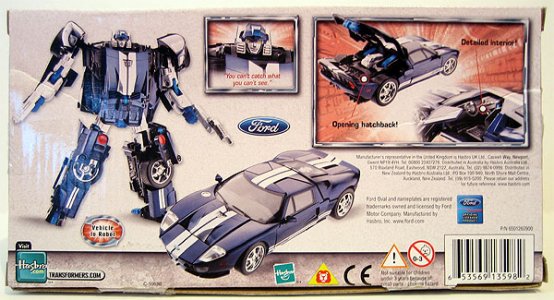
The back of the box was still bereft of bios and tech specs, mainly focusing on showcasing the toy. Robot and vehicle mode toy pictures were accompanied by one or more plaques with blurbs showing features of the car mode, and any gimmicks and any weapons that had made it through the design process. The manufacturer logo would be repeated elsewhere on the box as well, which makes sense.
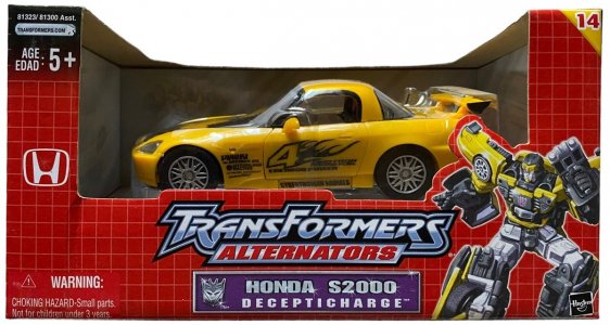
I'd forgotten about the first shift to new packaging, having not been able to follow/support the line at the time (I was still catching up on stragglers from latter-Armada stuff that never made it here, going all in on Energon and Universe, and avoiding the "boo no diecast boo" discourse), but this line did also get caught up in Energon's red packaging vortex (that was also claiming Universe). However, while it had the same color scheme -- mostly red fading into black -- Alternators maintained the white grid rather than Energon's loose grid lines and lightning, upping the nostalgia vibes. It did also add "Robots in Disguise" as a subtitle to the line logo. One particularly notable change here was that the window area no longer had a plastic sheet aligned with the box sides; this "open" box used a molded plastic bubble wrapping around the car's form to protect it. The back of the box offered the same features, now also repeating the car model/character nameplate.
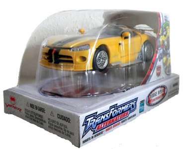
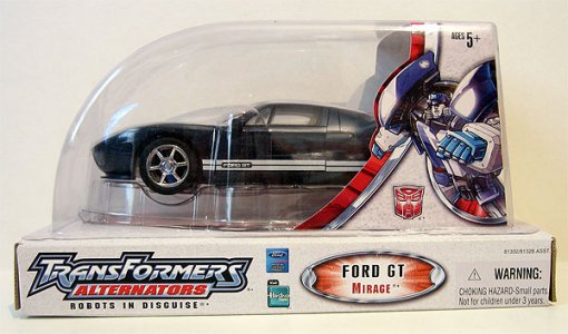
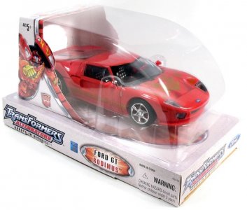
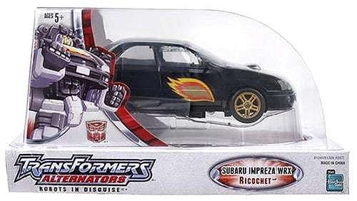
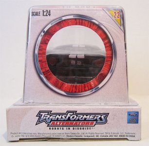
Finally, Alternators pivoted to what I feel was its best and most memorable packaging, if annoyingly difficult to reseal. (I had to cut out a re-tape-able hole underneath like Yosemite Sam trying to get Bugs Bunny to fall through a floor.) The bubble packaging was mostly that: a large bubble attached onto a flat white rectangular box, within which was the car in a plastic shell. A silver-bordered red oval with radiating light streams framed the car from below, and Cybertron-esque white inner card with red and silver borders and half-body character art in a round frame completed the upper half of the packaging from the rear, leaving the bubble mostly exposed. The logo would be present on either side of the base, accompanied by an oval plaque bearing the car model and character name (this plaque also being on the cardboard framing the bubble).
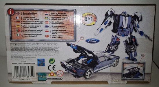
This was an even better way to showcase the car (there was even a cutout hole on the back of the bubble-framing card to let you see the trunk), if a bit on the bulky side in execution. The bottom of the bubble packaging essentially had the layout of the back of the older boxes. By now Alternators packaging was back to being English-language-only in some markets, and callouts were clustered together in one inset box. This was accompanied by a headshot of the robot mode with a character motto added. Markets that still called for multilingual packaging, however, got it, with toy photos (no more motto headshot) accompanied by a single inset box gathering callouts in the required languages.
Last edited:
(continued)
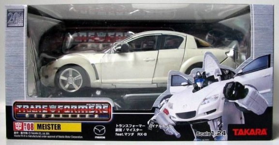
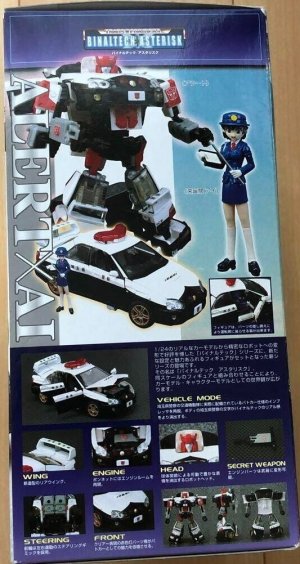
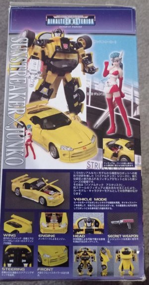
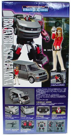
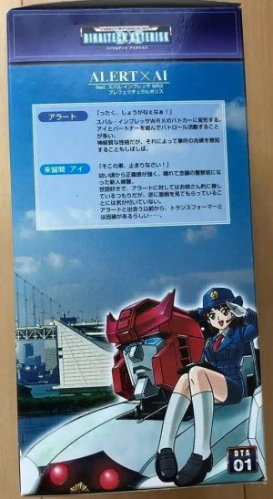
Debuting ahead of Alternators in Japan, Binaltech led with even more sophisticated (if a bit bland) packaging, which didn't change much for Binaltech proper (instead, the toyline name would change and bring new packaging with it), even after returning from different sublines.
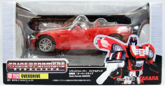
These were silver brushed-metal boxes with solid black bases, featuring a similarly laarge top/front window that showed off the licensed 1:24 car inside. A posed toy robot mode photo instead of artwork to our lower right, and the left of the box front would have the Transformers Binaltech logo (the G1 font for the first half with a faction-color glow behind it, and small glowy sans serif for the subtitle on the classic purple grid background). The character name would be below the line logo in the classic "sigil/number/name on a yellow bar" format, with the car manufacturer logo next to it and a blurb naming the character and the car model ("feat. ___").
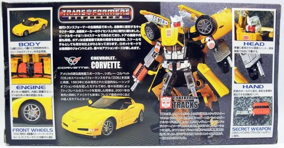
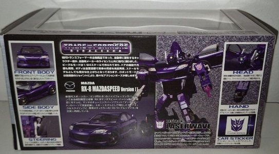
Where Alternators used the side panels for toy pictures in either mode, Binaltech provided cutouts that let you see a head-on view and rear view of the car. The back of the packaging had toy photos of both modes (with a character profile below the robot mode), with various insets showing off the different detailed features (Front! Engine! Steering! Head! Hand! Secret Weapon! -- exclamation points mine), as well as blurbs describing the Binaltech line concept and the vehicle licensed for the toy.
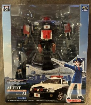
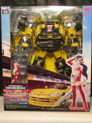
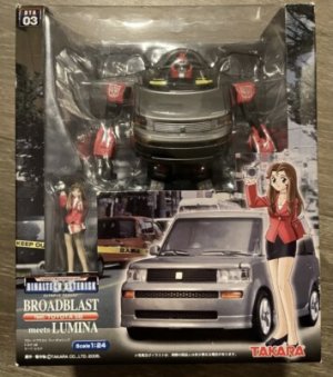
Binaltech Asterisk tweaked the logo, now the full The Trans[Autobot sigil]formers More than Meets The Eye in red and silver, and below it a larger BINALTECH ASTERISK (with blue glow border) overlaid on a large beveled asterisk on a blurple-with-white-grid background. All of this was enclosed in a red and silver border that made the whole thing look like a license plate.
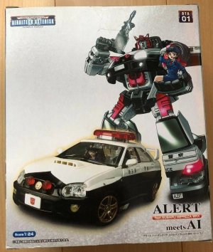
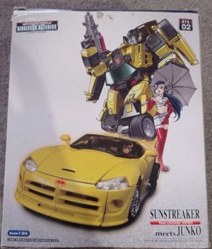
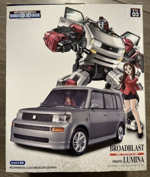
The toys were packed in robot mode along with their female human partners visible thanks to a cutout in the box front, and this was supplemented by a toy picture of the vehicle within artwork for a backdrop, next to large artwork of the partner. The toy's line number was on a plaque to our upper left, mirrored by the car manufacturer logo on the other side of the window. The toyline logo would be on our lower left, and below that the Transformer name (with a bubble highlighting the car model as "feat. ____"), with "meets [partner]" added to it.
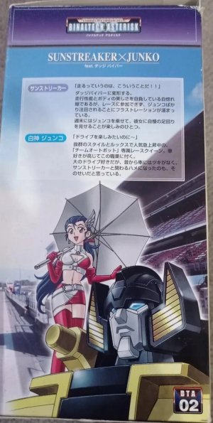
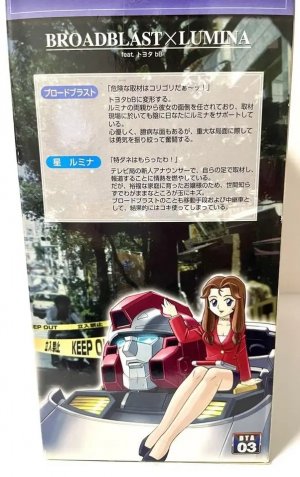
One side of the box would be fairly busy, looking like the back of the box typically would with more toy photos and the usual insets highlighting toy gimmicks and details, and a blurb introducing the toyline as a followup to Binaltech and describing the vehicle. The other side would have nice artwork showing the Transformer with the partner on their shoulder, and profiles for each of them. This left the actual back of the box a clean slate -- a white backdrop with a nice big toy photo of the vehicle, and posed artwork of the robot and partner. It's pretty neat, like a car ad mixed with a workplace comedy movie poster.
This was all very nice, until this too-short line (three releases!) was replaced by a line called Kiss Players, which you may have heard of. I'll roll that in here despite it not technically being called Binaltech.
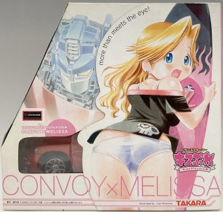
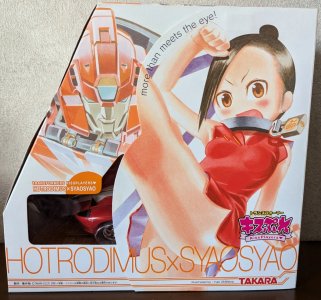
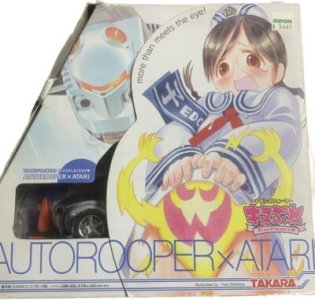
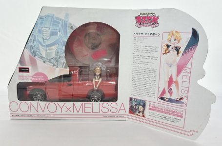
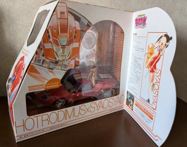
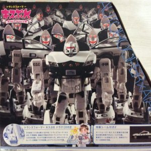
Leaving everything aside that we possibly can, Kiss Players also had a fairly short run with some more involved packaging. This line had some large oddly-shaped 5-sided boxes (that remind me of those boxes for vertical files that had a sloping angle); let's just say a square with a corner steeply slashed off.
The side that seemed to be the front (with the diagonal to our left) had on its whole right side a die-cut flap that featured large art of the female human partner and the toyline logo (large Japanese text, small "Kiss Players" in English text on a banner below it), as well as "More Than Meets the Eye!" (exclamation theirs) on the border. When closed, art of the Transformer character (sleeping?) would be next to the closed flap, and the large print of "[Transformer name] X [Partner name]" on the bottom (with pinstriping below it) would be completed (this was also printed in full below the flap. When opened, the flap showed a profile of the partner with full-body artwork, a box at the bottom with the characters... interacting, helpfully telling you this illustration and figure sculpture was Produce by Yuki Ohshima.
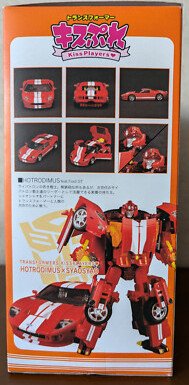
The full window cutout showing the Transformer in vehicle mode and their partner, as well as the included CD. The diagonal portion had a cutout in the shape of the Autobot sigil, so you could see the car and figurine inside from that angle too I guess; below this was artwork of the characters in the titular kiss. The flat side of the box (where the flap attached) had pictures of the Transformer in both modes, and a set of insets showing off details and gimmicks.
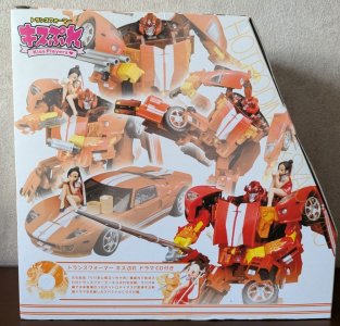
The back of the box had large, somewhat blurred/hazy (dreamy?) toy photos showing a posed robot mode and the ways the female partner figurine could pose around the Transformer, with a callout in the bottom talking about the CD. The Autorooper box skips this dreamy hoopla to instead feature alegion nooo large army of these army-builders.
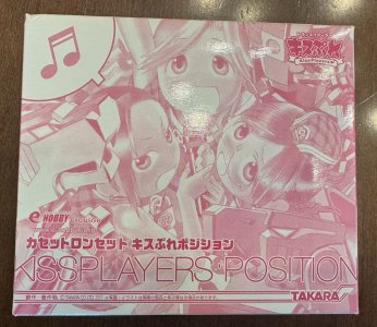
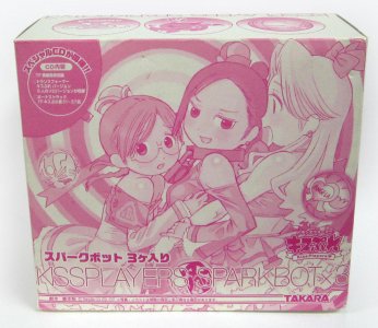
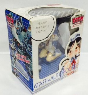
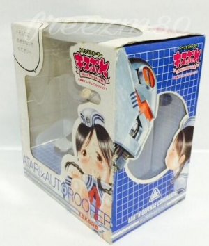
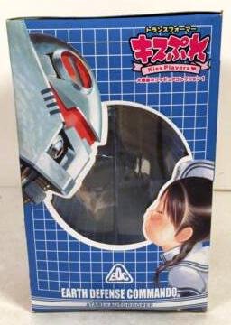
Kiss Players also had a few non-car releases that I'll just mention here. The three-packs (one for cassettes, one forEggbots Sparkbots) had original art in monochromatic pink/white, with large text naming the packs. A couple of PVC figurines of Atari (one with a mini Autorooper) were also available in white boxes that had white grids on blue as the inner background -- and on the sides, which also featured artwork of the Autorooper.
All the ick aside, I find myself actually really liking some aspects of the presentation. I remember the boxes feeling fairly substantial in hand, even premium, thanks to the thickness of the card (certainly the flap). There's also something quite refreshing about the soft white and pastel color scheme for most of the line, and I really like the watercolor-y painterly art style. It might be nice for a series that was just, idk... peacetime Autobots. I love the way the weapons formed out of non-weapon-y stuff here - a surfboard, a fishing pole, road cones. Optimus Prime as David Hasselhoff, taking Marissa to the beach to surf. Rodimus just chillin' and fishing. I wish we could see more of that lighter touch in general, in a toyline that didn't involve too-young-looking female characters in compromising poses.
I also wish I could find a way to get the two last versions of the Auto(t)rooper I need, the big and little ones from this line, without putting myself at risk of raised eyebrows and looks from the post office people or whichever intermediary I'd have to work with.
Next: How much more
Debuting ahead of Alternators in Japan, Binaltech led with even more sophisticated (if a bit bland) packaging, which didn't change much for Binaltech proper (instead, the toyline name would change and bring new packaging with it), even after returning from different sublines.
These were silver brushed-metal boxes with solid black bases, featuring a similarly laarge top/front window that showed off the licensed 1:24 car inside. A posed toy robot mode photo instead of artwork to our lower right, and the left of the box front would have the Transformers Binaltech logo (the G1 font for the first half with a faction-color glow behind it, and small glowy sans serif for the subtitle on the classic purple grid background). The character name would be below the line logo in the classic "sigil/number/name on a yellow bar" format, with the car manufacturer logo next to it and a blurb naming the character and the car model ("feat. ___").
Where Alternators used the side panels for toy pictures in either mode, Binaltech provided cutouts that let you see a head-on view and rear view of the car. The back of the packaging had toy photos of both modes (with a character profile below the robot mode), with various insets showing off the different detailed features (Front! Engine! Steering! Head! Hand! Secret Weapon! -- exclamation points mine), as well as blurbs describing the Binaltech line concept and the vehicle licensed for the toy.
Binaltech Asterisk tweaked the logo, now the full The Trans[Autobot sigil]formers More than Meets The Eye in red and silver, and below it a larger BINALTECH ASTERISK (with blue glow border) overlaid on a large beveled asterisk on a blurple-with-white-grid background. All of this was enclosed in a red and silver border that made the whole thing look like a license plate.
The toys were packed in robot mode along with their female human partners visible thanks to a cutout in the box front, and this was supplemented by a toy picture of the vehicle within artwork for a backdrop, next to large artwork of the partner. The toy's line number was on a plaque to our upper left, mirrored by the car manufacturer logo on the other side of the window. The toyline logo would be on our lower left, and below that the Transformer name (with a bubble highlighting the car model as "feat. ____"), with "meets [partner]" added to it.
One side of the box would be fairly busy, looking like the back of the box typically would with more toy photos and the usual insets highlighting toy gimmicks and details, and a blurb introducing the toyline as a followup to Binaltech and describing the vehicle. The other side would have nice artwork showing the Transformer with the partner on their shoulder, and profiles for each of them. This left the actual back of the box a clean slate -- a white backdrop with a nice big toy photo of the vehicle, and posed artwork of the robot and partner. It's pretty neat, like a car ad mixed with a workplace comedy movie poster.
This was all very nice, until this too-short line (three releases!) was replaced by a line called Kiss Players, which you may have heard of. I'll roll that in here despite it not technically being called Binaltech.
Leaving everything aside that we possibly can, Kiss Players also had a fairly short run with some more involved packaging. This line had some large oddly-shaped 5-sided boxes (that remind me of those boxes for vertical files that had a sloping angle); let's just say a square with a corner steeply slashed off.
The side that seemed to be the front (with the diagonal to our left) had on its whole right side a die-cut flap that featured large art of the female human partner and the toyline logo (large Japanese text, small "Kiss Players" in English text on a banner below it), as well as "More Than Meets the Eye!" (exclamation theirs) on the border. When closed, art of the Transformer character (sleeping?) would be next to the closed flap, and the large print of "[Transformer name] X [Partner name]" on the bottom (with pinstriping below it) would be completed (this was also printed in full below the flap. When opened, the flap showed a profile of the partner with full-body artwork, a box at the bottom with the characters... interacting, helpfully telling you this illustration and figure sculpture was Produce by Yuki Ohshima.
The full window cutout showing the Transformer in vehicle mode and their partner, as well as the included CD. The diagonal portion had a cutout in the shape of the Autobot sigil, so you could see the car and figurine inside from that angle too I guess; below this was artwork of the characters in the titular kiss. The flat side of the box (where the flap attached) had pictures of the Transformer in both modes, and a set of insets showing off details and gimmicks.
The back of the box had large, somewhat blurred/hazy (dreamy?) toy photos showing a posed robot mode and the ways the female partner figurine could pose around the Transformer, with a callout in the bottom talking about the CD. The Autorooper box skips this dreamy hoopla to instead feature a
Kiss Players also had a few non-car releases that I'll just mention here. The three-packs (one for cassettes, one for
All the ick aside, I find myself actually really liking some aspects of the presentation. I remember the boxes feeling fairly substantial in hand, even premium, thanks to the thickness of the card (certainly the flap). There's also something quite refreshing about the soft white and pastel color scheme for most of the line, and I really like the watercolor-y painterly art style. It might be nice for a series that was just, idk... peacetime Autobots. I love the way the weapons formed out of non-weapon-y stuff here - a surfboard, a fishing pole, road cones. Optimus Prime as David Hasselhoff, taking Marissa to the beach to surf. Rodimus just chillin' and fishing. I wish we could see more of that lighter touch in general, in a toyline that didn't involve too-young-looking female characters in compromising poses.
I also wish I could find a way to get the two last versions of the Auto(t)rooper I need, the big and little ones from this line, without putting myself at risk of raised eyebrows and looks from the post office people or whichever intermediary I'd have to work with.
Next: How much more
Last edited:
I only asked because you singled out Cyclonus, who predated Universe in a little-known separate line of four toys while leaving out both fellow Expanded Universe boxed figure CatSCAN and all of the previous packaged BotCon exclusives who were sold under the Generation 2, Beast Wars, and Beast Machines labels from their respective toyline sections.Just went with the ones the wiki lumped in with "Universe".
The simplest and truest answer there is: I wasn't going to really get into Botcon stuff, then I figured I'd add the small handful of Universe-adjacent ones the wiki listed, stumbled upon Cyclonus in an image search and saw "Expanded Universe" on his packaging, and shrugged and added him in there. And then I just straight-up forgot CatSCAN.
In case that was a lot to infer, well, at least it's explicit now.
Anyway, I've just gone ahead and removed Cyclonus and the description of his packaging to keep it to proper Universe.
In case that was a lot to infer, well, at least it's explicit now.
Anyway, I've just gone ahead and removed Cyclonus and the description of his packaging to keep it to proper Universe.
Last edited:

![tfgfvectorprime02[1].jpg tfgfvectorprime02[1].jpg](https://www.allspark.com/home/data/attachments/30/30228-11e38bba78f7dded5a9154ce874ca820.jpg)
