Outside? Inside? No, thinking ABOUT the box: your thoughts on Transformers packaging

lastmaximal

Administrator
Staff member
Council of Elders
Citizen
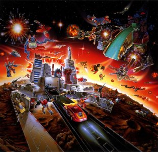
This brand is more than forty years old, and that history has come with an undeniable amount of refreshing, reinventing, and rebooting. That also means it's been in stores, both physical and virtual, for all that time, and many of us (certainly the older element) have indelible memories of the first impression these toys make on us in person: as packaged items on store shelves, themselves constantly changing in an effort to keep the brand visually fresh and eye-catching.

7yfdertgv.jpg

This is a long mostly US-line-centric ramble about packaging, assisted by the wiki, and it'll be constrained by my own limited familiarity with and exposure to a lot of this (especially from further back), owing in turn to my geographic placement and economic situation at that point in my life (and later, uh, laziness I guess). All these pictures are stolen from various places online, and are just here to facilitate discussion and break up walls of rambling.

I invite you to put up with it, or (more likely) scroll past it, and tell me YOUR thoughts on Transformers packaging across the decades.

My thoughts, after all, will be all over this too-long ramble. But TL; DR?

1754985208099.png


The 1980s
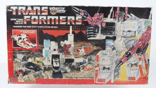
The retroactively-named Generation 1 gave us the classic, iconic grid-based packaging, in box and blister/card form. Toys ("Deluxe" and up) tended to be packed in altmode (nestled in styrofoam originally, iirc), with striking packaging design that faded from black into the white grid on red/purple (with a soft spotlight, behind the character art).

The juxtaposition of altmode toy and robot mode box art made it clear what being one of "The Transformers" meant, and the simple gimmick of "this is two toys in one" was illustrated neatly by a simple step-by-step photograph demo on the top of the box, and a callout that attested that this toy "transforms (later converts) from x to robot and back!". This was a great way to sell the toys, as in thos well-before-internet-days I remember a BIG hook for me was figuring out how the toys did what they did. How does this MASK vehicle turn into this MASK battle mode? Where do Swoop's robot legs go in dino mode? This was complemented by carded figures having instructions on the back of the card. Boxed figures had these paywalled, heh.

hgbv.jpgcyvcr9r44le91.jpg

The box art was similarly gorgeous painted depictions of the toy in poses it almost certainly could never achieve, but with details and proportions that were fairly accurate to the design nonetheless. The murals on the back are also memorable, and lavish in the early years. I'm thrilled that we finally got a book archiving these years', for the most part, and wish we would get more comprehensive coverage for the other eras (the Visual History book is nice, but gimme all of it).

4dvrivu6u6xa1.jpg

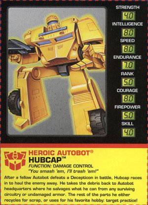
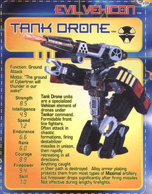
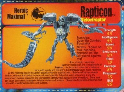
Along with the box art, it's worth noting the other key anchor of the packaging of this era: the panel featuring the character's Bio and Tech Specs. Bless you, Bob Budiansky, you took a toyline that could have coasted solely on the cool factor of its vehicles and box art for a year or two, and made nerds like me interested in finding out how cool they were "in person", as characters. Right down to having a motto or character quote that won me over faster, and more fully, than the also-cool trivia about what sci-fi weapon this dude had. This UFO guy is sad when he's away from his pals for too long. This fire truck is an adrenaline junkie. This cool-looking car is vain about being a cool-looking car. These little bits of personality went a long way, even if your sole exposure to the brand was the toys.

This was definitely an era when toys were surer sellers and harder to knock off their pedestal, and companies were generally willing to spend on production and packaging for even bigger-ticket items. I wasn't of age to be going from store to store in early G1, but I can't put into words the sheer wonder I felt upon seeing (I think) a beat-up packaged Sky Lynx (?) in a store that really had no business still having expensive toys from years ago but somehow did. (Sky Lynx would doubtless see this as fitting.)

28183_xl.jpg
I don't know if I ever saw a Metroplex at the time; maybe not. I probably would've fainted. Later on, seeing other big bois in local specialty stores evoked the same kind of childlike glee at seeing that packaging style blown up to such sizeable proportions. And decades later, getting the Encore Fortress Maximus in fittingly retro-feel packaging was quite the experience.

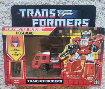
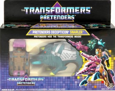
This would get streamlined and stylized as the years went by, with the color gradient in the main logo being tweaked for easier readability and things like a big triangle behind the letters being added (for the Pretenders era, which actually had "Pretenders" under "The Transformers" -- something I only remembered fully upon reviewing the wiki). It's a simple but effective grounding device; I have no art or design expertise with which to interpret this, but I like it. It's very distinct from the text orientation up to this point, which had tended to be left-aligned (to complement the box art on the lower right), and maintains the familiar packaging look while nudging it in its own direction. This works in tandem with the subtle change to the colors and design: the black half goes further, and the grid evolved smartly into a "digitized" tile mosaic that took a different tech vibe angle. The stylizing of the light burst behind the characters (see also GI Joe) started to some degree around the time of the Headmasters packaging, which itself has some unique elements highlighting the Headmaster partner.

7uytrfc.jpgimg_8934.jpg


The 1980s/90s: Japan
Are you even still reading? Thanks and sorry. I also apologize in advance for this being probably the most glossed-over, underinformed part in an essay full of glossed-over, underinformed parts. All of this I really just found out when backtracking upon getting back into Transformers full-time in the early 2000s. You know, ~25 years ago ( /psychic damage)

Rediscovering Transformers was first a matter of finding out that Headmasters, Masterforce, and Victory were a thing, but only through text lists and descriptions in the early-internet days. And only later finding fansites (oh boy) that had pictures. It's hard to describe the feeling without seeming like I'm romanticizing it, but it technically is retracing history?

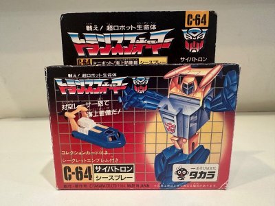
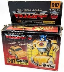
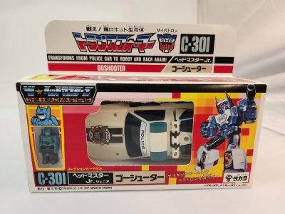
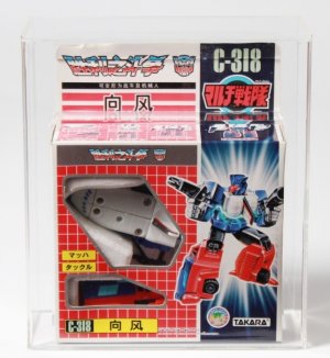
The earlier, still-in-sync-ish releases with the US lines had similar packaging, except with logos and really most text in Japanese (and, of course, the Japanese numbering label) for that extra weeb appeal. I do dig how almost all (?) of the toys came in a box, however small -- even stuff that would be carded in the US. I'd forgotten about this until seeing the Missing Link packaging for Bumblebee and Cliffjumper. Adorbs, fellow kids. And I can certainly see how this furthered the impression that Takara cared more about fans and whatnot, enough to give them premium packaging for everything unlike Cheap Has Blo.


nbgrf.jpg343rr.jpg

Looking for these and seeing so many pictures in one go has really shown me that yes, Takara really put that company logo on things, hoo boy.

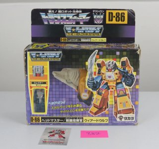
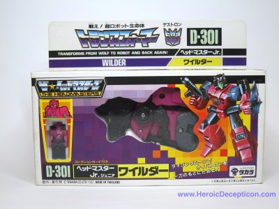
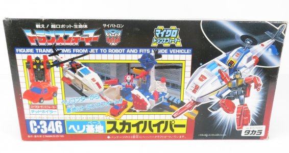
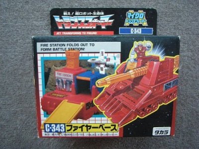
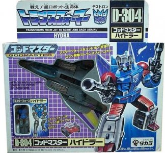
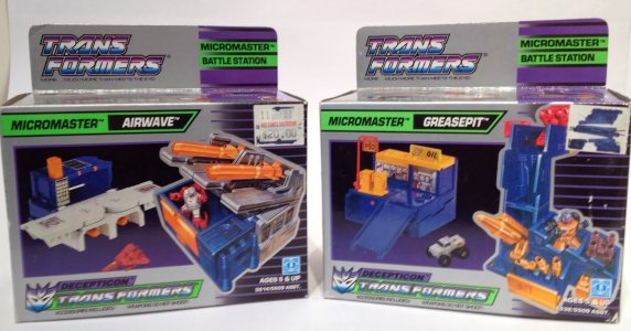
Once they had their own standalone toylines, however, they made their own packaging to go with them. Headmasters was initially more in line with the US boxes down to the pixel grid and highlights for the Headmaster, but with the show logo. They would then shift to very different-looking packaging and not look back from there. (The Headmasters closeups aren't in Transtector head mode, huh.) The Micromaster packaging was also kind of nice -- largely the same, but with a darker box base (the opposite of what they'd do later on).

G85C4179_a6a757e6-d447-4384-bec6-98f3e3674db4.jpgIMG_5638.jpg20231118-083548_1024x1024.jpg
526696514_1845709652891361_777158822594411669_n.jpg2839629240100811158S500x500Q85.jpg

Seeing pictures online, and then occasionally seeing these rarities in person in specialty stores, was quite the experience. I'd always assumed packaging worldwide was the same as the US, with translations where needed -- and when the US lines ended or paused, that they just kept using the same trade dress. Nooope.

As such, the discovery was a surprise. The largely-white/cream boxes seemed like such an aberration. Or a revelation. IDK. But it was definitely Not What You Got In America. The closest the Western releases had gotten was the silver Micromaster packaging. But here was a white/cream base, upon which would be the pixel fields and eventually a big white-on-faction-color grid.

10176591_1_1.jpgHydra_1274911596.jpg53243119334_9a60d5b0f0.jpg

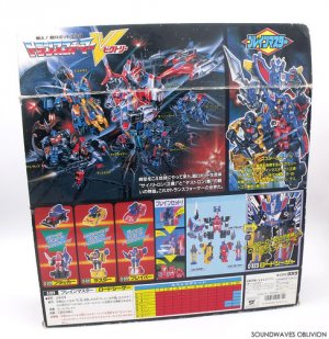
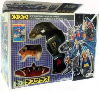
Notably, they did continue having gorgeous murals on the back. For some reason, this doesn't come together as nicely for me as the darker packaging, partly because the white background doesn't really keep the eye reined in. I THINK it might be that they felt like the bigger GI Joe vehicle boxes, where they didn't want to waste money on more ink and just printed on white cardboard. Maybe it's the thicker white-grid-on-solid-color feeling a little tablecloth-y. MAYBE it's the way the cutouts to show the toy are so close in against the toy -- actually more intricate work and probably costlier, but feeling like they were trying to clumsily display or hide the toy.


deszaras.jpghq720.jpg

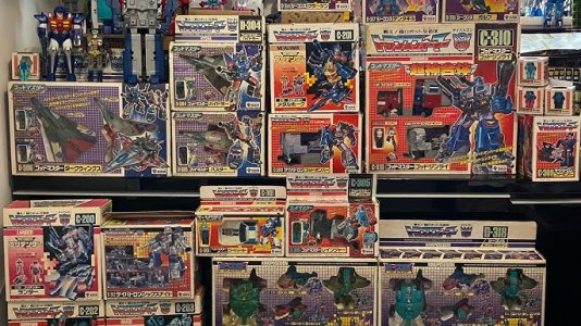
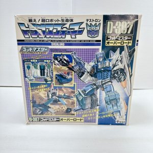
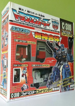
Or maybe it's that my first encounters with this look was probably with KOs that were copying these instead of US boxes (I vaguely recall a Skydive like this), intercepting Takara in forming that association? I don't really know. But as, uh, tacky as it sometimes feels (the boxes above are all right, but the more elements pile in, the more Graphic Design Is My Passion it feels) it's hard to deny the sheer impact of the bigger ticket items like God Ginrai or Overlord. Gorgeous box art and all, and packaging that really sold the impression of their size.

transformers_g1_reissue_c310_g_1613127885_8c086c6b_progressive.jpg8ijygbf.jpg


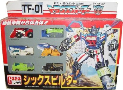
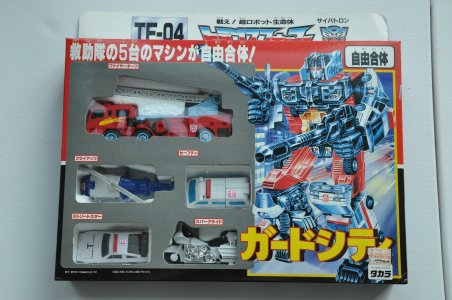
Shading into the 90s was Operation Combination, which did away with the grids and such entirely (except for on the back, somewhat cleverly echoing the scramble configurations). There were lots of solid color blocks instead, including a somewhat bland dark gray/silver sea surrounding the combiner team members. But there was nice, big box art that looked great. I especially love that they're set against backdrops, which we hadn't really gotten for main box art.

Sixbuilder_1274995710.jpgDSC_0426.jpg


This, of course, is far from the end of the fun with Japanese Transformers packaging, as they'd continue to make their own twist on each era...


Attachments

  • img_5547-2.jpg
    img_5547-2.jpg
    212.1 KB · Views: 13
Last edited:

lastmaximal

Administrator
Staff member
Council of Elders
Citizen
The 1990s, 1
As one decade shifted into another, the need to keep the packaging fresh for what must have been a surprisingly long runner (these were unprecedented times, as hard as that might be to imagine now) was becoming clear. The logo got stylized further and italicized (this was an era of dynamic angles), and the familiar grid-on-gradient packaging was replaced by solid blocks of color.

The lovely painted character art still featured, if less prominently, as a great visual anchor that maintained the brand's feel despite the radically different packaging. Definitely even more poseable and expressive than the Micromasters actually were... although I can say the back-of-box murals took a big step down, feeling more "I finished this page in my coloring book" than "lush, painted artwork". Less the content than the style, I suppose. Still, it gave us Spaceshot's finest moment ever, so it can't be all THAT bad.

micromaster3.jpg

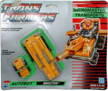
Micromasters got somewhat bland silver cards with the logo, toys , and right-hand edge (character art and a faction-color stripe column) being pops of color. Of interest to me here is how the toys were shifted more to the left on carded stuff (compare Micromaster Transports to, say, Minibots), as the artwork and design column took up the right (this works better on boxed figures like the Euro Classics). The boxed Micros also had no plastic window.

G1Toy_Erector_CardedSample.jpgphoto 1.jpg

I'd honestly forgotten about this (actually forgettable) silver blandness, as when backtracking and reading up on past years in the early 2000s all I found notable was "Euro Classics had gold boxes!". This despite having a Micromaster Erector and the Construction Patrol (although I sadly can't remember having or keeping the packaging for those) and never even having been to Europe at the time or since. Interestingly, the gold boxes seem to actually just be the same packaging design swapping silver for gold. Which, reviewing the wiki, was also the style the remaining Pretenders releases used?

I have vague memories of what Google searches tell me is (Euro?) Micro Transformers packaging, with the pre-silver card grid-on-gradient and central triangle device. Then again, those are vague recollections of owning a Patrol where Mudslinger was named "Mars" (not any of his European names), so that was prooobably a bootleg?

devastatoram0604.jpgDSC03538.jpg

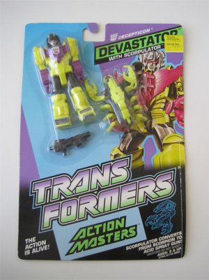
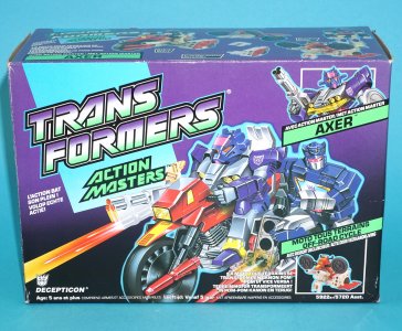
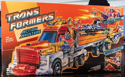
Action Masters gave the packaging a shot in the arm in terms of color. The largely-neutral-feeling gold and silver spreads gave way to the old faction-themed colors (fading into black), and everything took on a dynamic Dutch-angle slant. I can't get enough of the chartreuse? teal? on purple gradient here. It's so minty and relaxing.

The logo font had by this point been its stylized-retro form for a while, and feels quite at home with this riot of color. The simple, maybe basic, gradient background kept the focus on the large artwork -- which was similarly dynamic and different, no longer the blocky somehow-articulated visions of the toys from the past. Some of this is due to the Action Masters themselves being more poseable in general, I suppose, and the need to sell them as action-y rather than Robot That Stands There.

It's kind of wild how much card there was for how little toy there was, with so much space being just the logo (there's box art, but for carded figures that's like 1/4 of the space). Also, the norm was still to have blister bubbles that more or less confirmed to the toy's shape, rather than a uniform bubble like we'd see in most later series.

Carded Action Masters put the figures at the top left, with the box art and character name in big print next to them. The brand was probably big enough that it didn't need to be the first thing at the top. That, or the huge logo was a distraction from how tiny the toy actually was? This seemed to be a common thing for these lines as GI Joe was starting to have that feel too as cards had to be more visually loaded to be catching but (like the Action Masters) the figures remained small. Regardless, I like having quick and easy ways to see who's on the pegs/shelves.

515295322_10163969617879467_1973175195349862650_n.jpg

Boxed items (Action Masters and their vehicles) didn't even have the toys prominently visible on the front (just a smallish corner inset), with the front of the box being dominated by artwork showing off the vehicles crammed to the gills with other Action Masters. (I'm still getting used to how... Empty the backdrops were.). There's an inescapable GI Joe -esque feel with the vehicle being the highlight, and the pilot getting a small callout. It's kind of funny how small and lost the little slogans and labels seem to be. "The action is alive!" is there like an afterthought.

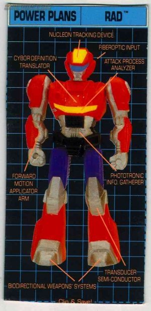
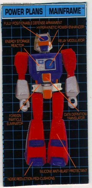
Action Masters then changed things up by also giving us Power Plans! This seems to have coincided with GI Joe bio cards labeling weapons (visible in the box art, like Ice Cream Soldier's "3 molotov designed baseball grenades") and, uh, whatnot (the Toxo-Zombie's "2. Mindless , mutant, unblinking stare") from the packaging art. I always loved technobabble, so this was an easy sell. Not that I was ever out in toy stores enough to find out that Jackpot's "Target Configuration Scanner" was in his crotch, or that Starscream's left nipple doubled as an "Image Revealing Sensor".

76ygvfd.jpg5tr43ed.jpg


The 1990s, 1.5: special Euro G1 shout-out
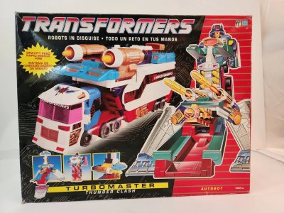
On a (more) personal note, I'm quite fond of the Euro G1 stuff from this odd intermediary period, as it was among the remaining stock I encountered in a local toy store after a pivotal pre-adolescence move to a bigger city. I had (and later had to sell) a Thunder Clash, and eyed so many others that this store had.

The packaging for these was a nice evolution from the Micromaster-era "lined righthand column" (now a solid column with thin lines, as opposed to the former thin stripes forming a column) with G2's black background instead of the silver or gold (but with very cool subtle tech greeblies). I think the carded figures started the "through the card" convention that G2 would also use?

maxresdefault.jpg471948642_10161530834504843_5763858604973300754_n.jpg

I love these in breathtakingly unhealthy ways.

Box art tended toward a chunky, sometimes Dreamwave Squat feel, and a nice big logo (distinct from the Micro-to-Action era font) up top (the boxed ones being one non-separated word), with a simple color strip with the subseries/subgroup nearby. The actual character name is below aaaall of this, and the faction is more readily indicated by the column color, more than the small sigil and smaller label below the art.

20240522-183418_1024x1024.jpg


As much as I am inextricably linked to G1, this is kind of what I pine for more, if only because that degree of missing it hasn't been sated by a decade of reissues like the 80s stuff has. It's vivid and colorful, but not overstated.


The 1990s, (Generation) 2
One of the neater things about G2 is that it's become infamous for being The Neon Toyline due to wonderful things like G2 Ramjet, G2 Bruticus, and candy-colored Dinobots (the last not even being neon, necessarily)... but it's on perhaps the most strikingly plain, black cards (Europe would later give this minimal faction-color gradienting at the bottom). Then again, the logo DID abandon the mostly-white/silver (with red and or blue gradient) of the past to go for a hot pink with yellow stroke, soooo. (I actually really like this combo.)

Lots of reused assets for the reissues and whatnot, and even newer art (Rapido, etc) seems to be evoking the more toyetic style of the pre-Action Master days. A lot of the staples, including the spotlight/explosion behind the character art, were still there. These now looked more like latter-day-Bay streaky fireworks, and later waves would have a cool wormhole-grid portal thing (is there a correct term?) Even the transformation demo pics were still there, although by this point we'd notably hit a nadir for bio and quote quality...

reduced-image_14266_106.jpg3513496_orig.jpg


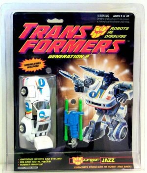
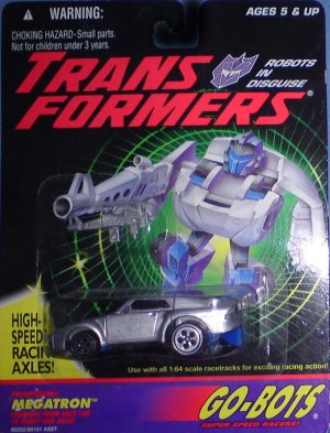
Perhaps most notable for G2 for me would be two things about the packaging: the "through the card" placement of the figures, and the giant non-resealable clamshell enclosures. The former was VERY cool, and the latter was very not cool. I liked getting to see "the whole toy", but even for a kid wrapping the card in plastic seemed weird and wasteful. Later on they'd go to simpler bubbles on both sides.

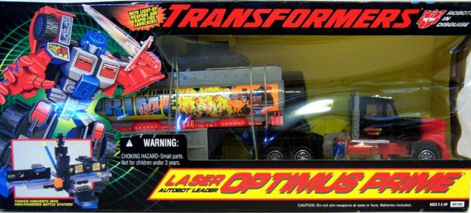
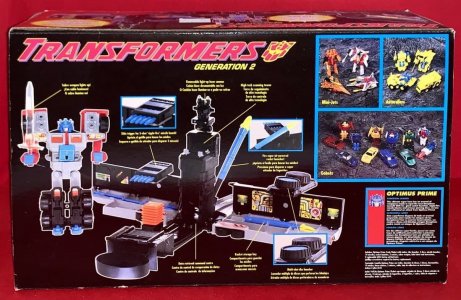
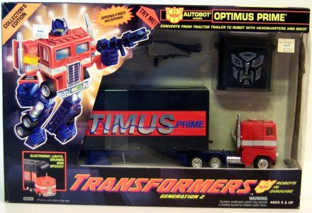
No more Power Plans, but we would apparently get some packaging weapon callouts (not as fanciful, though -- "lights and sound module", "scout car", spring-fired weapons"). This would peak somewhat with Laser Optimus Prime, who to be fair had a ton of (metaphorical) bells and whistles. Sadly, the final product robbed us of Some Kind Of Bucket, but you can't have everything.

578131_orig.jpgtransformers-g2-laser-rod-optimus-prime-empty-box-(2)-4007-p.jpg

I also don't recall many co-sells from years prior to this (other than featuring a horde of Action Masters in each vehicle), but here there was sometimes an Also Available box. Buy the other G2 figures: Autobots, Decepticons, Dinobots, Optimus Prime.

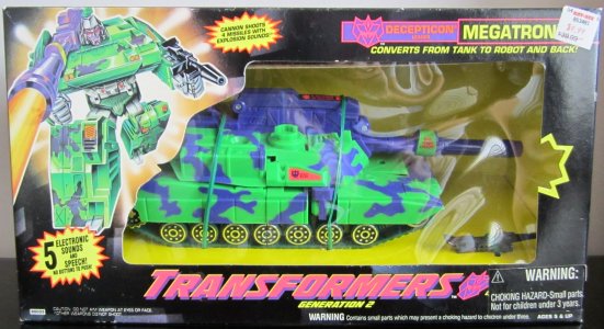
At this point it's pretty cool to look back at this and see a take, in packaging terms at least, that seems surprisingly grown-up. 10 years into the brand and the literal "next generation" of it is seemingly packaged in perhaps a "grown-up" sort of way that highlighted the brand's longevity (and maybe coming of age) at the time. Optimus' box even calls it a Collector's Edition, although calling everything that was very much The Style At The Time. But even that aside, the effort to evoke some sophistication can be seen in the understated black cards and (I guess) premium-feeling plastic clamshells early on that let the items stand up for display. Optimus even gets a similarly lower-key black trailer, although that's counterbalanced by the huge Very Much A Toy sticker of his name. There's even a contemporary vibe about how Optimus Prime is packaged, with a taller box that displays him+trailer and the sound box as separate units.

LeaderOptimusPrime_1212933108.jpgIMG_6666.jpg
Also, just noticing how the usual orientation of the vehicle facing left is reversed here, with both G2 Op and Laser Op facing to the right with box art on the left. The same is true for Megatron; I think this is the only bigger G2 toy I remember seeing in person post-move. Check out that cutout on the border, being blasted by the tank!


Next: The NEW New Generation

Truth be told, this kind of got away from me the more I remembered and the more I discovered. I thought this would just be "G1, grid on gradient, G2, black cards with clamshells, the end." In the end I did rediscover why I was so fascinated about this topic to begin with, but it kind of ate up my entire afternoon -- and for next time I may either need to budget another whole day to rabbit-hole, or streamline the approach.
 
Last edited:

Sabrblade

Continuity Nutcase
Citizen
This would peak somewhat with Laser Optimus Prime, who to be fair had a ton of (metaphorical) bells and whistles. Sadly, the final product robbed us of Some Kind Of Bucket, but you can't have everything.
For reference, for those not in the know:

1649458791992-png.5475
 

lastmaximal

Administrator
Staff member
Council of Elders
Citizen
Some SORT of Bucket, ah.

Thanks! I ran out of time looking for that. I love all of it. BIG OL' TOWER.
 
Last edited:

Rustron

Member
Citizen
Great write-up. I have a similar love for Beast Wars and 2007 packaging. I "discovered" Beast Wars when I was 3 years old. The lizard eye packaging of the original Beast Wars packaging was so cool. And the edgy box art is insane, I wish we could get an artbook with all of it like we did for the G1 era. Everyone looked more like monsters than robots. I kept the cards for every single Beast Wars toy my parents bought me. No other kid I knew did that, lol. I had to throw away some of them after my cat used them as a toilet a few years later, but some others were stored in a different place and survived. I remember being so sad about that, specially for the collapsed boxes for Transmetal Optimus and Megatron I had kept.

The first Bay movie was how I got back into Transformers, and I loved the packaging. I was at that age were you're embarrased about liking childish stuff, so I mostly experienced that era from afar, but there's a sort of "industrial alien" feel to that packaging design that's just perfect. AND it has a big eye behind the toy, like Beast Wars. So maybe the key to excellent visual design in packaging is just slapping a big ol' non-human eye behind the product.

I'm also a big fan of Classics, Cybertron and Animated cards and boxes. So much style, and detail. The little flaps depicting both modes on Classics I just found out about like, 4 years ago, as I've never seen a boxed Classics toy in person. I was blown away, VELCRO on a card???
 

Magnusblitz

Well-known member
Citizen
Nice write-up, always love the trip down memory lane. The packaging for '84-87 really does feel like top-tier stuff to me, and I think it's easy to take for granted how much the mural art, individual character art and tech specs all made the toyline so much more enjoyable. I remember being quite sad when Beast Machines got rid of the individualized art. We still get some decent art from time to time but I definitely miss the tech specs on today's packages.

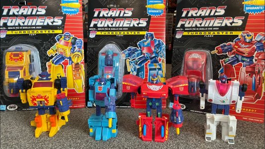
It's probably a good thing the 'net wasn't around yet for me to complain on, because I probably would've bemoaned those packaging changes for the Micromasters and onwards with the silver cards and downstep in art. The Action Master stuff is good but does look a bit more generic, like a lot of other 90s toys at the time. Turbomaster packaging (which we didn't get in the states) looks great though.

As I grew up on G2 I'm probably influenced by nostalgia, but I remember thinking those packages were really cool at the time. Not just the black cards, but the triangular clamshells that the mid-sized toys had were really cool. Total pain to open, but maybe that just added to the mystique, heh.

Beast Wars also had great packaging with the beast eye, and continuing the tradition of the painted individual character art. It almost felt like a shame that opening the packaging necessitated ripping off the clamshell and leaving a big tear in the card.

Cybertron had some nice packaging too with the white coloring and trapezoidal shaped boxes.
 

Sabrblade

Continuity Nutcase
Citizen
Beast Wars is also very good. The only thing that holds it back is the lack of murals on the back. Imagine how crazy those would have been. We were robbed.
On the other hand, some of the cross-sells looked really cool with the toys displayed on mountain dioramas that looked like each side was lining up for a military roll call scene out in the wilderness.
 

lastmaximal

Administrator
Staff member
Council of Elders
Citizen
The 1990s, 3: Rise (and Fall) of the Beast (Era)
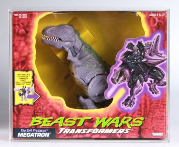
The brand's first real major reinvention took the stage in the mid-90s as G2 fizzled out (sadly at the peak of its engineering growth) and Kenner took over. Beast Wars was introduced as more or less its own thing, with packaging that looked wholly unlike anything that had come before and even the official logo initially downplaying that this was Transformers at all. I think partly as a result of this, my initial reaction to seeing these on shelves was to wonder if they were bootlegs that brazenly used the Transformers name. We did get quite a few brazen bootlegs. (I didn't really look all that closely to check the company branding and whatnot, as this was around the time of the big move and teen me was occupied with a range of other concerns.)

nbgfvfc.jpg76tgfde.jpg10178685_1_1.jpg

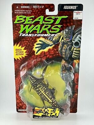
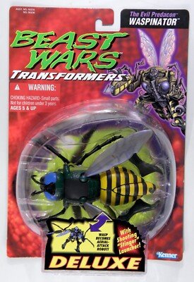
"Beast Wars Transformers" looked very striking on shelves, with a deliberately distinct look abandoning anything vaguely tech-y that could have been inherited or repurposed from G2 and before, instead going for a card design that would also have made for a cool poster (and I guess did). The simple, strikingly scaly red skin all over the card was a little distracting, but I don't think I'd ever seen that much raw detail on a toy card before. It's telling that some cards seem to have hit it with a thicker Gaussian Blur than others, perhaps to mute that effect.

This was nonetheless certainly a departure from the solid colors and grids of the past, as this organic, uneven, uncomfortably-close-up view of a beast/dino face with a stark yellow eye behind the toy was definitely its own thing. The vibe was lost a little bit with the biggest figures, as Optimus Primal and Megatron seemed to be emerging from... giant yellow sores. There's something about the yellow gradient instead of a solid border (I get avoiding black as yellow makes for a better highlight, but...) that makes the boxed dino-eye-face more off-putting from some angles.

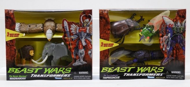
The toys were now mostly -- only a handful of boxed figures in the higher price points -- in blister bubbles on cards. Apparently early on there was also the question of variance between smooth bubbles and rocky bubbles, all of which I missed completely. The cards and bubbles alike were much bigger than I remember the line's predecessors being -- this span of time got me used to tall vertical cards and nice large round bubbles, and the toys inside typically set at an angle in whatever way fit them into the bubble most neatly rather than always in profile view. It may be the comparison to smaller, more budget-constrained contemporary stuff, but the big bubbles made the toys seem massive (part of this is also due to the beasts sometimes being flat and wide, like Razorclaw and Waspinator). Showing off these great, realistic-ish organic beast sculpts was definitely a mission accomplished by the packaging, which did it even better with Magnaboss and Tripredacus. It's not hard to see how this new flavor of "how does THAT seamless thing become a robot?" re-captured the imaginations of lapsed Geewunners and new fans alike. And they didn't need much more than to be displayed well, which the simple but effective combiner team packaging did excellently with a little shelf allowing for an angled view of some of the components.

BeastWars-AirazorBack_2048x.jpg6060109.jpg

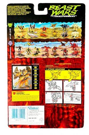
Stickers on the front of the bubble showing some figure detail (and/or the old transformation demo) were a neat touch, but would later be replaced with more generic logo stickers. Instructions on the back for carded figures, and co-sells with individual names (at first on a generic backdrop but later on neat, catalog-y nature stages) were still standard.

I hadn't realized until later on that this was where twist ties really got started? Lots of grousing over those in different online fora at the time and after, I think, from people who somehow found complaining preferable to just taking a pair of nail clippers to them. I guess it's part of the community discourse, the shared experience and all. Like how we romanticized driving or biking or taking the bus everywhere to hunt. (Perhaps to feel like I belonged, I did also manually untie the toys I got until, like, RID2001, to kind of squeeze out as much out of the experience as I could.) Was this also when molded interior trays became a thing? G1's bubbles seemed to just trap the toy against the flatness of the card, but here there was also a plastic bed for them to lay on and be tied to with plastic-coated wires. Sure glad we got rid of that environmentally-destructive styrofoam!

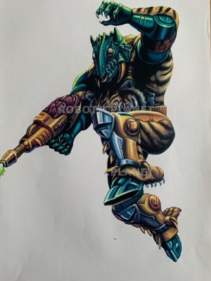
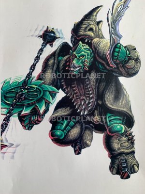
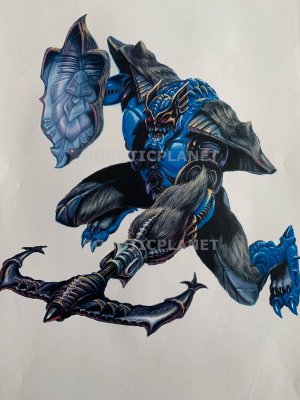
The box art was also quite a departure here from what came before, taking a somewhat more comic-booky or fantasy-style feel that really highlighted the bestial half of these cyborg creatures. I went back and forth on this, partly due to needing to get used to fur all over my robots, but more so than that just not being fond of how... 'GI Joe" some of the poses felt (Wolfang here in particular feels very Battle Corps). The box art tended to be unpleasantly crammed into the upper right hand corner of the card, sometimes blending in a bit with the background or obscured by the toy. Or posed to avoid the bubble (again, see Wolfang) but such that little of it wound up on the card.

E6LQgM6WYAA9LRn.jpgE6LQIAIWUBQbnUL.jpgE6LQjwaWEAQxxkm.jpgE6LQU62WUBED1Nh.jpg

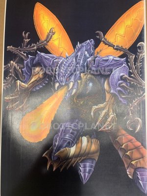
The painted style, which wound up highlighting the organicness of also the shapes and textures on weapons, read as a bit dark and again really pushed the vibe of the brand away from the tech-y, classic boxy robot feel of the last decade. It was definitely its own thing, and dammit, it was incredibly, amazingly METAL.

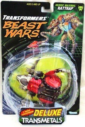
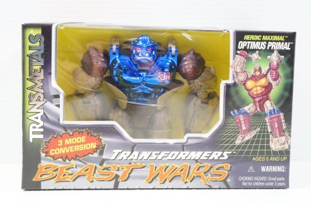
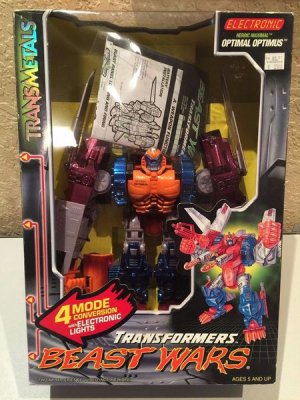
Of course it would only get even MORE metal as the next years brought Transmetals and Transmetal 2s to the line, and with these new packaging to reflect the change-up. This was I think where I actually took greater notice of BW packaging, finding it very clever that the Transmetal waves also transmetalized the dinosaur packaging, turning it into this metallic, panel-y dinosaur "skin" with a seemingly still-organic eye. Somehow they managed to keep it from just falling back into G1- or G2-ness, despite the addition of more metal and tech detailing (including the green grid) paired with TRANSMETALS in a foil finish.

97-Kenner-Rattrap-Transmetals-Dlx-80416-Pack-Wear1-Copy.jpgttref.jpg450px-BWToy_OptimalOptimus_BoxedSample.jpg

By this point it had been "Transformers Beast Wars" for a while, and the carded figures exhibited a cleaner look thanks to the smoother, darker backgrounds. The Mega boxes were kind of busy, though, with so many logos and callouts feeling a bit cluttered on the front and on top. (I remember Robert Powers' Optimal Optimus review quizzically listing all the words on the top of the box, and boy that was a mouthful. Looking back at it now I'm also very tickled at the graphic designers' choice to use a digital clock font for ELECTRONIC in 1997. My dude.).

76ygfd.jpgreduced-image_6391_0_1604182670.jpg5tgvfre.jpg

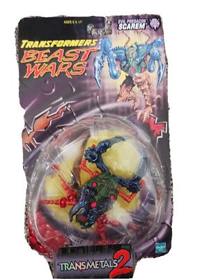
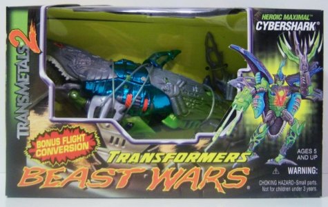
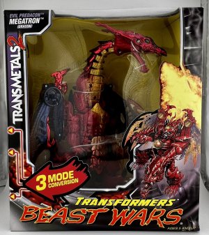
Transmetals was a big, and good-looking, visual packaging reinvention. Its sequel was less big and less eye-catching, but had some nice touches that gave it a bit of an identity. The Transmetal 2 packaging designs depicted organics (scales/spotted fur) breaking through the metal, while still maintaining good levels of contrast and readability. I do love that, like with G2 Megatron, someone had fun with TM2 Megatron's box and had him posed to breathe fire past the plastic window.

Co-sells sadly were by now again on solid color/light gradient backgrounds rather than environments/habitats, but the front end of the packaging added a splash of color to the logos (also pairing the bold sci-fi-y "TRANSMETALS" with a jagged paintbrushy organic "2"). I sometimes wonder if they meant for a cooler, clearer name, but ran out of time and just used the working electric boogaloo name.
 
Last edited:

lastmaximal

Administrator
Staff member
Council of Elders
Citizen
(continued)

reduced-mwmegapl.jpgreduced-mwprowl.jpg

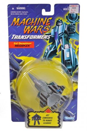
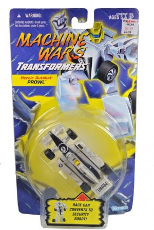
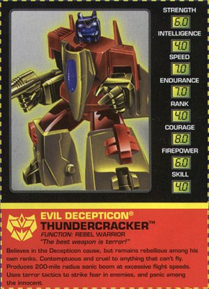
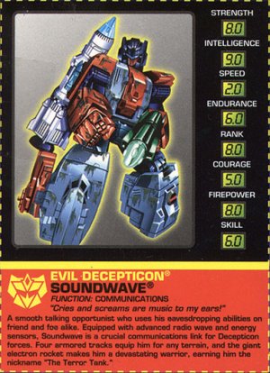
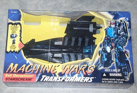
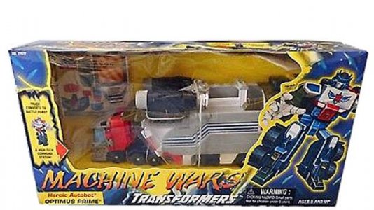
I've waited until here to talk about Machine Wars, to bridge Beast Wars to Beast Machines. This little capsule has always fascinated me, and its cobbled-together packaging is so reflective of its cobbled-together lineup. Like the later Beast Machines-era Dinobots, this really reads like Recycled As Hell: The Toyline, a filler line that had as a secondary benefit the ability to bring foreign or unused molds stateside, and didn't get much more love than that (didn't even get their own FONT for the logo, and the wiki has a particularly neat note about the oddly-minimal use of faction symbols). It was all fairly cookie-cutter: early BW cards with the dino skin texture clunkily replaced with diamond plate tinged blue (more apparent on the boxed stuff) and being torn up by the... statically posed vehicles, accompanied by rejiggered G2 etc artwork.

876yrdc.jpgreduced-image_6291_106.jpg

I am so, so fond of this weird little subline because it feels like it got canned and then randomly got uncanned at the very last minute and Hasbro/Kenner just said... you know what, just release what we finished, no time to give them another pass. Right down to packaging that feels more like a proof-of-concept or mockup (Some Sort of Bucket reference #2).

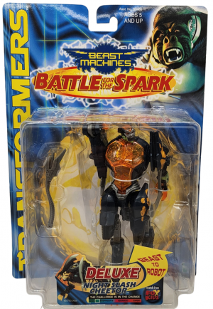
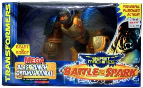
Beast Machines there's somehow less to say about, honestly. After all the changes and visual playfulness of Beast Wars, even in its latter Fox Kids padding waves, Beast Machines' was aggressively homogenized, generic-feeling packaging. Blue cards that had a very CGI-y Matrix-y/spark-y "textured backdrop" that I guess we might now associate more with old graphics card packaging, an admittedly neat toyline logo with its blend of a gear and wings/claws, and a giant TRANSFORMERS logo up the side that we wouldn't really see again as a unifying packaging element until 2014.

876yhgrfc.jpg5468.jpgIMG_1689__30340.jpg

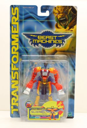
Other than now-square bubbles, a lot of packaging conventions persisted -- everyone still packaged in altmode (except, notably, Basic "we can't show them HIS altmode, are you kidding me?" Silverbolt), and the continuation of tall cards and wide boxes (it's almost quaint how little/compact the Mega boxes are now). The busy-ness of packaging copy seems to have also carried over for the bigger, more gimmicky stuff, as Blast Punch Optimus Primal (I still wonder if this was originally Power Punch Optimus Primal and they just did a find-and-replace for Power into Blast that also created Fireblast... which stuck) has an unwieldy amount of words AND fonts on just the front of the box.

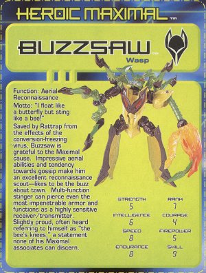
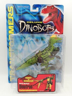
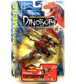
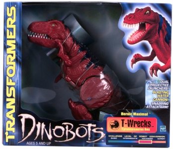
One sad facet of Beast Machines is, unique, painted box art died with the Beast Wars (in the West at least), and the most we got was Hope Ya Like Angry Cheetor/Primal Because We Have Some Spare Renders (or, if you picked up the Dinobots -- which got their own logo -- Hope Ya Like T-Wrecks). This was a DISMAL era for box art that didn't end until RID2001 did. It didn't bother me TOO much at the time (I didn't have much Beast Machines stuff) but now I'm very disappointed we never got even Machine Wars-ish edits of old art into Buzz Saw or Skydive. I did really like the shades of blue they used on the backing card/box, which contrasted surprisingly well with most of the toys. Didn't realize until checking the wiki that this blue would go a shade darker (and have a yellow in-bubble spark background) with the Battle of the Spark subline; most of the BM stuff I have in my collection I acquired loose from lots, and internationally, because I don't think we even got that here.

34rew.pngreduced-image_3327_106.jpg
You can kind of see how the era ended with the packaging equivalent of a whimper, despite some great toys and nice designs; I don't know if laziness or a budget situation or both (or maybe just knowing this was a last gasp and choosing not to sink more cash into it) led to the bland work put into packaging what was otherwise a pretty neat toyline (especially toward the end with BftS and the somewhat surprising Dinobots additions).

6ygfe.jpg6yhgvfd.jpgreduced-image_1051_2_1602094371.jpg

To shift away from a downer note? We can look at Japan, where Takara would have a fun little brand renaissance of its own, creating an almost pocket-universe-toyline feel for its own Beast Era...
 
Last edited:
Rustron

Member
Citizen
I loved the foil on the Transmetals packaging. I also remember being a bit confused and then disappointed at seeing Cheetor on every Beast Machines card as a kid. I liked the design of the packaging itself, but the lack of character art was sad. I've never thought of it before, but now that you said it, yeah, Beast Machines does look a bit like old graphics card packaging.
 

Sabrblade

Continuity Nutcase
Citizen
Looking closer at the Beast Machines packaging, I realize now that the background design on the cards resembles Terminator-style liquid metal, as if to give a sense of "living" metal without fully knowing yet what the technorganic concept was going to be like.

Also, for the second-year toys, the card backgrounds were given a golden Spark design to reflect the story's shift to searching and (heh) battling for the Sparks.
 

Blot

Well-known member
Citizen
I'm also a big fan of Classics, Cybertron and Animated cards and boxes. So much style, and detail. The little flaps depicting both modes on Classics I just found out about like, 4 years ago, as I've never seen a boxed Classics toy in person. I was blown away, VELCRO on a card???
Not Transformers but the real winner of that era for opulence goes to GI Joe Sigma Six which not only had the plastic bits become an accessory storage footlocker, but also included a blinking LED in the package that existed solely to get your attention on the toy aisle.
 

Rustron

Member
Citizen
Not Transformers but the real winner of that era for opulence goes to GI Joe Sigma Six which not only had the plastic bits become an accessory storage footlocker, but also included a blinking LED in the package that existed solely to get your attention on the toy aisle.

I don't really follow G.I. Joe, as it's not a genre of toy I'm particularly interested in, so I only found out about Sigma 6 last year, and the accessory locker thing I found an excellent bit of design. Specially for a toyline so focused on accessories. I had no idea there was LED in the packaging, that's crazy. I'll have to look up pictures of what that looked like on a store shelf.
 

Steevy Maximus

Well known pompous pontificator
Citizen
Not Transformers but the real winner of that era for opulence goes to GI Joe Sigma Six which not only had the plastic bits become an accessory storage footlocker, but also included a blinking LED in the package that existed solely to get your attention on the toy aisle.
I maintain that Sigma 6 was the last, truly great, "action figure" line. Even the 2.5" Mission Scale went WAY above and beyond with integrated "mission briefings" on carded items. With full "flip book" design.
 

DefaultOption

Sourball
Citizen
Looking closer at the Beast Machines packaging, I realize now that the background design on the cards resembles Terminator-style liquid metal, as if to give a sense of "living" metal without fully knowing yet what the technorganic concept was going to be like.
Huh, never thought of it like that. I always saw it like one of those wavy gifs that 80% of us used for the backgrounds on our Geocities pages.
 

LBD "Nytetrayn"

Broke the Matrix
Staff member
Council of Elders
Citizen
I invite you to put up with it, or (more likely) scroll past it, and tell me YOUR thoughts on Transformers packaging across the decades. I just think it's neat.
Gotta return later to continue reading, but just wanted to drop this off in the meantime:

1754985208099.png
 

lastmaximal

Administrator
Staff member
Council of Elders
Citizen
The 1990s, 4: Big (and Lio and...) in Japan

US Transformers toylines have generally tended to have an interesting transition to becoming Japanese toylines. I don't think it was until fairly recently that they were truly simultaneous, let alone synchronized, and to this day the release schedules are still uneven more often than not. This has resulted in Japan being able to tweak things or choose different approaches to the shows as well as the toylines. Of course, as latter G1 showed, Takara were down to take a visually-distinct direction in terms of look and design anyway. It is, after all, a different market, and the toys have to stand on shelves alongside different other toys and boxes. I'll note here that I miss these days and variations very much, as 2018 onwards have been kiiiinda boring.

Beast Wars was one of those cases where the Japanese releases were held back about a year from the US ones, and the wiki notes this was likely to let production on the first season be completed. There was also a gap between importing US BW seasons due to the same production schedule concerns, which resulted in two cel-animation shows being produced with their own accompanying toylines in the interim; this was, like the latter days of G1, a period of comparative design freedom as those shows were not "versions" of the US series. Again, I miss this, and am grateful to be seeing things like Cyberworld and Wild King now where each brand is innovating and playing in parallel while still knocking out bangers in the "main" Generations space.

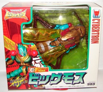
As a result of this greater release autonomy, the "main" Beast Wars toyline got the Takara release format treatment, including the tendency to put everyone in a box (Basics+) and change up how the toys were released, from pairing individuals into "showdown" versus packs to splitting up combiner teams into individual releases.

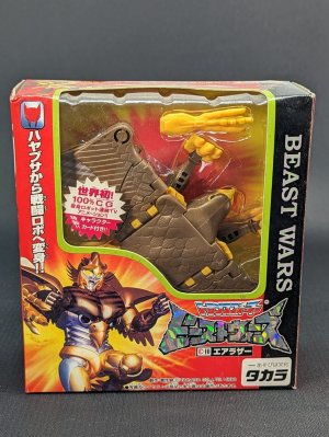
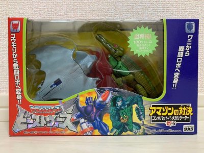
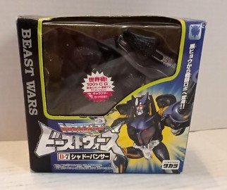
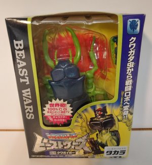
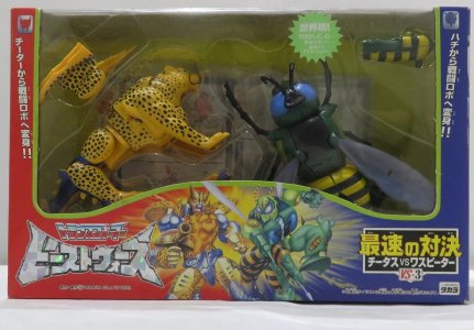
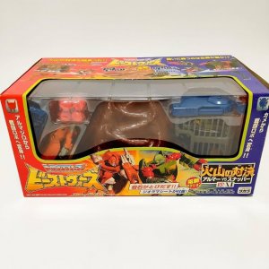
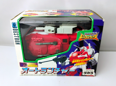
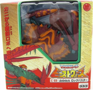
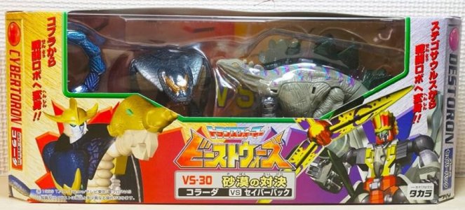
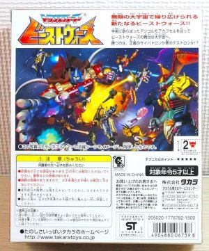
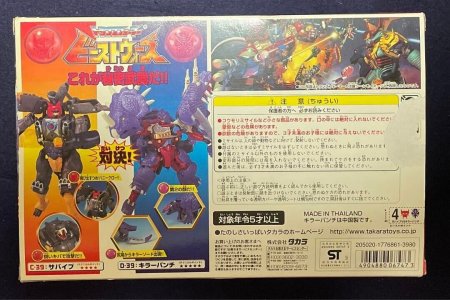
Packaging had an amusingly basic Courier New-ish serif font reading "Beast Wars" in English on one side of the plastic window, opposite a Japanese callout of what the toy transformed into on the other side. Opposing orientations for packaging layouts were also used -- Maximals/Cybertrons had art on the left and logos on the right, which was flipped for Predacons/Destrons. These met in the middle for versus packs; this whole situation was cut off by a yellow-green border separating it from the nice spacious window. On this window there'd also typically be a large starburst sticker touting the 100% CGI series. (I'm just going off of what Google Lens' translation function claims it says, so bear with me. That tool did also claim the BW logo was the logo for Gogo Sentai Boukenger, so YMMV.)


34543.jpg765tred.jpghgds.jpgtrfvg.jpg


Perhaps my favorite element of JBW packaging was that it featured original box art. Rather than use Hasbro's fantasy-ish organic monster art, Takara seemed to have taken the delayed/extended window to create original CGI-ish art in the style of the show for its packaging (with some apparent exceptions), which would persist for I think the entire Beast Wars period in Japan (including for II and Neo). I saw this for the first time with BW2 boxes that were surprisingly imported into mainstream retail stores in ~2000, and I was floored. It wasn't necessarily on par with what Mainframe did, but it was more than enough.

3dbfe3884d89859b408aa17f9994c6d67a1f7b15d22598efbebb2ad8a1a3ec91_1_8cf9b33a-489b-4753-ae85-362...jpg61kEWsMRh7L._UF894,1000_QL80_.jpge4b133b416ec12a88dac18fd0ae5687d52df33a1841b7c6d780d34faee73c4d8_2_a3f30b90-183c-4be0-af9b-9d9...jpg

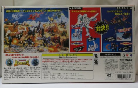
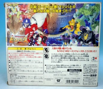
It felt like a fanfic come to life, what with all the offscreen characters (almost everyone from this immense roster, because of the CGI budget and propensity toward a smaller, deeper-written cast) now just existing in the style of the show. This was boosted by the versus packs tending to have names like Amazon Showdown and Volcano Showdown, sparking scene ideas. (Especially if you could read Japanese, which, uh, I could not.) Again, one can kind of see how a fan would gravitate toward Takara, being fan-spoiled by this pretty fanservice-y touch. The back of the boxes did also tend to have a cool battle scene showing off the toys. Not quite a mural, but more than the US got and nicely reminiscent of store displays from the old days.


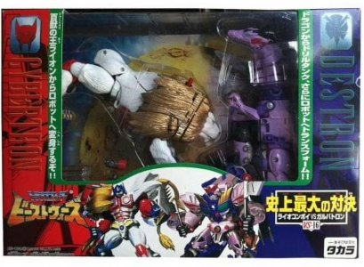
Beast Wars II changed things up a little, resulting in a cleaner look. It mainly rearranged things a bit so the boxes' main color was white, with the (more saturated) faction color being a wide strip that also featured line art of Lio Convoy's or Galvatron's robot head. Versus packs would generally still put those together, but now with the white forming a border in the center (and faction names being almost unreadable in the same color as the faction-color backgrounds).

tfbwiivoybm-1.jpg874rfdd.pngTransformers-Takara-Japanese-Beast-Wars-VS-16-Lion-Leo-Convoy-vs-Galvatron_e44e01c5-2827-4874-...jpg

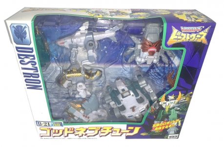
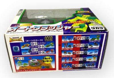
Still on opposite "facing" arrangements per faction, the boxes continued to have lovely original CGI art for the characters, with much larger individual names now dominating the bottom edge of the front (and the faction name in large print on the side of the window in faction colors). The back of box "mural" was basically the CGI art (some in new poses) put together on one background. I did like that the toys came with a cardboard inset that was decidedly NOT generic: these tended to be nature backgrounds related to the beasts (I assume), with some exceptions. The different sides of each box were decidedly occupied, but Takara put co-sells in a neat organized manner on the bottom of the box.

45yt4e.jpg710juAOxGjL.jpg87654rf.jpg

One thing I'd taken for granted with JW and BW2/II was that the boxes continued the G1 style of just being standard boxes. Rectangular prisms with predictable sides and whatnot. This would be departed from as Takara pivoted to their next animated show and toyline, Beast Wars Neo, before going back to dubbing/adapting the US show.

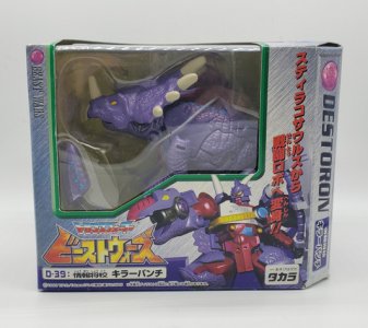
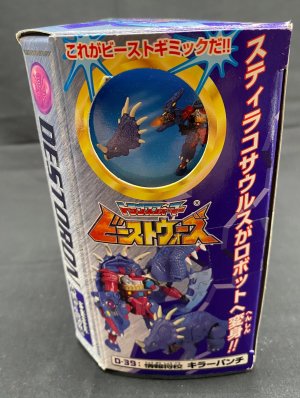
Neo (so 1999!) had packaging that introduced with added features, having an offset angled panel and the side panels having cutouts that revealed artwork, gimmicks, and such on other folded-in inner panels. (Lens/Translate says the callout there is "this is the beast gimmick"; I always found it funny/charming that Japanese releases explicitly use "gimmick" like Hasbro ones use "feature", if at all. Different cultures, different connotations, etc). More packaging experimentation would follow in later lines from both Hasbro and Takara, mostly in terms of adding angles and irregular box shapes. The transliteration of the faction names was also notable for this line, as they were Cybertorons and Destorons, which iirc they'd never been before or since.

reduced-image_4969_0_1604181160.png20231214_194512__38734.jpgGVMNWL6D4MVTBKMF3UGR3TCT.jpg

The white BW2/II box base color was replaced with a lightly-colored brushed-metal texture (orange for Cybertorons, purple for Destorons); the transliterated/English faction name was now "Beast Wars" in the same color as the backdrop (only barely visible thanks to drop shadow). I liked this a fair bit less than the cleaner BW2/II look. In a neat touch I DID like, the faction symbols (which had been on shiny plaques for the previous lines) now looked like the spark crystals that Japan had also imported from the US' TM2 figures for this line. Text sizing and styling otherwise went back to the first BW style, with (less-) tiny names below the series logo. Versus packs notably had the faction colors meeting in the middle (flipped from BW2/II's opposite orientation) in a shattering, jagged shape.

61yDZO2hgOL._UF894,1000_QL80_.jpg71QY+k68DzL._AC_SX679_.jpg765tgfd.jpg

The BW Neo boxes still featured original CGI art for the characters, but the inner cardboard backdrops were now generic dry/cracking rock with the spark-crystal style faction symbol. The back-of-box mural follows on from the BW2/II one in putting various CGI assets into one scene where they'd vaguely interact, although these seem to be in different poses than their front-of-box renders.
 
Last edited:
lastmaximal

Administrator
Staff member
Council of Elders
Citizen
(continued)

Eventually Takara got back around to the "main" Beast Wars show and toyline, and came back to round it out with Beast Wars Metals. I think by now the beast toylines had run their course in Japan (the wiki notes a decline in popularity around BW Neo, possibly due to the less-kid-friendly line) and Takara were cranking this out to be done with it. They were so done that they skipped Beast Machines (insert jokes here), only going back to release a handful of toys in 2004 (I'll add this later as a sort of coda of hero for this era).

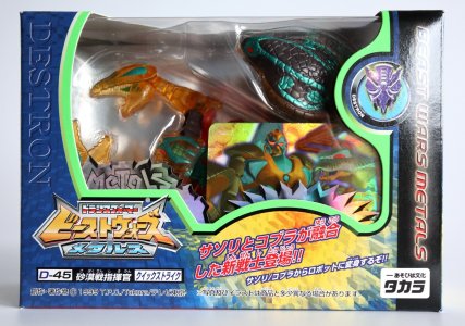
They did still go as nuts on the packaging as you'd expect. The Beast era staples were still in place -- lightly-textured faction colors on one side, series name on the other (now a thickly-glow-bordered "Beast Wars Metals" running down the side of the box), BW Neo style "barely readable" text on same-color background (now the Courier New-ish "Cybertron"/"Destron "instead of "Beast Wars") on the other side, Cybertrons/Destrons having flipped box layouts, a solid color border delineating the plastic window, versus packs combining all this-- but the execution had some unique flourishes.

tgredcds.jpgIMG_8125__66406.jpgfgrd.jpg

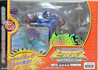
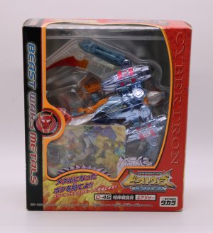
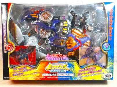
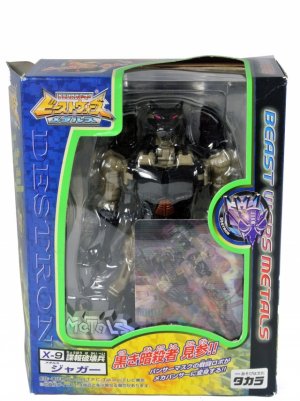
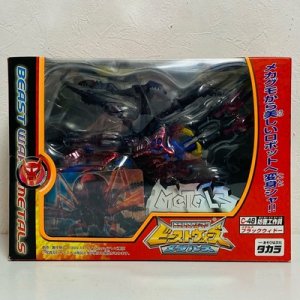
Rather than just go with character art on the box fronts, Takara used in-show CGI on lenticular character cards that were in the plastic window facing outward. This and jagged foil stickers that said MeTaLs in a radical angular font spiced up the solid-color window border, and both tied into the metal/chrome/shiny vibe they wanted to associate with, well, Beast Wars Metals. The window border alternated between straight lines and sweeping curves, one of which picked out the badge-y feeling faction logos (more "readable" than the Neo ones which blended into the background of their "spark crystal"). Faction-color backgrounds were now red-orange and more-blue-than-violet, and the spots where character art would be had an explosive highlight that now picked out text that did the old "[beast] transforms into robot". (The cards that replaced character art would be right above this in the plastic window, er... partly covering up the toy).

I didn't really get into this line, as it showed up in specialty stores here around the time I was just reintegrating into Transformerdom in general (and I already did have some of the US releases). But I do remember the very eye-catching packaging, especially as Takara did what Takara gonna do and made a ginormous window box to show off Silverbolt (my boyyyy) and Rampage in his wide-as-hell (thanks to the legs and big meaty claws) beast mode. I still kind of wish I'd gotten it.

717he4D4CAL._UF894,1000_QL80_.jpgreduced-image_16908_0_1585246546.jpg654e.jpg

When thinking about Japanese packaging in general, I constantly have to remind myself that I may not be informed enough to really judge it. The culture has visual preferences that are not what I'm familiar with or used to, and compositions in the language traditionally are done vertically vs. horizontally -- which is likely what leads to the many cases of text running down the sides of boxes. There is a tendency for things to end up feeling a little cluttered or busy, but that may be a preference difference as they seem keen on (how did I wait this long for this pun) maximizing the real estate. Nevertheless, I can't say it doesn't convey a sincerely exciting feel, so I guess it works as intended, no?


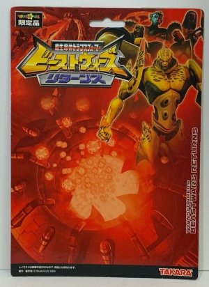
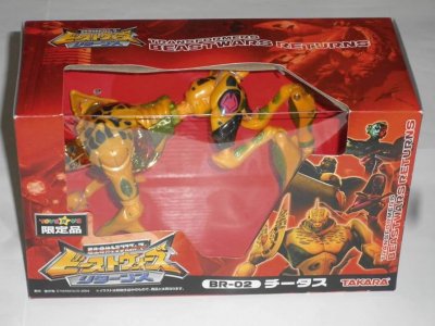
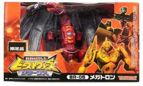
The beast era in Japan had an unexpected "and another thing" years later, as (somehow) Beast Wars Returns popped up in 2004. There's about as much to say here as there was for Beast Machines, which is... not a lot. This tight, Metals-ish toyline (just the cast, including the Grand Mal Megs that had to be shunted to RID2001 after Hasbro's big 2001 shift to that direction) had packaging that seemed to match its counterpart's energy, being as quick and generic as possible so Takara could get back to main line stuff that mattered (which at that time was... the Unicron Trilogy).

1_1b3b710dc33ab184a50e32d2df84c67f.jpg61eQmSKUWIL._UF894,1000_QL80_.jpg7yhgfd.jpgStrika_1270943554.jpg

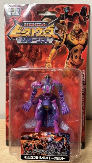
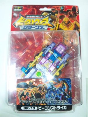
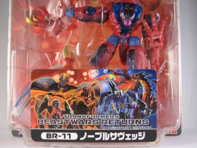
Beast Wars Returns used red where Beast Machines used blue, meaning the packages were on an admittedly fetching red background that featured various monochrome art assets -- dragon mode Megatron breathing fire, a shot of the sparks floating out of a containment chamber, robot-mode-in-Coke-can-control-garness Megatron -- and doubled down on Beast Machines' ubiquitous CGI Cheetor render by adding the same for Rattrap, Primal, and Blackarachnia, with "empty"/white-stroke English toyline name text on the box edge (and partly on top of the artwork). The monochromatic card doesn't highlight the figure with a different color background for that part, and boxed figures have a flat red insert. The whole thing tries to walk the line of being understated but dips into being, well, boring.

tf-bw-207.jpg407248401_b5a26a3948.jpg

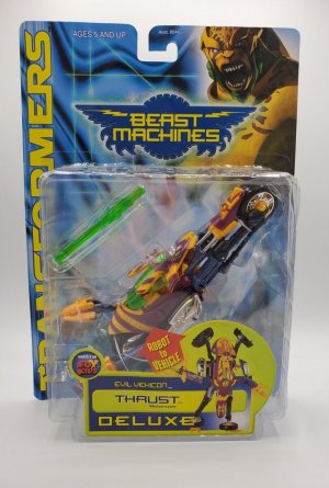
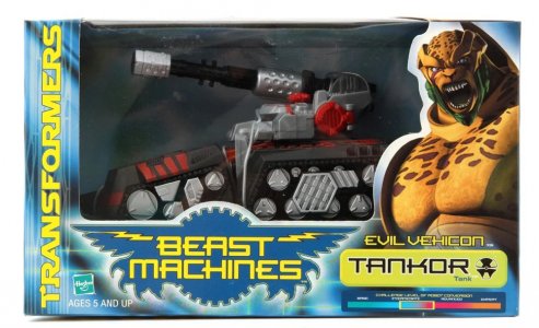
Carded figures got an even more visually-cluttered sticker on the front of the bubble, with Primal, Rattrap, Cheetor, and Blackarachnia (not just the same art I think) on one side and dragon Megs, Tankor, Thrust, and Jetstorm on the other atop a red-and-blue saturated version of the "floating sparks" backdrop. Hard to escape the bootleg-y feel of "let's use ALL the art assets in one place" there, even if you managed to resist that impression from the cardback. On top of THAT was fairly small text naming the toyline, and a black strip at the bottom with the character name and number. The toys were otherwise packaged the same way as they were in Beast Machines, maybe even using the same plastic trays and bubbles (I assume, anyone confirm?). Hard to miss Savage/Noble's very specific pose, and Silverbolt still being in the more presentable (and probably easier to package, to be fair) mode.

The toys themselves were in great, more-show-accurate deco (I still have to talk myself down from getting an overpriced BWR Silverbolt once every few months), but this was clearly among the filler-iest of filler toyline efforts, and the packaging reflects that. It's neat that we got these at all, and red cards are unsurprisingly quite striking and a good palate cleanser from all the same-y blue. And it is kind of amusing how they seemingly figured "okay, how do we make this consistent with the US line? Oh, I got it."


Bonus: Big (and Lio and...) in Korea

I'll pause here to quickly look at some fun Korean packaging, from the Sonokong imports of Beast Wars II and Neo stuff. I first became aware of Sonokong around the time they were importing Car Robots, and the packaging approach they took for those is not too different from what they apparently did for their earlier, Beast era imports.

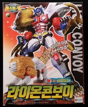
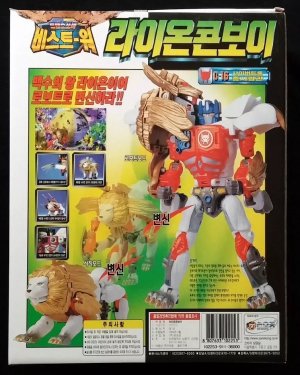
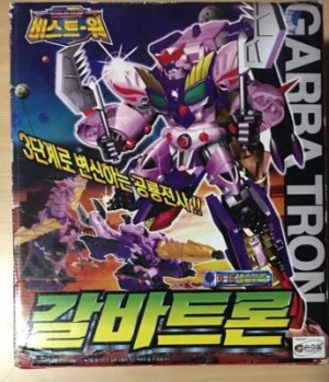
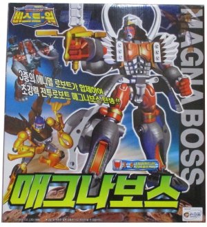
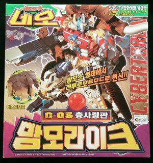
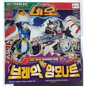
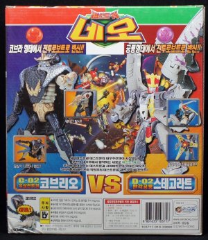
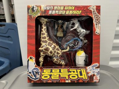
These tended to be windowless boxes that were dominated by bold, huge applications of the CGI artwork on the front and similarly-large pictures of the toy and its transformation and gimmicks on the back. This had the effect of making the usually-small artwork seem more... epic as a visual anchor (on a busy box front) accompanied by their own transliteration of the robot name (Garba Tron). These would take a few elements from the Japanese presentation (like the badge-like faction logos and nameplates from BW2/II, or BWNeo's "Cybertoron"/"Destoron" spelling and even font, and spark crystal-y faction logos) but change others up (small toyline logo, huge character names anchoring the packaging). They apparently also did some windowed gift sets (check out the "animal special forces" in this Instagram post from Ben Yee; one pic is mirrored below).

3edswed.jpg76tygfd.jpg34tgf.jpg44trrfe.jpg

rghbhge.jpg919UbPCjKJL._SS400_.jpg2erfgboij.jpg490023467_1223940059733519_8288532724508982559_n.jpg


Next: In the Year Two Thousaaaand (plus)
 
Last edited:
LordGigaIce

Another babka?
Citizen
Speaking as someone who delved into completing Machine Wars recently....
I love how committed they were to mirroring Beast Wars' packaging with that line, swapping the animal/organic elements with mechanical elements.


Top Bottom