Unmute
You are using an out of date browser. It may not display this or other websites correctly.
You should upgrade or use an alternative browser.
You should upgrade or use an alternative browser.
P&R Funnies!
- Thread starter KidTDragon
- Start date


I call shenanigans. The writing on the sign in the right photo is very obviously cut-and-pasted from the sign on the left.
You can tell because it conforms to the bottom curve of the sign on the left and retains the same curve despite the sign on the right being at a different angle.
It's such a lazy edit too because all they'd have to do is rewrite the whole sign, not just one name.
It's such a lazy edit too because all they'd have to do is rewrite the whole sign, not just one name.
It also doesn't quite look like the same spot, unless she's facing a different direction. But even then, there's nothing really congruent between the shots.
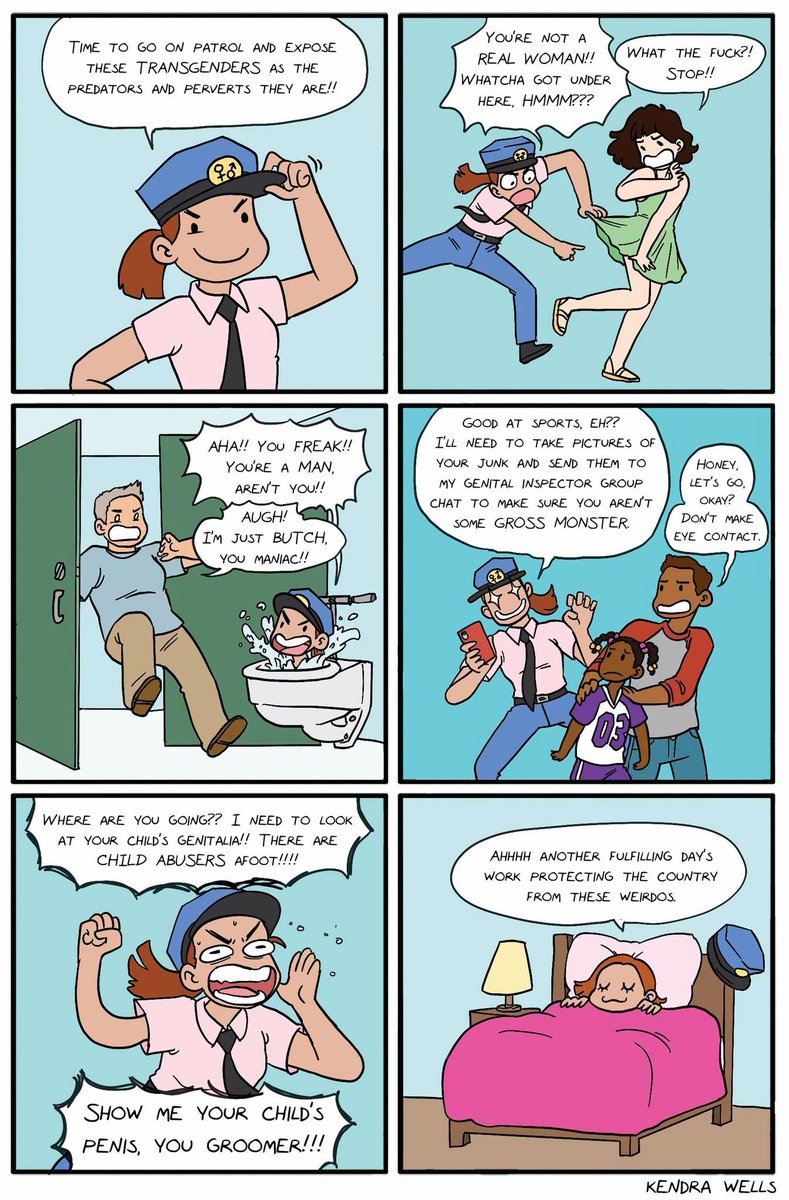
Language Warning...


When can I get this as a Doom mod?
He knows people can see all the empty chairs, right...?
That's perfect in pretty much every way.

Congratulations to trans people on your successful deicide campaign.
I, for one, welcome our new trans overlords.
I'm more into welcoming the new overladies, but to each their own